.svg)
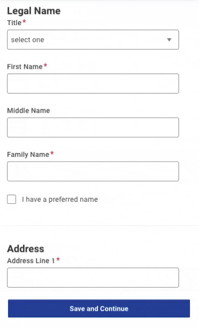
All forms are difficult to get right but delivering a good user experience for forms on mobile devices is doubly tricky. The smaller screens that interface with fingers rather than a mouse cursor throw out their own set of challenges that you need to tackle if you want to stop people abandoning your forms.
With mobile usage making up around 60% of all internet traffic and Zuko benchmarking data indicating that mobile conversion rates consistently lag behind desktop ones, it’s clear that getting mobile forms right is critical to getting the most out of your website.
We’ve previously shared many general tips that can be used to optimize all forms. This article focuses on providing advice that is specifically pertinent to mobile devices. We know these design patterns work as we’ve used them in Zuko’s Form Builder to deliver a smooth mobile user experience.
Building your form in the single column format will mean that it is automatically responsive and will render in the mobile environment as it should. Forms in a multi-column style tend to take longer to complete anyway but you also need to make sure that they will translate well to a mobile screen.
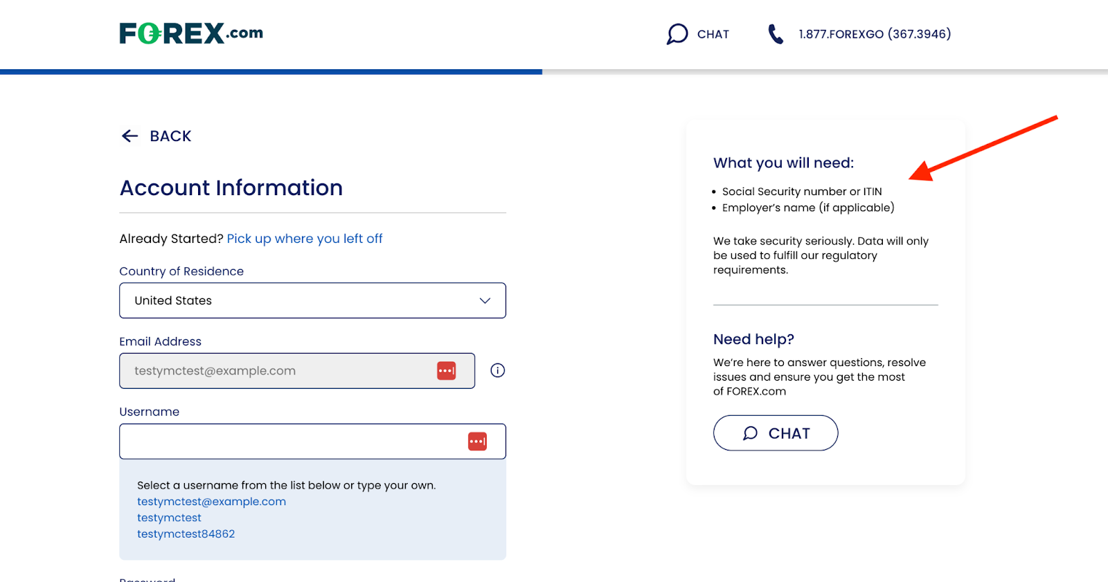
Note this principle doesn’t just apply to form fields but to all elements of the experience. Take this example of a foreign exchange platform’s registration form.
In the desktop version, the critical microcopy explaining the information the user will need to complete the form is clearly visible on the right hand side:
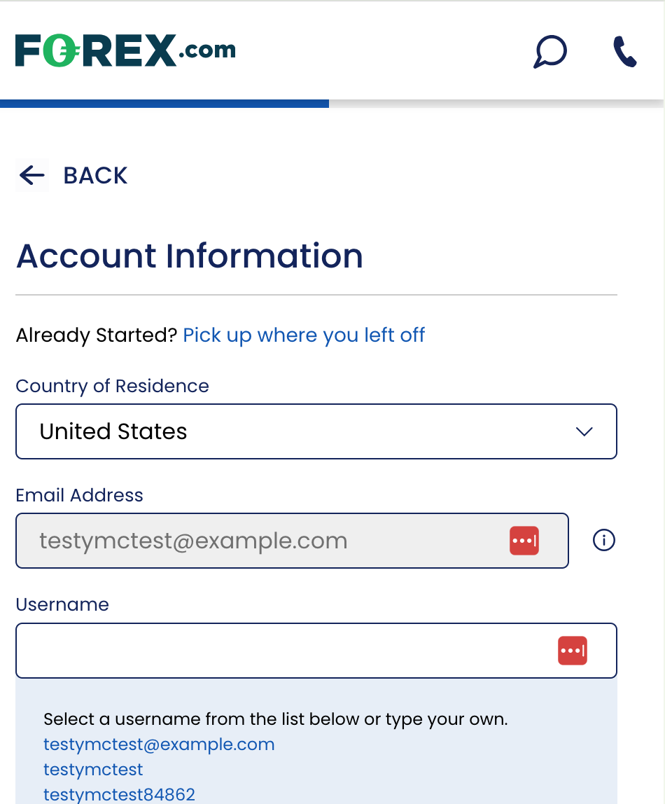
However, when looking at the mobile version the formatting has completely removed the copy, meaning that users do not get their expectations managed as they should.
Multi-step forms are often the best choice for forms anyway but in the case of mobile it’s important that you actively look at whether breaking the form up will improve the experience. A long single page form involves a lot of scrolling that can take a toll on the user’s patience.
For example, here is the mobile rendering of an Italian government form:
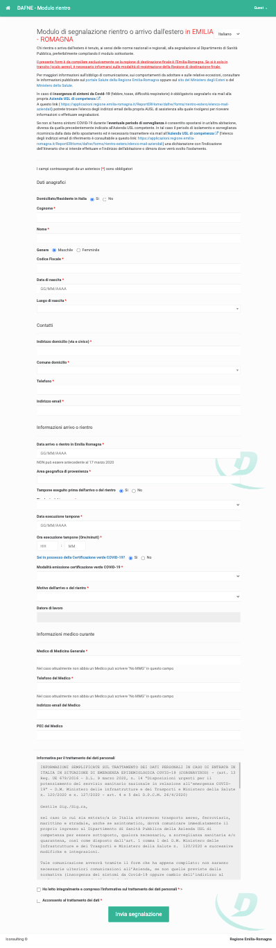
Even though it’s not the worst example of a single page form rendering poorly on mobile, it would certainly benefit from “chunking” into sections to reduce the cognitive load and prevent a “what the heck is this” reaction from the user.
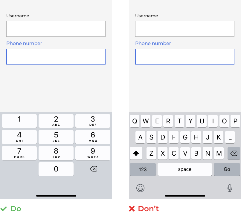
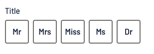
It’s all too easy to forget how the user will interact with your form if you’re designing it on a 34 inch screen whilst sitting in a comfy swivel chair. Mobile users will be jabbing at it with a set of poorly coordinated, pudgy fingers so your elegantly designed desktop elements won’t cut it in the real world.
Specifically, you need to make sure that your elements are big enough for the user to easily tap them rather than their neighbours. WCAG guidelines suggest that target sizes of tappable elements (radio buttons, checkboxes, dropdowns, buttons, textboxes) are at least 44 x 44 pixels. You also need to make sure that there is enough whitespace between elements to avoid people hitting the wrong element by accident.
To illustrate this, take a look at the relative sizes of radio buttons in forms created by Zuko Form Builder and those in the cramped Italian government form we shared above.

One other tip to keep things finger friendly - stay away from sliders. As much as they seem like a good idea on mobile they are fiddly as heck and very difficult to navigate to an exact value using your sweaty index digit.

Instead, just use a simple text box that the user can enter the value they want. They’ll thank you for it later!
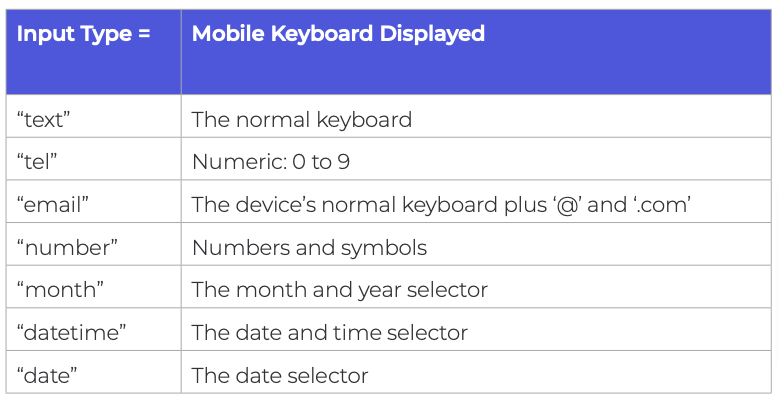
If you’ve ever tapped a “Phone Number” text box on a mobile form to be met with a keyboard that only contains letters, you’ll understand the frustration that a miscoded form field can cause. It’s all too avoidable as well. Simply code the appropriate HTML type so it shows the relevant keyboard type when interacted with.
Here’s a handy cheat sheet to help shortcut the process:
Tooltips are generally problematic on all forms for various reasons. The justification for using them in the mobile format is even less. Specifically, some of the functionality (like appearing on hover) ceases to apply and the shortcomings become even more pronounced (obscuring fields, being cropped, being difficult to close).
In short, if something is important enough that the user needs to know it then include it as microcopy above the question rather than hiding it behind a tool tip.

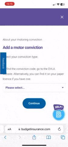
We’ve previously spoken at length about why dropdowns are generally not a good idea. This is magnified in the mobile environment where screen real estate is even more limited and a monster dropdown isn’t going to help the experience at all.
This extreme example shows how dropdowns can go very wrong on mobile, obscuring the rest of the form and taking a long time to navigate.
Even in less egregious cases like the one below, you still have options that the user cannot easily access without an involved scroll and search.
The best alternative to a dropdown for mobile devices is a set of properly sized radio buttons. This is a “one tap” mechanism that cuts out all the scrolling and pain of a dropdown with a format that can be completed in milliseconds.
If you absolutely have to include a dropdown make sure that you:
The password field is consistently a source of friction and drop-off (see Zuko data on the subject here). Don’t make it harder than it needs to be.
In the mobile context, this means not insisting on password input being masked at all times. When you’re tapping on a fiddly little keyboard, it’s easy to make a mistake and if the password is masked you won’t know until you’ve submitted.


Masking was developed in a world of internet cafes and heavy computers tied to a desk. In a world of mobile devices it’s easy for a user to head to a secure place to create a password safely. Put the power in their hands - unmask as default and let them choose if they want to mask it.
As we like to say; unmasking shouldn’t only be for Scooby Doo villains…

The mobile environment is completely different to that of desktop so why try to force the old way of doing forms into this new(ish) format? Phones have a plethora of functions that can be used to enhance the user experience and shortcut the form journey so why not use them?
Specifically, you can consider:
Camera - Let the user scan a document (passport, drivers licence, credit card) and use the technology to complete the form (be sure to let them check and confirm the details first though).
Voice - If you have a form with heavy text input, provide a voice option and translate for them.
Location Services - Hook into the user’s GPS location (with permission) to create smart defaults for relevant questions (like country, etc).
Biometrics - Using a biometric login can remove UX issues around the password field altogether.
By using these tips in conjunction with our general advice on form design you should be able to create a much smoother user experience and increase your forms’ conversion rates.
To help identify where the issues are on our form (mobile or desktop) sign up for a free trial of Zuko or contact us at sales@zuko.io


Zuko is the most powerful form analytics platform available on the market. Find out how to improve your form and checkout conversion by taking a product tour.
PRODUCT TOUR