
Dark UX Patterns On Airline Sites
We share examples of misleading user experience patterns from the travel industry
Examples of misleading website design from the travel industry
Booking flights should be exciting. You’re planning a trip away for fun, frolics and relaxation. The reality, however, is different; the user experience on airline sites can be stressful and unpleasant. This is largely down to the assault course of extras we have to navigate, checking and rechecking that they haven’t been sneakily added into your cart.
Airlines are famous for employing what are known as dark UX patterns. These are elements in the user interface that are purposefully misleading, steering users toward a specific path, usually one that costs more.
Over our years of form optimization we’ve borne witness to numerous dark UX patterns in the travel industry. Here we share some of the ones we’ve seen over this period so you can watch out for them in your professional and personal capacities. We’ve deliberately not named the names of the guilty parties - so many airlines indulge in these practices it seems unfair to single them out. However, if you happen to be able to deduce which ones they are from the brand colours and styling in the screenshots then so be it. That’s on you. We definitely didn't tell you ;-)
Pattern 1 - Promoting the more expensive option
In the first example of this pattern, the airline pushes their mid-range ticket by applying the word "Lowest" to it. At a glance, it looks like the middle option is the cheapest when in reality it is just talking about the lowest Premium Economy option. If the user were in a hurry they might pick it without thinking.
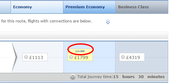
This fare is also highlighted in yellow, making it more eye-catching and tempting users to click.
In a similar wheeze, this US based airline has their cheapest fare in the right-most column, whereas most other airlines put the lowest price on the left.

Whether this is trickery or not is debatable. On the one hand we generally put calls to action on the right where they are more likely to be clicked, so placing the cheaper price on the right could help the user. On the other hand, we’re used to looking left for the cheapest option, something this airline might bank on.
Pattern 2 - Hiding free options (Don’t insure me)
While most airlines have gotten better in recent years and are reducing the number of dark UX patterns, there are those who still hide them in their booking process.
In this example, the airline starts off on the right foot by helpfully selecting the cheapest ticket price for you by default. However, having received your trust, they then sneakily push you toward expensive extras. One of the ways they do this is by making free options harder to find.
The classic example is buying insurance - declining this purchase is made as difficult as possible.
With this particular airline, when the user fills in their name the airline simultaneously changes the insurance option and adds UK insurance, at a cost of £8.70.

When the user then changes the dropdown back to “Insurance – country of residence”, hoping this will cancel the insurance, they can’t proceed. The “Continue” button was clickable but the page didn’t react. What’s wrong?
It’s only by scrolling to the top of the screen that the user can identify the problem. Hidden at the top was an error message, telling them they had to choose an option from the Insurance list.

If we give them the benefit of the doubt, we could put this down to poor execution of error messaging but, if we were cynical, could this be more sinister? To opt out of insurance you must look in the country selector for “Don’t insure me”, which is hidden amongst the list of alphabetically arranged countries, rather than at the top.

If you have to bust out your magnifying glass and hunt out the “don’t insure me” option from a list of dozens of countries we can probably say that the airline is guilty of sharp practice (at best!).
Pattern 3 - Confusing opt-in + opt-out instructions
Figuring out whether a checkbox is opt-in or opt-out should not require a degree in linguistics! And yet airlines seem to be particularly addicted to this sleight of hand. Here are a couple of particularly egregious examples.
The first opt-out message consists of three sentences giving contradictory information. The message is designed to seem like your information will be kept private when in fact users are agreeing to join a marketing list unless they check the box.

The words chosen and how they are arranged is very clever. The message begins “only be used to contact you about your booking unless you are subscribed”. Great, I’m not subscribed and I don’t want to be so I’ll leave that box. This appears to be reconfirmed at the end, “best offer then please tick the box.” I’ll assume again that I only tick the box if I do want offers. Actually, this is an opt-out box and I haven’t noticed because I skim read, like many other people. This is a carefully constructed message to make users think it’s an opt-in box.
This second example from a different airline also has confusing instructions for their marketing sign up. Underneath a checkbox to opt-in for SMS messages is a second checkbox with smaller writing relating to email-based marketing. At a glance, the user would assume that the second line of text still relates to SMS messaging, which I am not opting in for, so wouldn’t bother to read it.

This message is harder to read due to the small font size, isn’t placed near the email form field, and comes directly after an ‘opt-in’ checkbox, all of which implies that this is purposefully misleading.
Read a more in-depth overview of how to ethically use opt-in and opt-out here.
Pattern 4 - Added extras
Most airlines offer added extras in the checkout but this isn’t simple upselling. Sometimes items are selected by default and often the user can’t continue without viewing 10 or so extras.
In the worst cases, the user has to hurdle past this list of extras in order to continue:
- Checked bags
- Reserved seating
- SMS alerts
- Parking at the airport
- Airport transfers
- Checking bulky items
- In-flight meals
- Hotel booking
- Car rental
- Suitcases of specific dimensions
It’s not always clear if these cost extra or not. After all the difficulty declining insurance, users need to be on their guard to make sure they don’t accidentally click on the nice big yellow button that charges them extra rather than the dull, uninviting “No thanks” one that will protect their cash:

The seat selection area is notorious for this UX pattern. In this example, the user is shown a diagram of the plane complete with costing for each seating area. It all looks so easy. What the site doesn’t do is make it obvious that this is an optional cost. Hidden at the top of the page is a small link allowing you to continue without choosing a seat.

The airline has called the link “skip”, which might lead some users to believe they’re only skipping for now. It is not clear at all that you’re not obliged to choose a seat; it is presented that paying for a seat is the norm.
Is this bad?
Caveat Emptor, the cynical might say. The airlines are only acting in their best interests. They offer cheap base prices so it is within their rights to guide users towards their upsold add-ons. It is down to the user to make sure they are happy with the deal they finally pay for.
If you’re ever tempted to indulge in these practices we’d advise you to read this article by Paul Boag who argues that the costs of dark UX (in complaints resolution and damage to brand reputation) far outweighs the short term benefit they deliver.
Further reading
The term ‘dark patterns’ was coined by UX consultant Dr Harry Brignull. Brignull says he wanted to give a name to these tricks and so make it easier for people to talk about them. As he points out, if we know about them we’re less likely to be fooled by them. He also set up darkpatterns.org, a website for exposing dark patterns on sites such as Currys.co.uk, seetickets.com and apps such as Skype.
We wrote the book on form optimization!
"The best book on form design ever written - 80 pages of PURE GOLD"


More from our blog:


Want to get started with Zuko?
Start a free trial that includes all features, or request a demo