Form Abandonment Data by Form Purpose

Here we share data on forms broken down by their purpose.

The specific purposes considered were:

Comparison

Comparing products (such as insurance). Quote forms can fall within this.

Purchase

Buying something. Often an ecommerce checkout but also includes any forms that solicit payment details.

Onboarding

Getting information from someone for a new service.

Application

Applying for a product such as a credit card or loan.

Enquiry

Logging an enquiry. Essentially a Lead Gen form.

Contact

A contact us form.

Registration

Registering to sign up for a service.

Configuration

Providing details to set up a product or service.

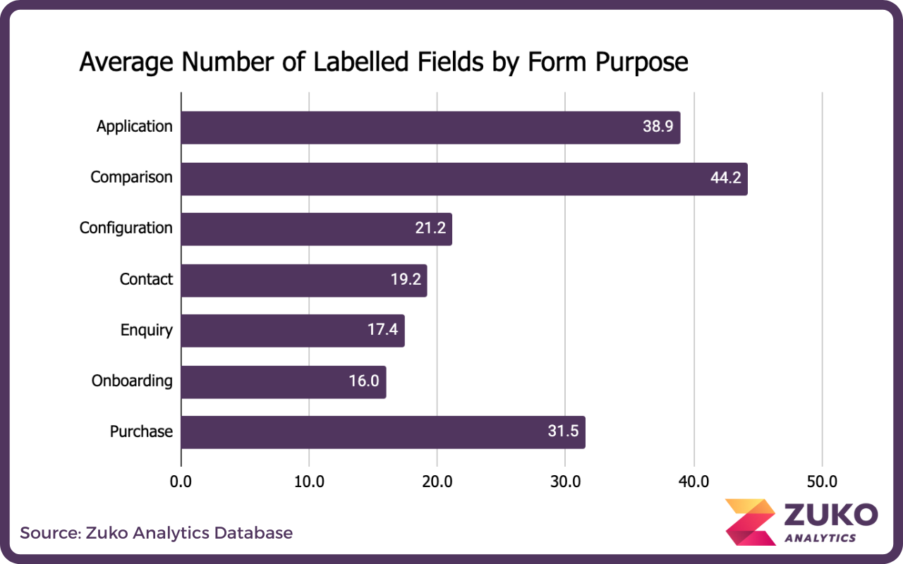
As you might expect, comparison forms are the longest given the amount of information they need to create a quote.

Bar chart showing the average number of labelled fields by form purpose, with Comparison highest at 44.2, Application at 38.9, Purchase at 31.5, Configuration at 21.2, Contact at 19.2, Enquiry at 17.4, and Onboarding lowest at 16.0.

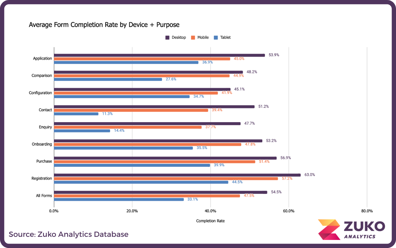
If we look at completion rate we can see the highest conversion for registration forms and the lowest for contact & enquiry forms.

Bar chart showing average form completion rates by purpose, comparing view to completion and starter to completion rates, with registration forms having the highest starter to completion rate at 60.7%.

The form completion breakdown by purpose and device type:

Bar chart showing average form completion rates by device type (Desktop, Mobile, Tablet) across purposes like Application, Comparison, Configuration, Contact, Enquiry, Onboarding, Purchase, Registration, and All Forms, with Desktop rates highest across all categories.

Industry Sessions Tracked Desktop Conversion % Mobile Conversion % Tablet Conversion % Overall Conversion %
Application 27,575,784 53.9% 45.0% 48.7% 51.6%
Comparison 7,583,511 48.2% 44.9% 44.8% 46.4%
Configuration 1,304,907 45.1% 41.9% 50.6% 44.1%
Contact 321,937 51.2% 39.4% 39.6% 47.4%
Enquiry 4,797,087 47.7% 37.7% 35.6% 42.7%
Onboarding 4,678,212 53.2% 47.8% 47.0% 51.8%
Purchase 20,179,282 56.9% 51.4% 56.4% 54.4%
Registration 26,582,277 63.0% 57.2% 58.3% 60.7%
All Forms 93,022,997 54.5% 47.5% 49.3% 51.7%

The same breakdown by browser:

Bar chart displaying form completion rates by browser (Safari, Chrome, Samsung, Firefox, Opera) across purposes such as Application, Comparison, Configuration, Contact, Enquiry, Onboarding, Purchase, Registration, and All Forms.

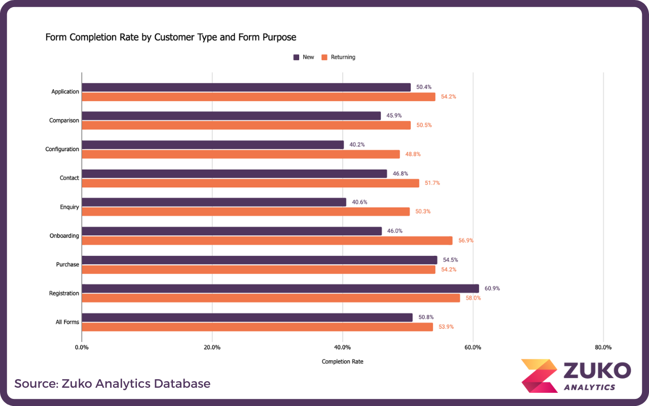
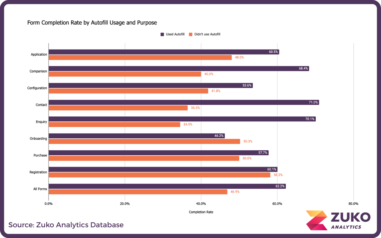
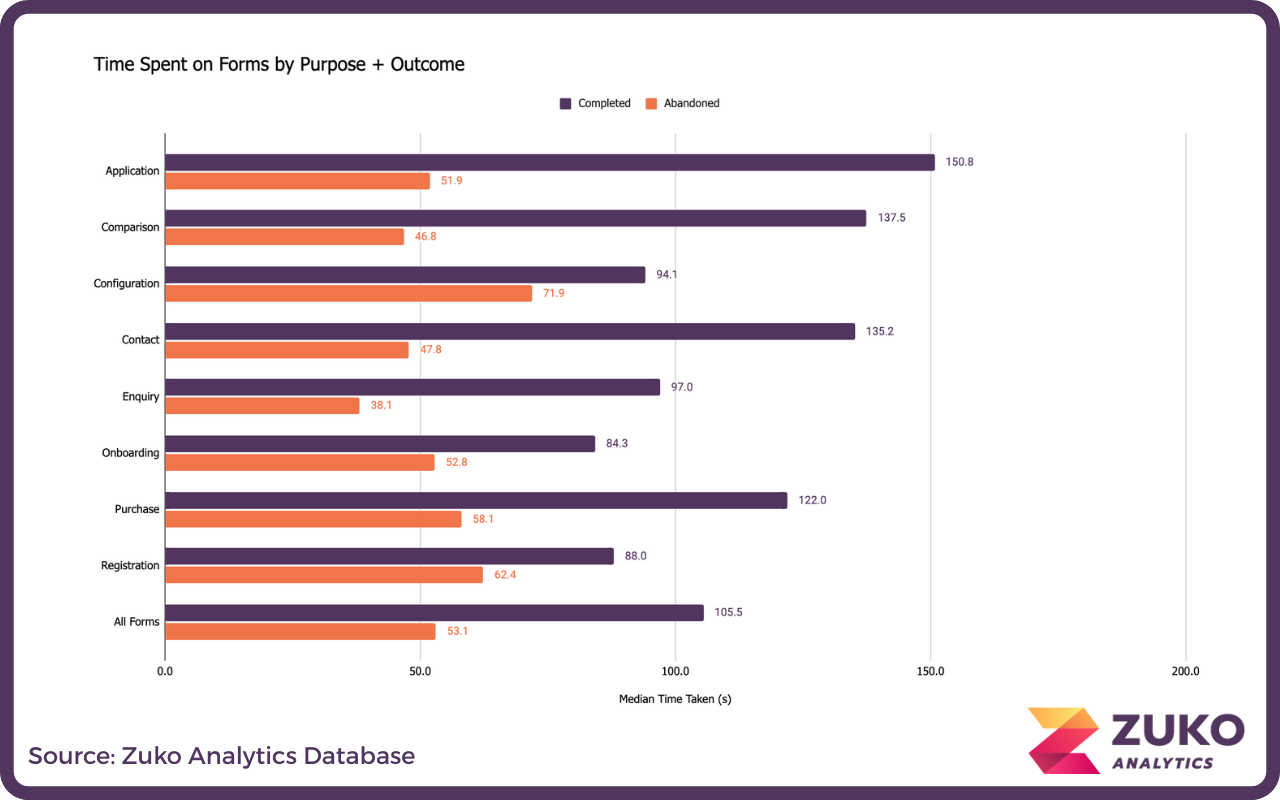
Form completion by purpose:

Bar chart comparing form completion rates by customer type (New and Returning) across different form purposes, showing returning customers generally have higher percentages.

Autofill again correlated with successful completion (with the exception of onboarding, interestingly).

Bar chart showing form completion rates by autofill usage and purpose, with higher rates generally for users who used autofill across categories like Application, Comparison, Configuration, Contact, Enquiry, Onboarding, Purchase, Registration, and overall forms.

Application and comparison forms have the highest median completion times.

Bar chart comparing median time spent on forms by purpose and outcome, showing completed and abandoned times in seconds for applications, comparisons, configurations, contact, enquiry, onboarding, purchase, registration, and all forms.

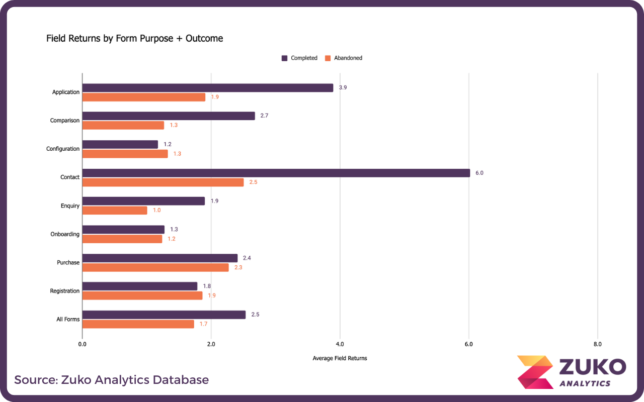
Average field returns by purpose:

Bar chart showing average field returns by form purpose and outcome with categories: Application, Comparison, Configuration, Contact, Enquiry, Onboarding, Purchase, Registration, and All Forms, comparing Completed and Abandoned rates.

If you have any questions or would like to learn more about Zuko’s benchmarking data or how Zuko can help you improve the completion rate of your forms please contact us on sales@zuko.io

About the Data

Find out more about the data we've used to go into our benchmarking study. Get a breakdown of industries, form types, browsers and device types. Click to see more.

Partial donut chart showing percentages for Ecommerce (16.5%), Financial Services (15.8%), Insurance (14.2%), and segments for Forex Trading, Gambling, Utilities, Education, Software, and others, color-coded with a legend on dark background.

Industry Benchmarking

Compare industry form performance across a wide range of form metrics, including average form completion rate, time to complete, and more. Click to start exploring the data.

Horizontal bar chart with multiple colored bars on a dark grid background representing comparative data.

Form Performance Analysis

Explore how different form performance metrics affect each other - for example compare the number of form fields with the average number of field returns. Click to find out more.

Scatter plot with large yellow-green bubbles on a dark gray background, showing data points clustered around 50%, 60%, 70%, and 80% on the horizontal axis labeled with 'Total: S-C' at 50%.

Got any questions or feedback on our data?

Please get in touch using the short form below:

Thank you! Your submission has been received!
Oops! Something went wrong while submitting the form.