
Mastering the Checkout Experience: 22 Examples to Learn From
Checkout patterns that will help you improve your user experience
Checkout patterns you can use to improve your UX
In today's digital world, the checkout experience is a critical component of the user journey. It is essential, therefore, to focus on creating a checkout process that is usable, accessible and optimised for conversions. However, the average eCommerce site has 31 preventable usability issues in the checkout flow. This high number of checkout issues results in an average cart abandonment rate of 69% across industries.
To help you improve your own checkout experience, we've gathered 22 examples from brands that have nailed elements of their checkout experience. These examples showcase how you can successfully incorporate design and usability principles to create a seamless checkout experience.
As with any guide based on best practices, you need to consider your brand, customers, and context by analysing your form analytics and conducting user research before applying any new ideas.
Let’s explore the 22 checkout examples and examine what makes them good.
Before the checkout
It’s essential to view the checkout in the context of the overall user journey, not a standalone element. What comes before the checkout will impact how you design the checkout itself.
One key consideration is dealing with any doubts or questions a user might have before presenting the checkout. This is especially true for complex products or high-value purchases.
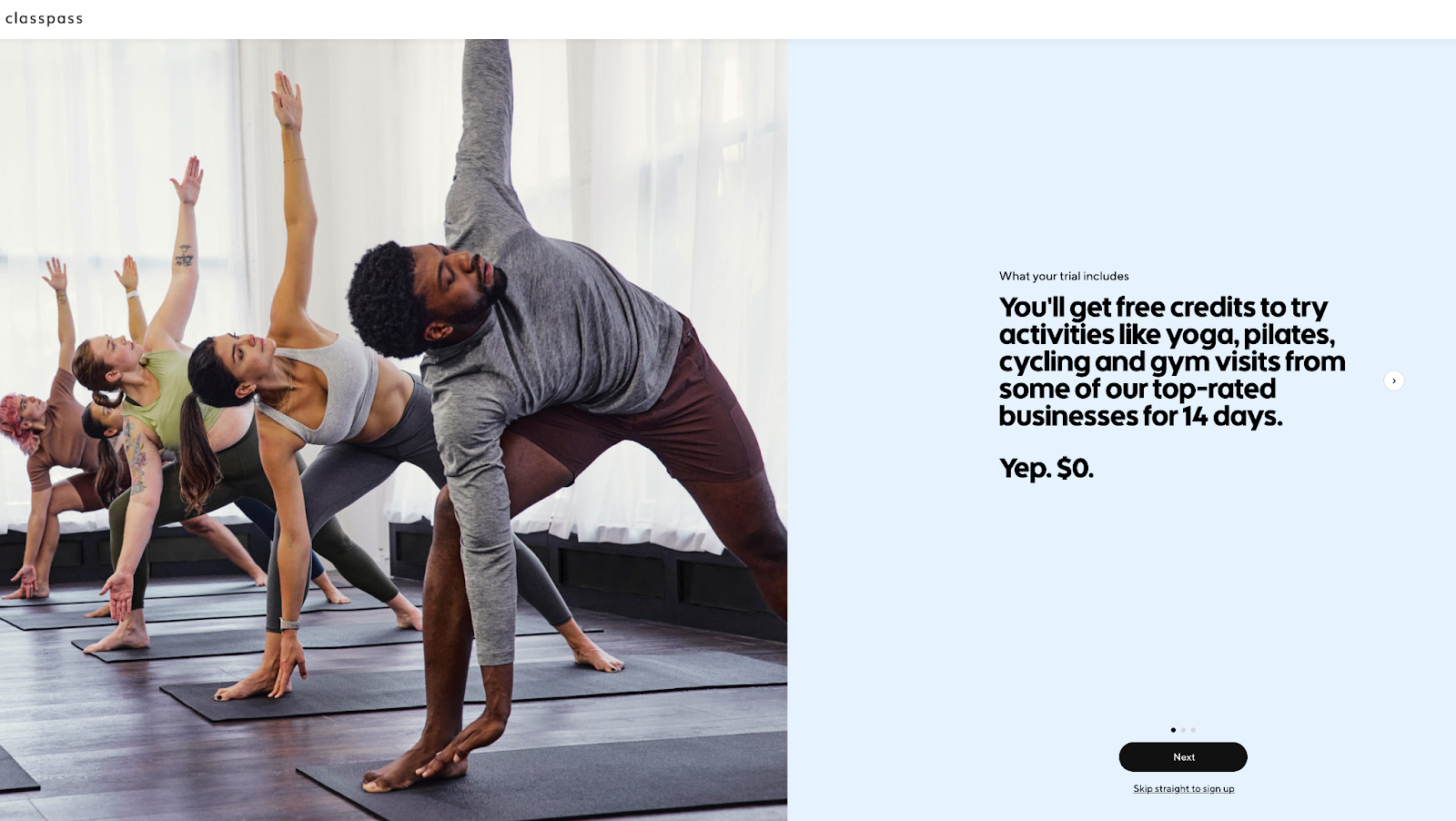
Whilst ClassPass isn’t eCommerce, it is a good example of priming the customer before presenting the checkout page. Below you can see one of three screens shown to a user before the checkout. The screens contain answers to common questions, so when the credit card fields are presented, the user is confident to proceed.
Guest Checkout
According to the Baymard Institute, 65% of websites don’t make “Guest Checkout” the most prominent option. While your marketing team might be pushing to add account signup to collect user data, forcing a customer to create an account is a bad idea.
Imagine providing all the information you have to input to set up an account, but in the retail store when you go to the till. Most customers would be frustrated and ask why you’d need to set up an account to purchase a mundane product. The same applies online.
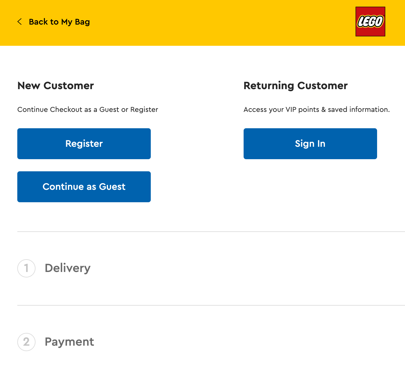
Lego provides a lovely example of clear account options (perhaps continuing as a guest could be above “register”, but we're nitpicking). The microcopy also offers a reason for returning users to sign in to access their VIP points and saved information.
One-Page Checkout
If ease and speed are crucial to your customers, a single-page checkout could be the answer. Containing the customer info, shipping details and payment options into a single screen view minimises the number of pages and clicks required to complete the checkout.
However, it’s worth considering how this type of checkout is implemented along with your user expectations. For example, even when an accordion-style checkout is used, the customer may still expect the back button to take them to the previously viewed section.
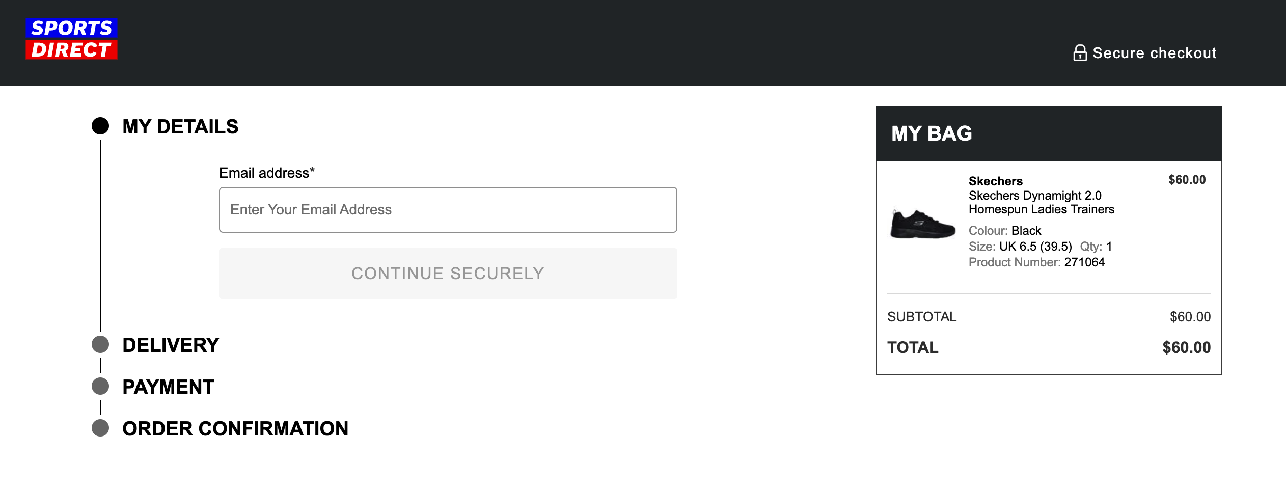
Below is a clean one page checkout design from Sports Direct, which uses an accordion-style checkout, with each stage viable to the user so they know what’s to come.
Bloom and Wild utilise an auto-scroll user interface triggered when the user clicks a section button. However, unlike the accordion examples above, the following sections and their fields are visible to the customer. A progress bar is also viable in the top header to orientate users.

Form Fields
There are a ton of specific UX and UI best practices for form fields, many of which you can read about in more detail in our free guide. Below, we’ve covered some general good practices that apply broadly.
Pre-populating information
If a user has already gone to the effort of typing out their information, the least you can do is pre-populate matching subsequent fields or use services to shortcut what they need to provide, e.g. addresses can be pre-populated using a postcode.
Below is an example from H&M where the name and address fields were already completed in the shipping information section. The first and last name fields have been pre-populated in the payment section and the cardholder address.
Lego offers an express checkout option which uses PayPal account information to pre-populate information needed in their checkout process.
Only show the form fields you need
Show only the necessary fields so users can power through your forms. This reduces the likelihood of users abandoning a form because it looks long and overwhelming.
Dell hides unnecessary fields but still allows users to include the field if relevant to them. In the example below, Dell offers the option to add a phone extension number catering for a specific segment of their customer base—business customers.

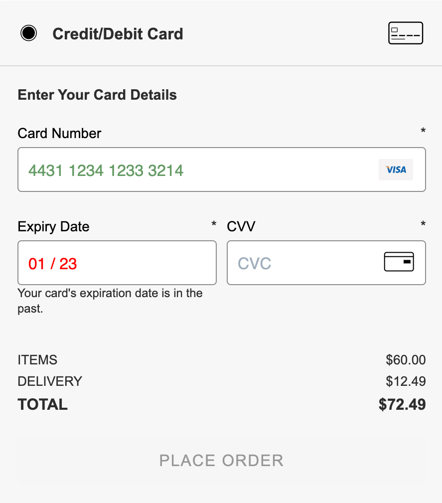
Validate information
UX designers can show validation errors at the field level to help users quickly identify which piece of information is incorrect.
H&M provides a second round of validation; after the address has been inputted but fails to match the address lookup data, a popup is used to draw the user's attention to the full address. H&M provides the address they believe to be the correct version, again cutting down the effort required to change specific fields.

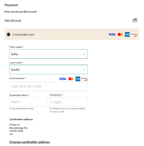
Sports Direct uses smart validation on credit card fields, presenting an inline error if the card expiry date has passed. This is an excellent example of how to validate different types of data.
Provide edit functionality
For many users, the checkout process isn’t linear but involves some back-and-forth between fields, stages or pages. This is why it’s important to provide a summary of completed sections and allow users to edit them rather than repeatedly hitting the back button to find the information they seek. This is especially useful for more complex products or high-value items where the wrong inputted information can cost the customer a lot, e.g. incorrect date of birth when buying flights.
Disneyland provides a good example of an editable summary.

Shipping
One major frustration for users is not knowing the final price of their basket until the last step of checkout.
Provide detailed shipping pricing
H&M provides a standard shipping cost in the basket view and includes in-depth information on all the shipping options. This way, the user is fully aware of the total price before entering a single piece of information.


Dr. Martens goes further by allowing the user to select their state from a drop down field within the basket. This input is then used to estimate the cost of a range of shipping options before hitting the checkout.

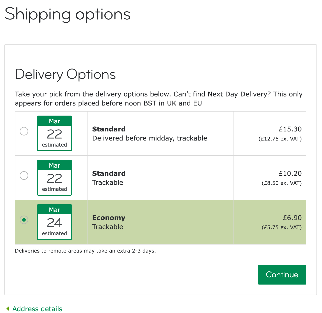
Give detailed shipping dates
Knowing a parcel will arrive in 5-7 days is OK and better than no information. But what’s even better is being specific. There are many use cases where a customer might need a product to arrive on a particular date.
Moo offers users a nice visual representation of different delivery options with a calendar icon and date to help users decide between options.
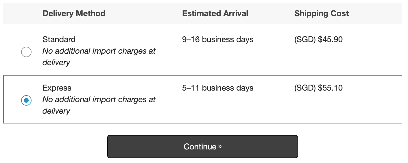
AO.com provides another good example: customers must be home for a delivery, so specific timing windows are needed. They offer a range of options with varying delivery fees. The selected delivery date and time is also repeated in the text before the continue button.

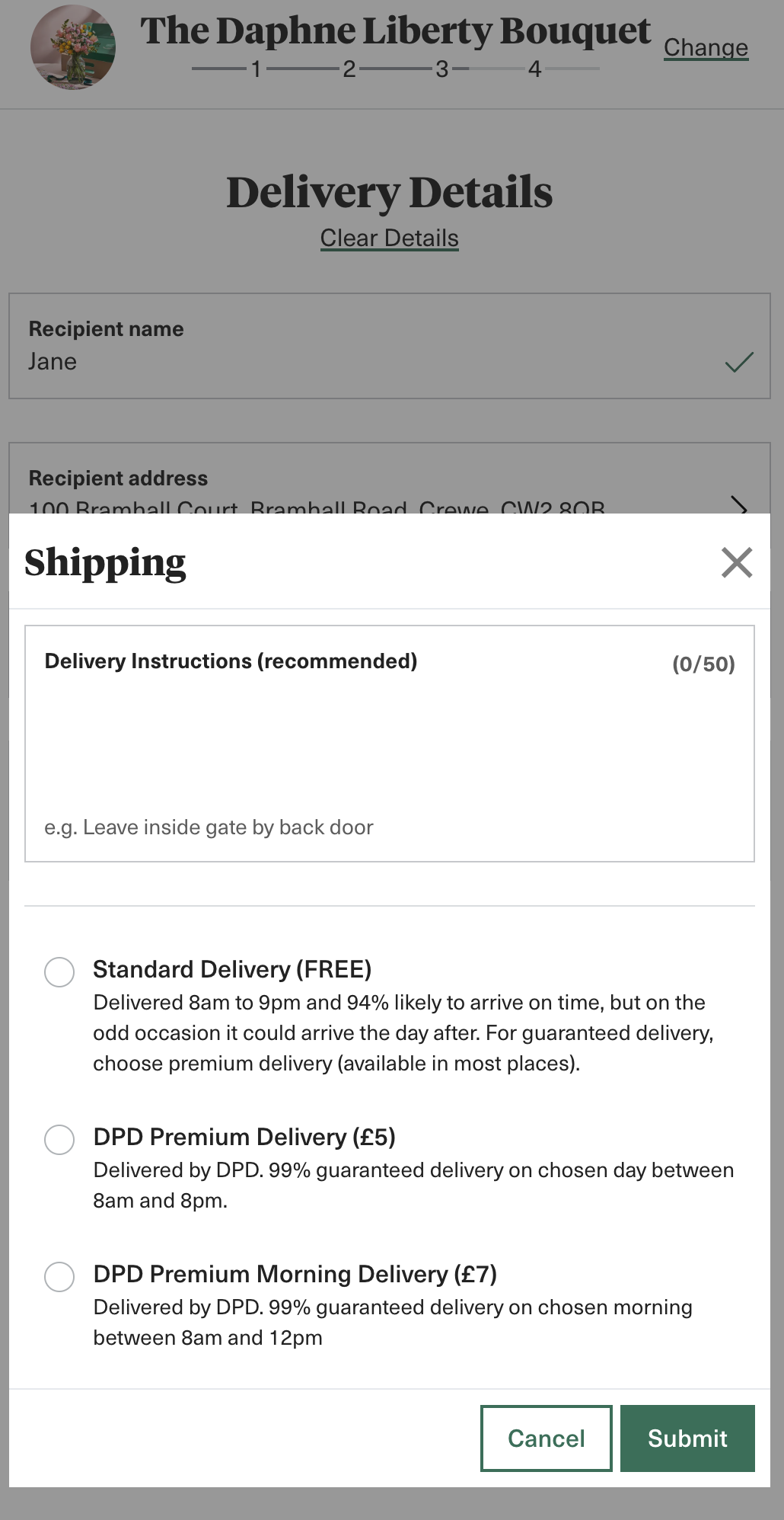
Provide details on the delivery company
Another stumbling block for users can be the delivery company. Whether it’s frequently damaged parcels or multiple failed delivery attempts, customers can be nervous about which delivery company an eCommerce company uses. Bloom and Wild provide the specific company and delivery type with comforting stats on delivery timings allowing the customer to make an informed choice.
Offer alternative pickup options if available
Samsung provides a great example of incentivising users to pick up their purchases in-store, offering a range of “complimentary services.”

Victoria's Secret understands you might have to send someone else to pick up your purchase. Anticipating this, the website allows the customer to add an ’alternative pickup person’ and sets out what they need to bring to collect the order. This helps ensure pick-up goes smoothly in-store for staff and customers and prevents fraudulent collections.

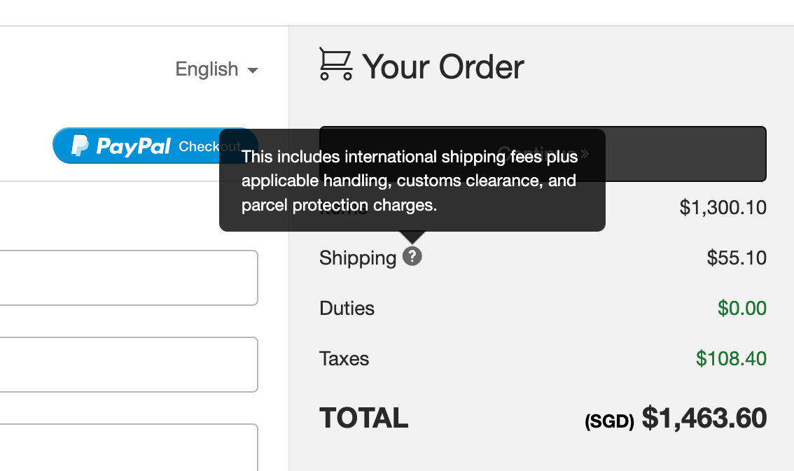
Consider the needs of international customers
Nordstrom provides a good example of understanding international shoppers' fears when purchasing from a company in another country. The shipping information clarifies whether customs and import charges are included in the shipping price.
Customise the checkout
How you customise your checkout will depend on your specific users. However, I’ve provided some examples below to inspire you.
Relevant social proof
Adding social proof to areas of the checkout where customers might be apprehensive can help quell their doubts. Bonus points if the social proof is personalised to the user in some way.
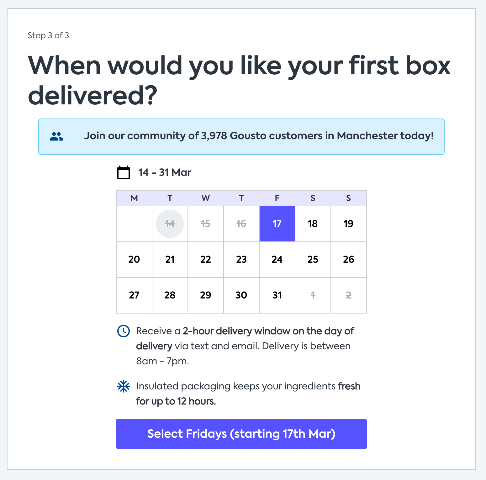
Gousto does this by adding the user's city to the social proof copy, making it feel extra relevant to the user.
BarkBox provides another example of personalised microcopy by using your pet's name in your order summary and the guarantee text.

Payment options
Payment is the final hurdle in the shopping journey. After all the hard work you’ve put into helping your customers reach this stage, you must ensure you offer the right payment options in the right way so nothing stops your customers from hitting the buy now button.
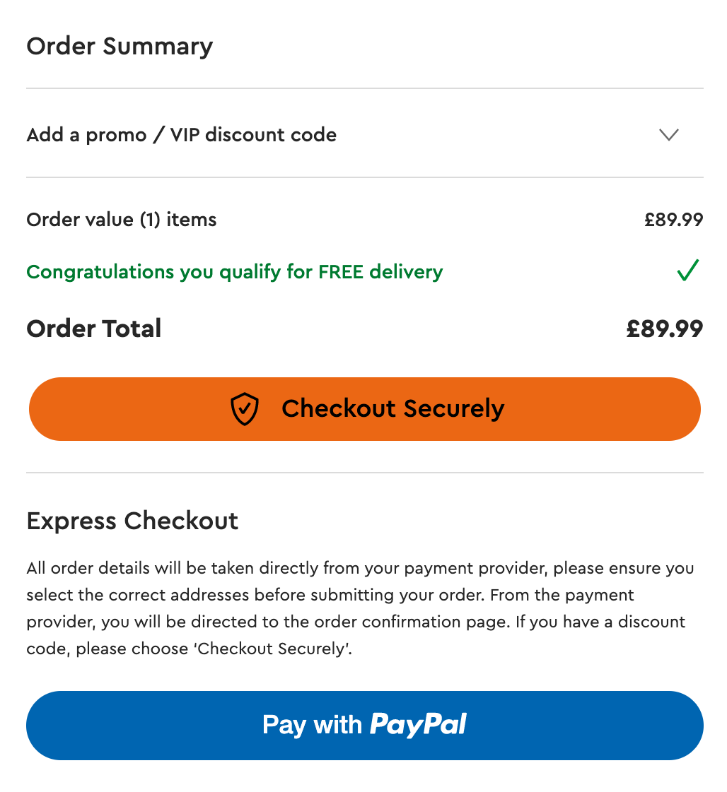
Offer multiple payment options
Common payment options can vary by region, so it’s important to establish which methods are the most common among your customers.
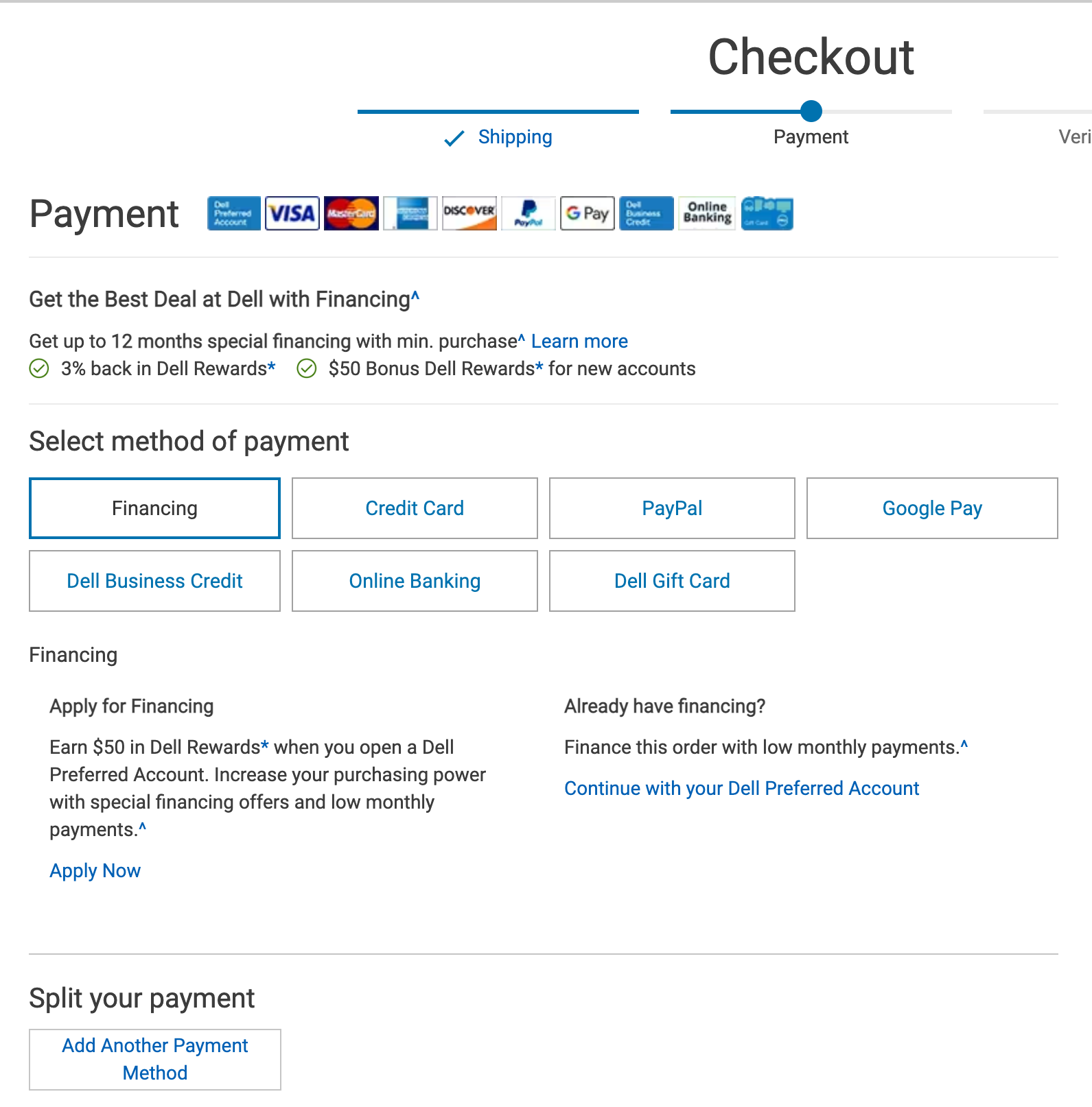
Dell uses a combination of logos and buttons to show the range of options, including a split payment option between payment methods. This is an unusual option but might be a common need for business users. There’s also a “chat with an agent” option in case the complex financing options are holding up customers who have questions.
Explain what to expect next
It can confuse the user when 3rd party payment options pop up or redirect the user to another website. Including a message before the user selects such options can help set expectations of what will happen next. Dell again provides a good example of this below.

Summary
We hope the above advice provided some valuable examples and inspiration for creating a checkout that works for customers. Before following any examples, you must get to grips with your own customers, their behaviour and feelings when moving through your checkout experience. To gain such insights, dig deep into your form analytics and conduct user research to really understand where problems lie for your users. Armed with this information, you can create a great checkout experience that is user-friendly and has an optimized conversion rate.
We wrote the book on form optimization!
"The best book on form design ever written - 80 pages of PURE GOLD"


More from our blog:


Want to get started with Zuko?
Start a free trial that includes all features, or request a demo