
Form Abandonment Tracking: How to Measure and Improve it
Worried that people aren’t completing your forms? Find out how to measure + benchmark form abandonment and what to do about it
Help! I Don’t Know Why People Aren’t Completing my Forms!
So, you’ve spent a lot of time designing your online form. You’ve consulted internally about what information you need from your users. You’ve laid out the field flow in logical steps, breaking it into stages where necessary. You’ve worked really hard on the UX and you’re sure that your form experience is decent.
And yet, you have a niggling feeling that users are abandoning your form at levels higher than you expected.
But a “niggling feeling” that users are jumping ship doesn’t prove that form abandonment is a problem on your site and isn’t helpful in diagnosing the issue and fixing it. You need to install some form abandonment tracking software like Zuko to work out what is going wrong.
This article is a guide for anyone worried that people are bailing on their forms mid-way through. It discusses what form abandonment is, what the causes are, what to consider for form abandonment tracking products and, finally, how to reduce this drop-out.
What is form abandonment?
The definition of form abandonment is when a user starts to complete an online form or checkout but drops out of the form before successfully completing it.
Note that the metric is generally applied only when a user has actually shown intent by interacting with the form. If they just view the form but do nothing they generally are not classified as a form abandoner.
All forms are susceptible to premature abandons although some form types and industry sectors tend to have bigger issues than others (as Zuko’s form abandonment benchmarking data reveals).

Considerations for form abandonment tracking
In order to track form abandonment and use data to optimize your form, you’ll need a software tool that logs user behaviour and is able to identify those who begin completing the form but drop out early. At the most basic level, you can hack something together using Google Analytics but this may not give you the insight you need to fully diagnose the causes of abandonment. Ideally, you would use a specialist tool (such as Zuko Analytics) but you may be able to get away with some of the basic form analytics features that some UX software providers bolt-on to their main offering.
Some of the key metrics that you should ensure your form abandonment tracking software delivers are:
- Form abandonment - what percentage of users leave the form without completing it?
- Field returns - which fields do users consistently have to come back and correct?
- Time spent in fields - are there fields that users spend longer in than others? Does this indicate they are getting frustrated?
- Audience segmentation - a comparison of the differences in behaviour between those who successfully complete the form and those that abandon. This may indicate where your problems lie.
- How users flow from one field to another - if users don't flow through your form as you would expect, there may be UX issues.
If your tool provides this information, you should be able to use it to diagnose and fix your problem form fields.
What causes form abandonment?
The reasons for form abandonment are manifold. However, from Zuko’s countless years of form optimization experience we find that they tend to fall into six main categories:
- The user is not serious or motivated enough to complete the form
- The customer is unwilling to provide the data you are asking for
- The field is asking for information they are unable to provide at the moment
- The user wants to provide the answer but can’t because your form is broken or has UX issues
- A field is too intimidating or complex so the user abandons rather than tackling it
- A field is driving users to external sites and they are never coming back
1. The user is not serious or motivated enough to complete the form
This group is essentially users that are never going to complete your form today. They may have been erroneously driven there by an advertising campaign or they may be just window shopping, looking at how difficult your registration process is in case they decide to sign-up in the future. Alternatively, they may have concluded that the perceived value of completing your form is not enough to warrant the effort spent doing that. The common denominator is that, no matter how hard you push, they will not complete the form.
How to diagnose this: If your form analytics tracking tool is showing a particularly low view-to-starter rate for your form (i.e. users are landing on the page but doing nothing) you may have this issue. You may also see a large dropout after a single interaction - many users in this category will “kick the tyres” by clicking on a single field (often the first one such as “Title”) before shutting down the browser window or clicking the Back button.
To further refine this diagnosis, you should be segmenting the analysis by audience group, particularly by traffic source. You may well find that some sources (such as paid-for traffic) may be exhibiting this behaviour more than those that come in via organic means.
2. The customer is unwilling to provide the data you are asking for
In this case, the form visitor understands your request but isn’t comfortable providing you with the information so decides to leave instead. This can be for a variety of reasons but the most common ones include:
- You are asking for sensitive or overly personal information that the customer is not comfortable giving you in this context.
- The user has security concerns about whether their data will be safe or shared elsewhere.
- You are requesting information that the user was not expecting (for example, if it is a simple contact form, the user would not expect to provide anything over basic details).
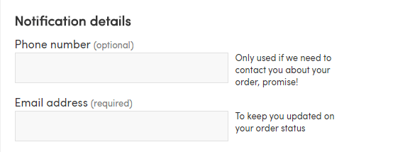
- You are asking for information that the user does not think is relevant to the purpose of the form. The classic example of this is requesting a phone number field in an eCommerce checkout - the user may believe that physical and email address is sufficient and that the phone number request will just be used to spam them with sales calls.
How to diagnose this: Your form analytics tracking tool will identify the fields with high abandonment rates so you start there. Open your form and look at the fields with high drop-off rates. Could they fit one of the categories above? If so, put the form in the hands of users and get their feedback on those particular fields. Alternatively, run a form A/B test based on the remedies suggested later in this article and see if the abandonment rate for that field reduces.
3. The field is asking for information they are unable to provide at the moment
This category of abandonment involves users reaching a question that asks them something they simply can’t answer now. Usually, this is a request for a particularly complex piece of information that they can’t summon from memory; either personal information (Social Security ID, passport number), product details (insurance expiry date) or financial information they don’t know off the top of their head (net assets, gross income).
In all these cases, the user was probably not aware that they would need to provide this information so they didn't have it to hand. When they see the question, they either quit immediately in annoyance or they head off to rummage for the information but can’t find it so they don’t bother returning (or, worse, they get the information but come back to discover they have been timed out of the form).
How to diagnose this: Have a look at your abandonment tracking data. If any of the fields with high abandonment rates ask for gathered answers (as opposed to “slot-in” ones) then you need to consider whether the user experience is being managed correctly.
4. The user wants to provide the answer but can’t because your form is broken or has UX issues
At the base level, this is a simple issue. If there is a serious technical problem, a user may not be able to progress through the form at all so abandonment is their only option.
More insidiously, however, this problem can exist at a lower level and be harder to spot. There may be a UX issue with a particular field but either the field / error is not exposed to all visitors (it may only affect mobile users for example) or some visitors have the patience to overcome it (while another segment abandons because of it).
How to diagnose this: Get your form up and complete it yourself on a variety of devices / browsers. Any serious technical issues should be immediately obvious. For the more specific difficulties you should look at your form analytics data to see if the high abandonment rate for a field only affects a specific segment (device, browser, form pathway). You can also overlay a session replay tool to see if the issue becomes apparent.
5. A field is too intimidating or complex so the user abandons rather than tackling it
If a user is expecting nice, easy questions and you hit them with a request for a 1,000 word dissertation you can guarantee they’ll be out of there before you have a chance to explain why you need the information (Education sector application forms are notorious for this).
This can apply to your whole form as well. If a visitor loads up the form and is faced by something like this beauty they are very unlikely to stick around:

How to diagnose this: An interesting quirk of this issue is that a standard interpretation of form analytics data may be misleading. Often, if a form field looks too difficult the user may not even start it and drop out immediately. The form analytics software will then attribute the abandon to the preceding field (based on the last user interaction). If you have a field that has an unexpectedly high abandon rate and is followed by a question that requires a lot of user thought / input, you may have this particular issue.
6. A field is driving users to external sites and they are never coming back
The classic example of this is the discount coupon code field on eCommerce checkouts. Customers get excited by discounts so they go searching for them online. If they can’t find one they don’t bother coming back (or they get tempted by your competitors offer).
How to diagnose this: The “time spent” metric in your form analytics tool is useful for this, especially when combined with audience segmentation. A recent review of eCommerce checkouts on Zuko’s database revealed that users who abandoned spent, on average, 20 seconds in the promo code field compared to only 3.5 seconds for users who completed the checkout, further supporting the hypothesis that giving users the incentive to spend time searching elsewhere leads to abandonment.

What should I do to stop form abandonment?
The solution to preventing form abandonment depends on the reason behind the drop-off. Some of the potential remedies to the causes listed above are outlined here.
1. The user is not motivated enough to complete the form
On one level there is not too much you can do about this. These users are never going to complete today and some may be completely the wrong audience for your proposition. That said, some of these “non-intenders” will not be complete write-offs. Even though they are not completing your form today, they could still be persuaded to come back another time when their motivation is higher. A fuller overview of how to manage users not intending to complete your form today can be found in Zuko’s white paper on optimizing financial forms but some of the actions to consider include:
- Make sure your pricing & conditions are fully transparent and available
- List the requirements needed to complete the form upfront
- Create a “quick check” function to allow users to swiftly check their eligibility for your product (such as credit cards) so they know whether it is worth coming back or not
2. The user is unwilling to provide the information asked for
If some users are not prepared to input the information you want, you have a few options:
- Remove the field from the form. Do you really need that information? If you do, consider whether you can ask for it another way - perhaps in follow up communications or later in the form when the user is more comfortable.
- Make the field optional. Give them an avenue to still continue in the form without having to provide the information.
- Provide a good reason for needing the information. A good explanation (using microcopy or help text) can go a long way to convincing a user to share some personal information. A good example is in the case discussed above of the phone number. If you explain that the number will only be used for emergencies or to arrange delivery, the user will be more open to sharing it.
3. The user is unable to provide the answer at the moment
The mitigation for this particular issue is fairly simple. If a form visitor is going to have to provide information they don’t have readily to hand, make sure that you tell them this upfront. If you give them a list of the information they need to gather, they can do this first without having to waste any time interacting with the form.
An additional tip, if relevant, is to provide links to databases where they can source the information they need. Good examples are a link to UK Companies House where they can get their Company Registration Number or this one for UK car owners to check their status.

4. Your form is broken
If there is a clear break in the form you will certainly need to get your developers involved to fix it and get the user experience smooth again. For the more specific issues; once you have identified them you should be able to create test hypotheses based on possible solutions (you can research some of these in Zuko’s Big Guide to Form Optimization) and run an A/B test to see if that solves the problem.
5. A field is too intimidating for the user
The basic answer to this issue is to make the question simpler. Explain it better or loosen the restrictions / requirements. However, there may be other changes you can make without the need to reign in the complexity of the question. A save function will allow the user to spend some time on the question but not have to commit immediately.
6. You are driving users to external sites
The first question to ask yourself is do you need to do this. Does it benefit you? If not, remove the incentive for the user to go surfing elsewhere. If you do need to include something like a coupon code field, can you structure it better? There is more discussion of this in our dedicated article on promo codes but you may want to consider solutions like reducing the visibility of the field, only making it accessible if the user has come from affiliate sites, or automatically pre-filling the field with the best offer the customer is eligible for (based on their basket).
If you want a form builder that helps you avoid these issues then Zuko Form Builder has been specially created to provide a smooth user experience and maximize conversion rates.
For more advice and tips on form abandonment tracking and improving conversion rate optimization take a look at Zuko’s Big Guide to Form Analytics and Optimization.
Or, for a more data and process driven approach that builds on this article you can download or Guide to Using Data to Optimize Forms & Checkouts.
Common Questions about Web Form Abandonment
What is form abandonment?
Form abandonment occurs when a user starts filling out a form but leaves before completing and submitting it. It’s a key conversion issue because it indicates users had enough intent to begin the process but encountered friction, confusion, or hesitation that prevented completion.
How do you measure form abandonment rate?
Form abandonment rate is typically calculated by dividing the number of users who start a form but do not complete it by the total number of users who begin the form. To fully understand abandonment, you should also track field-level metrics using a form analytics tool like Zuko. Metrics such as drop-offs, time spent per field, and field returns help identify where and why users are struggling.
Why do users abandon online forms and checkouts?
Users abandon forms for several reasons, including poor user experience, overly long or complex forms, unclear questions, privacy concerns, and technical issues. Friction at specific fields such as confusing inputs or validation errors can also cause users to drop out, making it important to analyse behaviour at a granular level using a specialist tool like Zuko Analytics.
We wrote the book on form optimization!
"The best book on form design ever written - 80 pages of PURE GOLD"


More from our blog:


Want to get started with Zuko?
Start a free trial that includes all features, or request a demo