
Optimizing Financial Forms: Section 1
Broad Issues and General Advice
This is the shortened version of Zuko's white paper on optimizing financial sector web forms. If you want the pdf version you can download the full financial forms white paper here.
The guide is divided into two sections. This first section provides and overview of the general issues that affect conversion rate optimization when dealing with banking, insurance and credit card forms. Section two looks at advice on specific problems and fields that appear on individual financial forms.
Navigation
Skip to a particular subject using these links:
Use your customer’s language, not industry jargon
Foreword and Overview
When Zuko’s Big Guide to Form Optimization & Analytics was launched in early 2021, the reception from the digital marketing and CRO community was enthusiastic. This was the first time a comprehensive set of form optimization advice had been brought together in one place and made available, free of charge.
It was inevitable that we had to build on that success and the obvious route was to produce industry specific guides on form optimization. Every industries’ forms have their own quirks that can’t necessarily be covered in a general advice book so need specific attention.
The natural place to start in this journey was the financial services sector - banking, credit cards, insurance, forex, etc. Whenever we are asked which forms benefit the most from optimization & analytics we always state three criteria:
- Complex forms - those which are long, ask difficult questions and request private personal & financial data have huge scope to get it wrong. Data and optimization is crucial in ensuring that user abandonment is kept to a minimum.
- High cost of customer acquisition - if you work in an industry that has to pay a lot for each new customer, even a small percentage improvement will yield a large return, making optimization efforts highly worthwhile.
- A high customer lifetime value - if getting a customer over the conversion line for the first time is going to be immensely valuable to you, it is worth investing in data and optimization as it will pay for itself and more.
It should come as no surprise that financial services’ forms tend to strongly fulfil all three criteria so they are prime candidates for optimization. This is backed up by external studies that show plenty of room for improvement (online banking applications have a 63% abandonment rate). The financial sector is easily Zuko’s largest customer base as they see the value in properly analysing, and constantly improving, their customer acquisition forms.
This white paper provides particular advice for financial services forms. It is intended to be an extension of Zuko’s original Big Guide and a companion to our practical Step-by-Step Guide to Using Data to Improve Forms. It is based on experience from our data platform and form optimization consultancy services. We won’t repeat information already shared in the Big Guide here unless it is absolutely crucial to the advice being given. If you haven’t done so already we recommend that you read the Guide alongside this finance-specific companion as the basic tips it contains will provide the starting point for your optimization projects.
This paper is split into two main sections. The first section provides general thoughts to take into account when you are designing your form. The second focuses on particular issues that we consistently see come up in financial forms across the Zuko customer base.
Hopefully this concentrated advice will help you eliminate some of the friction in your online forms, creating a smoother customer experience and increasing their ultimate conversion rates.
Broad Issues and General Principles
1. Use your customer’s language, not industry jargon
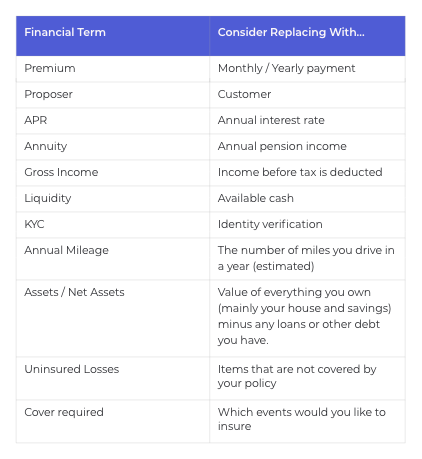
Just because you spend all day talking about APR, premiums, policies, proposers, gross income and annuities, please don’t make the mistake of splattering these across your financial form with no explanation. Your customer probably doesn’t know what they mean in this context and by using jargon and acronyms you run the risk of scaring them off before they even start.
Numerous studies have shown that plain language improves comprehension and reduces reader confusion across all documents. Online forms are no different and the financial sector is at particular risk. If you blatantly use industry jargon then users may feel that you are deliberately trying to hornswoggle them into a bad deal. (Pro tip - never use the word “hornswoggle” in your form copy, it won’t end well!).
Before you press the button to go live on your form, always look at it through your customer’s eyes. Heck, you should definitely pull in a few customers in to review it as they are sure to pick up on things that you hadn’t considered. Are there any terms that wouldn’t be understandable by a significant proportion of your audience? If so, remove them and replace them with something simpler, or at least have an explanation the user can easily reveal. As a starting point you can use this crib table.
2. Single step or multi-step form?
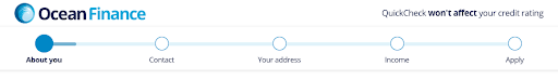
One thing everyone notices about financial forms is that they tend to be looooong. All that information needed to open an account / apply for a loan means a lot of questions. The obvious dilemma then, is how to structure the form. Is it better to have one long form or break it into smaller sections like this one from Ocean Finance?
We’ve covered this question in detail in a Zuko blog comparing single step Vs multi-step forms. The good news is that the answer is pretty clear.
Pretty much all the research out there indicates that, unless you have an extremely simple form, breaking it down into smaller, manageable, chunks will improve its conversion rate. With financial forms being inevitably complex, this means you should almost certainly be using multi-stage forms.
That said, you still need to do it right. Our recommended guidelines are:
Cluster similar questions - Multi-stage forms work best if similar topics are grouped together, keeping the user’s mind on one type of data. Be careful not to “over-split” though. If you’ve already asked for an address and email it may irk users if you ask for their phone number much later on.
Easy before difficult - Don’t start by asking things such as annual income or monthly outgoings. Start with something that can be answered easily like name or product selection. Once users have started a form they are invested, making them much more likely to complete it. (However, note the exceptions to this rule in our section on insurance forms later).
Allow users to move between steps - Make sure that users can pop back to previous stages. They may realize they have given an inaccurate answer so you want to make it as easy to return to the relevant field as possible. You don’t want them using the back button if you can help it, especially if your site hasn’t been built so the back button breaks everything (see next point).
Ensure the inputs save between stages - If a user is faced with a blank form when they hit the back button you can be sure they won’t be happy. If you fix it so the data is always saved for them you should see a reduction in abandonments (up to 10% based on Zuko’s experience).
Don’t have too many stages - No one wants to be slogging through 20+ stages. Try to keep your form to 3-6 steps if possible.
Use conditional logic - If, based on their answers, some questions are not relevant to a user, then code the form so they don’t see them. This will save time and provide a smoother experience, increasing the chances of completion.
Use a progress bar - You need to manage the user’s expectations. How long will the form take to complete and what information will you be asking? The above example from Ocean Finance is a good one - users can see the type of data they will need to provide and can estimate how much time they will need to dedicate.
Start Optimizing Your Forms with the Award-Winning CRO Analytics Platform
Zuko helps you understand why users abandon forms, identify friction points, and increase completion rates — faster and easier than Google Analytics.
(No Credit Card Required)


3. Handling “Non-Intenders”
"You need to consider all visitor motivations. Just because someone doesn't want to buy today doesn't mean they will never buy." Chris McCarron, CRO Specialist, GoGoChimp
Not everyone who visits your form will be intending to complete it that day. A report by Forrester Research and Comscore found that 49% of users visiting a financial product page had no intention of seeing the application process through to completion. This is a significant proportion of users who will not complete your form now, no matter what. The operative word, though, is “NOW”. Many of these users can be tempted to return and complete at a later stage if you give them a good experience today.
We’ve broken down these site visitors into the rough groups below alongside what you can do on your form to give them what they need to return.
Product information / comparison - This group is still in research mode. They want to see what you offer and compare it to your competitors' products. The main thing is to ensure the key facts they need to make a decision are easily accessible (interest rates, etc). Often this can be covered off in the product pages of your website but it is useful to add them to the form as well (e.g. through a link with an overlay) to make it completely transparent.
Not ready just yet - These folks are interested but still in the first tentative phase of the purchase journey. They are looking at your form to see what information they will need to provide once they are ready to begin. To make things easy for them you should make it clear what they need. If you have a complicated set of requirements then you should list them upfront. Alternatively, if the requirements are broad, a well labelled progress bar will help them (in the example of Ocean above, “income” tells the user they will need to provide salary information).
Eligibility / price checkers - Some users just want to know whether you’ll give them that credit card / loan. Or maybe they want to know how much your home insurance will cost. To keep this group happy, you need to make it as quick and easy to check their eligibility or the cost. Give them a quick check function upfront with the bare minimum of information needed for you to give them the decision. Save the detailed personal questions for later when they are primed and ready to commit.
4. Manage Expectations Early
“You need to manage your customer’s expectations early. We see large drop-offs in forms where users move past the first stage and only then realise how much information they need to provide.” Kiké Helen Adesina, Optimisation Consultant, IG.
Before users invest their time and effort to embark on your form journey, they should be given an indication of how long your form will take and the type of information they will need.
We’ve mentioned progress bars previously. They are a great way to manage expectations and give a rough idea of the process.
However, depending on your form, there may be some other things you need to do to avoid user frustration:
If you need specific documentation (passport, drivers licence, etc), make sure you list them right at the start of the form. This gives the user notice to go and find the information before investing any time in the form. We’ve seen plenty of forms which only tell users they need their passport number later in the process and you can guarantee there will be a spike in abandonment rate at this point as the users huff away to try and find their documents. Those that fail to find them (or worse, are timed out on their return) will inevitably put the process on hold, giving your competitors a window to tempt them away. At the very least, you should include a “save” option so that the effort they have put in already isn’t lost if they take a break.
If your journey includes an element of post form completion processing - for instance, a Know Your Client (KYC) check, a credit query or perhaps the time needed to create and dispatch a credit card - make sure you tell the customer what to expect, how long it will take and, importantly whether it is a done deal or not. If there is still a chance that they could fail the process they need to know that now and not a week later when you have completed your checks.
Also, explain why you need the information. Users get suspicious if they think you are asking for things that aren’t essential to providing the service or assessing an application. The classic example is the phone number field. If you need it, you had better tell the user why - the Baymard Institute found that failing to provide a reason for asking for a user’s number was a direct cause of form abandonment.
Click here to progress to Section 2. Or download the pdf White Paper.
"We have used the services of Zuko for the last 2 years and have benefited from their vast knowledge and experience in digital journey optimization. As a company they are very easy to work with and be connected to and we value the input they have given us when developing new digital journeys and enhancing our existing digital propositions."
Stephen Paton, Digital & Customer Experience Manager, Sainsbury's Bank

“Zuko has enabled us to improve visitor to conversion rates for a series of clients. An example of this is a website increasing their click to enquiry rate by 25% through form changes highlighted to us through Zuko as ‘sticking points’.”
Steve Tarbard, Owner, Beyondclicks.co.uk

"Zuko was a game changer for us. It was the only form analytics software we could find that tracks data from Pardot iFrames. The depth of the data is impressive and easy to digest. Their account reps are very responsive and helpful. Overall, a great experience."
Addison Witt, Digital Marketing Manager, Emplify

"The insights we gained from Zuko have been very helpful in pinpointing the issues we are having in our form, and the team has been very helpful in gathering those insights!"
Matthias Ferlings, Online Marketing Coordinator Web Analytics, Lebara

"We're a B2B lead generation business and our forms are critical to driving quality leads to our sales teams. Zuko is by far the best tool to analyse and optimise form flow in order to improve our conversion rates."
Bryan Hunter, Head of Digital Marking, The Instant Group

“Zuko made it possible for us gain further insight into the behaviour of consumers in our forms. This gave us a lot of valuable learnings and input for conversion optimization. It’s probably the quickest way to improve your conversions!"
Robert Veltkamp, Manager Online Marketing, via Bovag.nl

"Zuko helped us decide where to put our development efforts on at the most important part of our website: our checkout forms. The new and improved checkouts, based on many valuable usage insights from Zuko, are now being built by our front-end team."
Stefan Sleutjes, Digital Strategist, Verzekeruzelf.nl

"Formisimo's easy to implement tool enabled Udacity to easily identify the outages when customers fill out lead generation and check out forms.
Zuko rocks."
Scott Wilder, Global Head of Life Cycle and Growth Marketing, & Demand Gen , Udacity
