
Optimizing Financial Forms: Section 2
Solving Specific Finance Form Issues
Welcome to section 2 of the web version of Zuko’s free white paper on maximising the conversion rate of financial forms. It looks at individual issues and fields you may come across in optimization projects for forms in the banking, credit, forex and insurance sectors. A downloadable pdf version is available here.
Click here to read section 1 - general advice and broad issues
Navigation
Skip to a specific topic with these links:
Customer Verification / KYC Processes
Specific Financial Form Issues
1. Individual fields
Financial forms tend to have a lot of fields (31 on average according to Zuko’s benchmarks). This leaves a lot of places where the user experience can be damaged. Many of these questions will be bespoke to the individual form but there are commonalities that come up on most forms. Some of the frequent issues have been covered in Zuko’s general guide but we build on that advice here with finance specific points.
(i) Email
99% of the time, you’ll require your customer to give you their email address to access your service so you’d better not mess up this field.
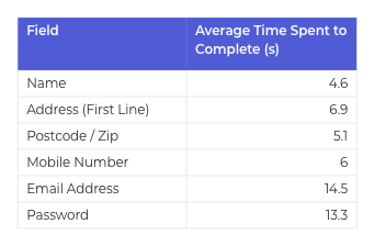
Information taken from Zuko’s database shows that, out of the common personal details fields, email address is the one that users spend the most time completing:
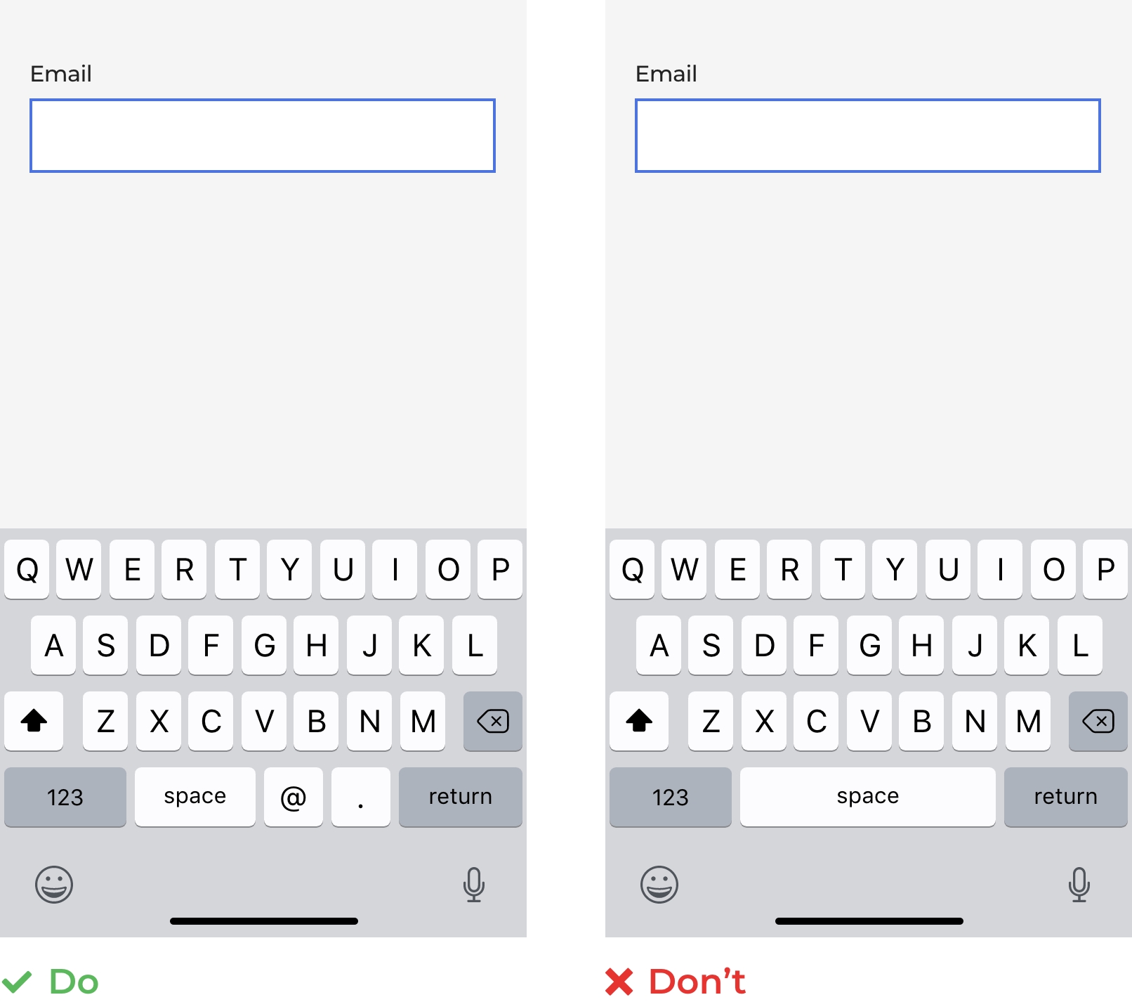
People know their own email address don’t they? So why are they spending so long completing them on forms?
The first reason is due to the mobile user interface (users entering their email address on a mobile device take 2 seconds longer than desktop users), and a lot of this is because the mobile keyboard is incorrectly configured. The keyboard setting for email fields should be set to the correct “email” input type rather than the “text” or “number” types otherwise the @ symbol will not be readily available, slowing the process down unnecessarily. Research by the Baymard Institute indicates that 61% of mobile sites use the incorrect keyboard settings for at least one field so you’d better check that you are not making the same mistake.
The second common problem is the insistence of many sites that the user confirms their email address. This leads to them jumping back and forth between the two email boxes to try and get the answer “right”, meaning they spend much more time on the field than they should.
Why put them through this pain? We get that you are paranoid that they will mess up and enter the information incorrectly but it is a terrible user experience and the evidence indicates that they will just copy and paste their answer from the first box anyway, negating the reason to confirm in the first place. Keep it simple and just ask them for their email once. We’re confident that the reduced abandonment rate will more than make up for the occasional person who misspells their address and can’t be bothered to correct it. If you are still worried, install a sophisticated inline verification solution to your form that will prompt the user if they make a common error (missing the @ for example, or using “gnail” instead of “gmail”).
(ii) Phone Number
People don’t forget their own phone number. So why is there often a disproportionate proportion of abandonments for this field?
In short, it is because of the capricious validation that many forms use. Users are confused about what to enter. Country code? Does there need to be a “+”? Include the opening “0” or not? Are parentheses needed for the area code? Include spaces or not? What about dashes?
Studies back up the fact that this field is a minefield for users - 89% of users in this test entered their phone number differently to the requested format.
The best way to mitigate this issue is to remove the need for the user to think too hard. Ideally, accept any format that the user enters; minimize the on page validation and reformat at the back end if you really must. For example, “07772766234”, “+447772 766 234” and “(07772)-766-234” should all be accepted as valid inputs. If you can, autoformat the input as the user types and, if country location is important to you, use smart defaults to automatically geolocate the user and reduce the need for them to add the country code themselves.
Finally, as mentioned earlier, use microcopy to tell the user why you need their number (and make it genuine!). If you truly don’t need their phone number at this stage then don’t ask for it.
(iii) Date of Birth
Again, date of birth should not be a problematic field for the user. The childhood buzz of birthday presents has conditioned that particular moment in time deeply into our psyche. We don’t forget it. Yet forms continue to make it more difficult than it needs to be for us to supply that top-of-mind information.
Firstly, you should make it abundantly clear the date format you are expecting. Is it the American (MM/DD/YYYY) or European (DD/MM/YYYY) convention you are asking for - particularly important if your form spans multiple countries.
Even more importantly, use the most simple format for data entry. This means steering clear of dropdown menus. Dropdowns are problematic in many ways but are especially bad when it comes to dates. Who wants to scroll back decades to find their year of birth? Indirect age discrimination in action.

Date pickers are not much better and can be fiddly on mobile. A far superior solution is a simple, clean 3 text box format involving 8 taps / keystrokes. Zuko commissioned eye tracking research that revealed this configuration was the most user friendly, requiring the lowest amount of eye fixations and attention to successfully complete.

(iv) Social Security Number (or Equivalent)
Unlike DOB and phone number, users are much less likely to have their Social Security / National Insurance / PAN / National Identity number memorized. This may mean they need to leave your form to rummage through their (digital, metaphorical or physical) drawers to retrieve it. As we discussed earlier, you should make it clear upfront that you will require the information so they can locate it before they start to complete the form.
Other things to be aware of when asking for this sensitive information are:
- If you’ve decided to mask the input make sure you have an unmask button so the user can see what they are typing if they are in a safe environment.


- Use a simple unified text field to make it as simple as possible for the user - no tabbing or drop downs to complicate the experience.
Think:

Not:

- The UK government design service has a good pattern it recommends for collecting National Insurance Numbers. You could do worse than just copying it for your own form.
- Use a trust badge if you can. Trust badges have been shown to increase user confidence and improve conversion. If you have credible ones that you can use (for example, if you use a respected third party to verify the SSN) then it will help reassure the user.
Stash, an app based Fintech, do this well; displaying their trust badge alongside a convincing reason for needing the information:

(v) Employment Details
At the risk of banging the same drum over and over, this shouldn’t be difficult. Your customers know what their job title is so why do you insist on forcing them to jump through your hoops to give you that information?
The first item on the list to spook your users is the simple Employment Status question. Consider this innocuous looking dropdown:
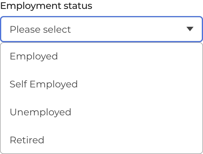
Seems simple right? Yet there will be many corner cases that see the drop down and think it doesn’t apply to them. Students? Semi-retired? Part time? Retired with a side-hustle?
Although you may see a simple, mutually exclusive list of categories the user won’t necessarily place themselves into such a comfortable box.
This issue is magnified considerably when it comes to specifying an actual job itself, especially when it comes to insurance forms. The insurance industry has a bad reputation for using any excuse to not pay out on claims. Potential customers are paranoid that if they get an answer “wrong” on their application form they will be denied their due in a future claim so, if there is any doubt, they’d rather drop out now and find reassurance in the arms of your competitors. Either that or they “job hop” - changing their job description multiple times to see if they get a lower quote.
Even if the user is happy to proceed, they will probably be tearing their hair out at the implementation of the field. Often, this form field has a limited list of job titles it will accept. If the user’s finely crafted job title doesn’t match the list then “Computer Says No” - they’ll be politely (or impolitely if you haven’t sorted out your error messages) rejected and have to consider whether it is worth their time trying to shoehorn their (perfectly reasonable) job into your restrictive form field like our friendly Conversion Rate Optimization Consultant has tried to do here:

So how do you get around this? Possible answers are below, in order of preference:
- Consider whether you really need this information and whether you need it now. We get that the insurance industry prices insurance based on job sometimes (vegetable pickers are “riskier” than secretaries apparently). But is it right for you to do it? (especially if it is being used as a backdoor way to segment by gender now it is illegal to price discriminate in certain territories). If you can conceivably remove it without your business model collapsing you probably should. Alternatively, do you need to ask it now? Moving it later in the process when the user is more committed may reduce abandonment on this step.
- Use a free text box for the user to describe their job. Do the work at the backend to categorise the job into the basket you need rather than making it up to the user. It’s not beyond the wit of today’s AI to match most job titles to the relevant category.
- Use a smart search function. As the user types in their job title, give them an auto suggested list of relevant options from your list to select from. This shouldn’t just be based on character match but subject match derived from previous user behaviour. You can build this yourself or buy it off the shelf from an appropriate vendor. The UK comparison site Compare the Market is a good example of this implemented well.

- Finally, and we feel dirty saying this, if you have no other option, you may want to use an exhaustive drop down for the user to choose from. We really don’t recommend it for all the reasons outlined previously, but it may be a better option than having the user struggle to guess how you’ve categorized their life’s work.

(vi) How long have you lived at this address?
“I don’t know. Mabel, when did we move here? Was it January or February ‘73?”
Some financial forms, particularly ones involving a credit check, require an address history over a certain time period (typically 3 years). It can be fiddly for a user to remember all their previous details, particularly dates, so you should make it as easy as possible for them:
- Ask up front if they have lived at the address for 3 years. If they answer “yes” you can cut out all the nonsense about dates, etc and allow a large proportion of your users to progress with minimal fuss.
- Start by asking for the year someone moved into an address (generally easiest to remember). Only ask for the month if it is necessary to determine if the 3 years has been reached.
- Never ask for the exact date of moving. They won’t know.
- Always auto-calculate the time for the user based on their inputs. Don’t force them to work out how many months Aug 2018 - May 2020 is.
- Tell them at the start of the form if they will need to enter this information.
- Make sure there is a save function. If they have to leave the screen to search for the details they don’t want to come back and find that all previously entered data is lost.
- If they are struggling, you may want to prompt them where they could find the information. Amazon’s profile history is a great repository of information about previous addresses for many people.
(vii) Income / Wealth
“Asking for personal wealth details often is the biggest trigger for form abandonment. People won’t share that information if they don’t trust you yet.” Matic Kasnik, Conversion Optimization Expert, UBS
Unlike many of the previous fields, this one actually is difficult. Even if the user knows their income / wealth (many won’t know the exact figure), it is sensitive personal information that people are reluctant to part with.
Some advice to smooth this part of the form:
- Explain what you are asking for. As noted in section 1, just because you know what gross income or net assets are it doesn’t mean that the user does. Explain in clear language what you need from them.
- Don’t ask if you don’t really need the information. Your marketing department may be clamouring for data to create audience segmentations but you can’t segment someone who doesn’t give you the information in the first place. Let the marketers base their analysis on different metrics while you concentrate on providing the smoothest user experience.
- Provide hints on where to find the information. If you need something specific from a pay cheque or tax return, show a visualisation of where the exact figure can be found.
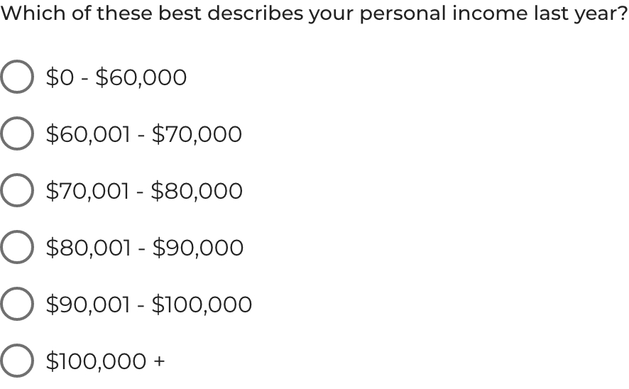
- Use income brackets rather than a specific number. You are not the taxman so you probably don’t need to know your customer’s income to the nearest penny. Using brackets makes it easier for the user - they don’t need to calculate their income exactly and it also reassures them that you are not going to be delving too deeply into their personal affairs. Be slightly careful though; set your brackets evenly. Don’t have a bracket that is obviously low or borderline as users in that category may believe that you don’t really want them. For example, users in the sub $60K bracket here will be a little suspicious:
- If possible, include a “Prefer not to answer” option. Many users are so sensitive about income questions they will be put off. If you give them an option to avoid this, your form conversion rate should improve. If it is absolutely necessary for you to have the information, consider whether you can get it any other way (through a follow up phone call, survey or email, for example).
Start Optimizing Your Forms with the Award-Winning CRO Analytics Platform
Zuko helps you understand why users abandon forms, identify friction points, and increase completion rates — faster and easier than Google Analytics.
(No Credit Card Required)


2. Customer Verification / KYC Processes
“Know Your Client” (KYC) or other Anti-Money Laundering (AML) verification procedures are at the heart of many regulatory systems to ensure that clients of financial institutions are known entities, are not being mis-sold products, and that financial fraud is minimized. The challenge is to weave them into your sign-up process without them being overly burdensome for the user.
Regulations may vary by country but our general advice for KYC is:
(i) Manage Expectations
As noted before, give the user an idea of what they have to provide early on in the process. If there is an element of after-processing once documents have been supplied, manage their expectations on timescales. Finally, if they have been successful in the process let them know. A big green tick will do wonders to keep the momentum going through the final stages of your form.
(ii) Use Mobile’s Native Features
With mobile web usage comprising 68% of all site visits, the chances are the majority of your users will be on their mobile device. You’d be crazy not to leverage that to improve their experience. If you need documentation from them, let them take a picture and submit without having to leave the form. If they have to minimize their browser or app to scan, save and upload a document, your chances of losing them increases.
(iii) Integrate with a specialist
If you are time and resource poor, there are existing KYC products you might want to consider integrating with. Companies such as Onfido, Sumsub and Cognito have off-the-shelf identity verification solutions that you can easily slip into your onboarding process.
(iv) Consider Video KYC
In some jurisdictions you may be able to use video to verify individuals on the spot, cutting out lengthy manual processes.
In India, for example, the regulatory authorities allow a video KYC check involving the applicant showing their ID card with PAN (tax) number. They are then asked a few questions along with a visual check to further verify their identity before being approved (or rejected) swiftly and moved through to the next part of the onboarding process.
3. Integrating with your offline infrastructure
Whilst there are digital-only financial institutions, many banks, particularly in developing markets, maintain a vast estate of offline assets such as banks and call centres. Indeed, in many territories, these are crucial to converting customers. The forms are not completed by end users but by agents and brokers while the customer sits in front of them or at the end of a telephone line.
There are ways that integrated financial institutions can leverage these offline resources to improve their customer experience.
(i) Provide a prominent phone number in your form
Even in the most “ digitally sophisticated” markets, users like to know there is someone they can talk to if they get stuck (84% of bank customers in the US want access to a live person to discuss banking needs). By displaying a phone number you are reassuring them that they are safe to take the time to start your form. Of course, you need to follow through with your promise - make sure your phone line is staffed so the user won’t be hanging on for hours otherwise it could prove to be counter-productive.
For an even better customer experience, ensure that your call centre software is integrated with your CRM / website so if the customer has ever provided any data to you, you can shortcut the process by pulling it up for them.
As an alternative, and dependent on your audience, you might want them to also be able to access an agent on a video call at the click of a button.
In some markets where online proficiency is lower (and regulations permit), you may want to consider giving the call centre more prominence, letting the agent fill in the form itself based on answers from the customer.

(ii) Collecting documentation at a local branch
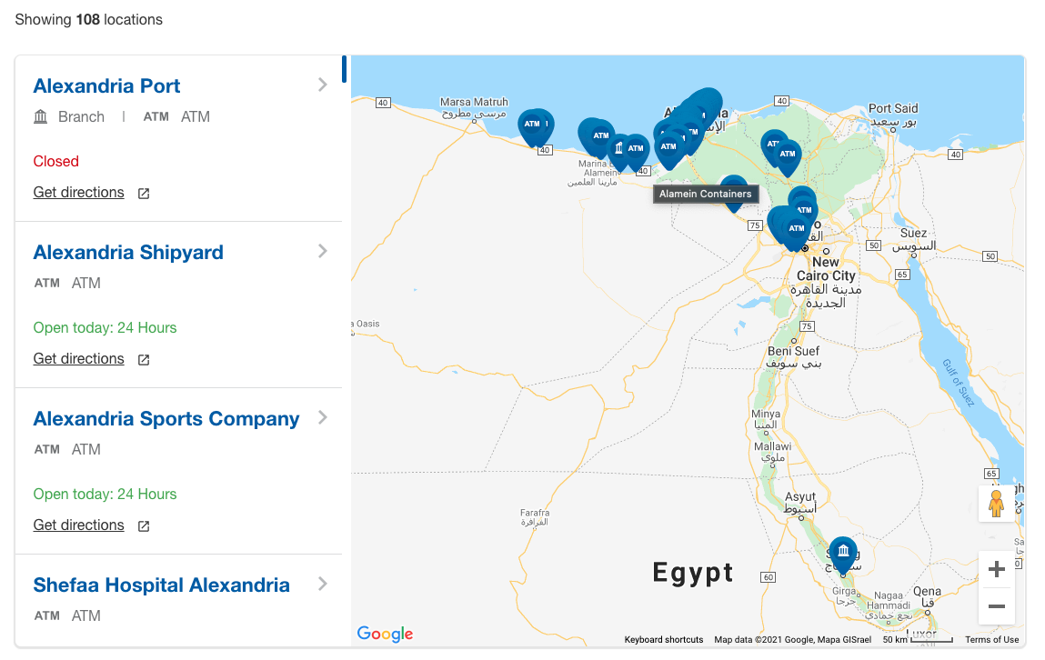
In markets with lower smartphone adoption, where sharing documents electronically is more difficult, you may want to deliberately drive users to your local branch to complete the registration / application.
If this is a viable route for you, you’ll need a prominent, effective branch locator function. To do this you may want to build your own on top of an established platform such as Google Maps or use a specialist location services provider like Loqate, Woosmap or Findmystore. Also consider using appointment scheduling software to give the customer reassurance that they will be properly received at the branch and won’t have to hang around unnecessarily.
(iii) First Accounts
"There's a demonstrable preference for even the most tech savvy of customers to research online first but then visit the branch for human guidance to open that first account." Christopher Bajgier, Vice President Digital Product Management at Dollar Bank, USA.
Whilst online forms have become ubiquitous in the application process for many goods and services, it is easy to forget that, as a standalone, they are not always the best route to convert the customer. McKinsey found that in-branch still made up 60% of all new financial product sales. When looking at conversion rate, the numbers were even starker. 85% of in-branch leads converted compared to only 15% for digital channels. This is especially true when a customer is taking their first steps with you such as opening their first current account. They value the expertise of the agent to help them navigate the product and pricing complexity involved. In these circumstances, you may not want to make converting first-timers through an online form your top priority (and that’s difficult for us online form evangelists to say). Instead, perhaps push them to their friendly neighbourhood branch office using some of the techniques listed in point (ii) above.
(iv) Digitize your branch
Sometimes the relationship between online and offline can work the other way round. Although customers, particularly first timers, may be more comfortable in-branch, you can leverage digital assets there. US Bank has been trialling a digital branch featuring self service stations instead of tellers and McKinsey have recommendations on a bank branch for the digital age.
4. Insurance Forms
Insurance forms have their own quirks. Although the advice in the rest of this white paper generally applies to them, we thought we’d also cover some insurance specific points in this section.
(i) Don’t ask for personal information up front
We normally advise putting the simple questions on a form up front due to the easy before difficult principle - getting users to start a form makes it more likely that they will complete it.
(ii) Don’t assume the audience knows your product
While you may know the difference between Assurance and Insurance, you can bet that most people don’t. Always give context to users (or links to explanations) when they are selecting a product so they don’t get scared off or pick something that isn’t right for them.
This advice is flipped for insurance, however. Insurance questions tend to be very personal and users may be wary of giving you that information. They’d prefer to get a quote from you first before deciding whether to share their precious contact details so just ask the bare minimum that enables you to give them an accurate price.
(iii) Provide calculators where appropriate
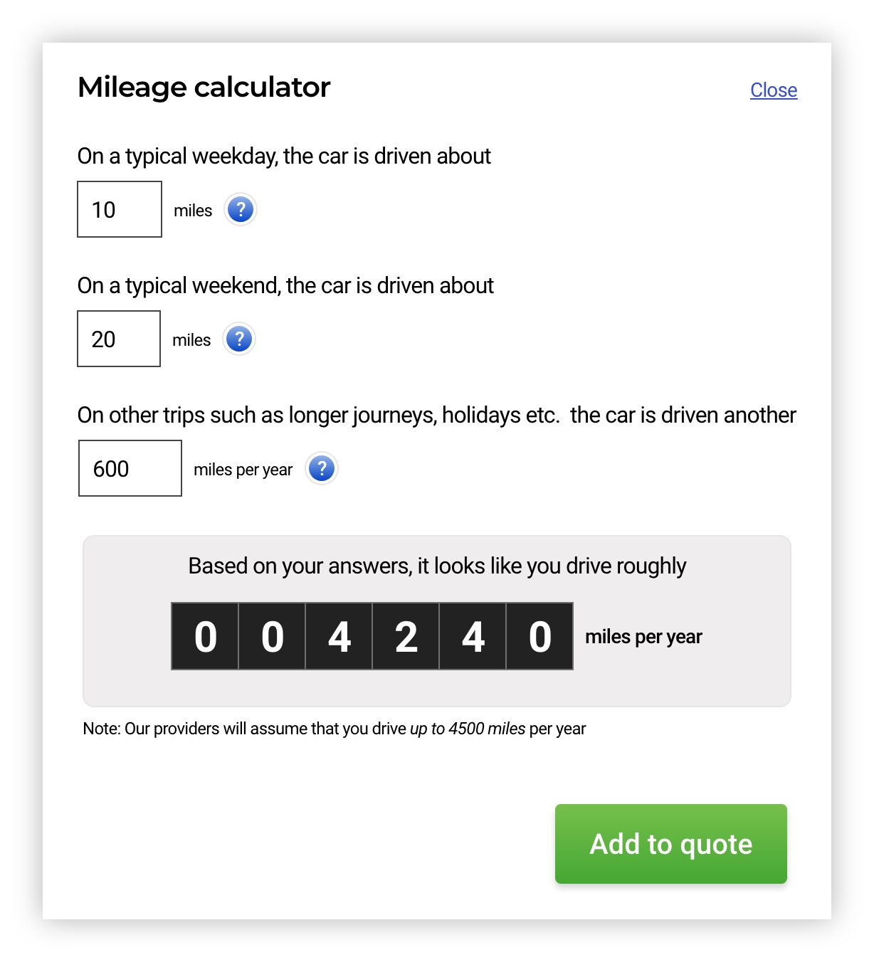
Your form may ask questions the user doesn’t immediately know the answer to. “What is your annual mileage?” being a classic one for car insurance. To avoid them having to go away and try to work it out, give them a simple calculator such as the one below to help them to come to a figure quickly. It is also reassuring if you make it clear that it doesn’t have to be exact, just an estimate - you won’t turn down their insurance claim if they are slightly over the entered mileage.
(iv) Don’t be too hasty in returning a quote
Humans are suspicious creatures. If, after they have spent 15 minutes filling in a form, you come back with a quote in a millisecond, they may suspect that all of the information they gave you was a waste of time and you were going to give them the same answer whatever. This may translate to a lack of trust in the quote itself and a quick trip to your competitor’s website to see if they can do better.
Obviously no-one wants to be waiting for a minute while the wheel turns round and round but a respectful second or two’s delay will reassure them that you are crunching the numbers and coming back with the best deal.
In Summary
If you've blindly skipped ahead to the end (and who doesn’t!?), here’s the TL:DR so you don’t need to plough back through everything. If you only take a few pointers from this white paper, these are probably the most important.
- Speak in the customer’s language - Jargon and acronyms will confuse and alienate.
- Use a multi-step structure - Unless your form is super-short it will convert better than a single page format.
- Manage user expectations early - Indicate how long it takes to complete the form and what information they have to provide.
- Don’t ask for a phone number unless you truly need it - If you must ask, make sure you tell them the reason why.
- Make the job picker field simple - Use a free text field and categorize at the back end.
- Always consider how to handle “non-intenders” - Just because some form visitors won’t buy now, with a bit of thought you can make sure they return in the future.
Catch up on section 1 here or download the full pdf version of the white paper. Or, other useful downloads that can help you improve your forms are:
Zuko's Big Guide to Form Optimization
The Step by Step Guide to Using Data to Increase your Form's Conversion Rate
Happy Optimizing….
"We have used the services of Zuko for the last 2 years and have benefited from their vast knowledge and experience in digital journey optimization. As a company they are very easy to work with and be connected to and we value the input they have given us when developing new digital journeys and enhancing our existing digital propositions."
Stephen Paton, Digital & Customer Experience Manager, Sainsbury's Bank

“Zuko has enabled us to improve visitor to conversion rates for a series of clients. An example of this is a website increasing their click to enquiry rate by 25% through form changes highlighted to us through Zuko as ‘sticking points’.”
Steve Tarbard, Owner, Beyondclicks.co.uk

"Zuko was a game changer for us. It was the only form analytics software we could find that tracks data from Pardot iFrames. The depth of the data is impressive and easy to digest. Their account reps are very responsive and helpful. Overall, a great experience."
Addison Witt, Digital Marketing Manager, Emplify

"The insights we gained from Zuko have been very helpful in pinpointing the issues we are having in our form, and the team has been very helpful in gathering those insights!"
Matthias Ferlings, Online Marketing Coordinator Web Analytics, Lebara

"We're a B2B lead generation business and our forms are critical to driving quality leads to our sales teams. Zuko is by far the best tool to analyse and optimise form flow in order to improve our conversion rates."
Bryan Hunter, Head of Digital Marking, The Instant Group

“Zuko made it possible for us gain further insight into the behaviour of consumers in our forms. This gave us a lot of valuable learnings and input for conversion optimization. It’s probably the quickest way to improve your conversions!"
Robert Veltkamp, Manager Online Marketing, via Bovag.nl

"Zuko helped us decide where to put our development efforts on at the most important part of our website: our checkout forms. The new and improved checkouts, based on many valuable usage insights from Zuko, are now being built by our front-end team."
Stefan Sleutjes, Digital Strategist, Verzekeruzelf.nl

"Formisimo's easy to implement tool enabled Udacity to easily identify the outages when customers fill out lead generation and check out forms.
Zuko rocks."
Scott Wilder, Global Head of Life Cycle and Growth Marketing, & Demand Gen , Udacity
