Five Techniques to Optimize Form Submission Speed and Completion
Customer experience agency Speero (formerly CXL) share 5 of their top form optimization tips
Advice on improving web form user experience
While we at Zuko are the form data and optimization specialists, we often partner with CRO and customer experience agencies to ensure that the data is translated into meaningful insights and integrates into the bigger optimization picture. Speero (formerly CXL) are one of our favourite partners and have kindly agreed to share some of their best advice when it comes to form optimization. Here, Paul Randall, one of Speero’s CX Strategists, takes us through five techniques he uses to improve forms’ customer experience.
_______________________________________________
Forms have been a fundamental part of web experiences for decades and remain critical components of the websites we all use daily. They are how we sign up, log in, purchase and submit information.
Despite being an old-school input mechanism, there are still techniques you can use to squeeze the performance of your forms. Here are my top five approaches you can use today to improve your website forms.
1. What information do visitors want to avoid giving to you?
We’re increasingly conscious about how our data is collected, stored and used. Numerous security breaches have made us wary of giving away sensitive information too easily and despite this, forms continue to request unnecessary information in exchange for services, goods and resources.
Analytics data can help you identify user behaviour that indicates a reluctance to hand over personal information. Set up tools like Zuko and Google Analytics events for form errors, listed by field. You can identify if users are trying to submit a form while leaving certain fields blank–a sign of them wanting to avoid giving you this information.

A process you can use is the Question Protocol to assess if every field is needed. It’s a methodology created by Caroline Jarrett, a name synonymous with forms and someone who has written several books and posts on the topic as well as serving in a variety of government organisations.
The methodology used in the Question Protocol is to:
- List every question you ask.
- Identify who within your organisation uses the answers to each question.
- Understand what they use them for.
- Decide whether an answer is required or optional.
- Handle if an answer is required, what happens if a user enters any old thing just to get through the form?
When describing the process, Caroline explains; “If you know exactly why you are asking every question and what you will do with the answer, then it is easier to eliminate unnecessary questions and to explain necessary ones.”
Takeaway: Use analytics to find which fields are regularly submitted blank, or skipped most frequently by users and apply the Question Protocol to them.
2. Using placeholders might be a hindrance
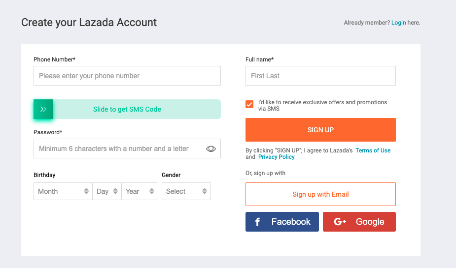
So many forms have taken to removing labels and replacing them with placeholders, however, the W3C, who developed the standards for placeholders state placeholder text is not a replacement for labels.
Placeholders are relatively new in web terms, coming in with HTML5 around a decade ago. W3C who developed the standards for the World Wide Web, state that placeholder attributes:
‘Provide instructions or an example of the required data format inside form fields that have not yet been edited by the user’.
But there are some challenges to using them. Assistive technologies such as screen readers do not treat placeholders as labels and on top of this, the styling applied to placeholders is usually lighter than the text input and these often don’t meet accessibility standards. A general rule of thumb is if you need a hint to demonstrate the data input, place it outside of the field.
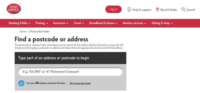
To assist visitors, these examples can be misunderstood and lead to confusion. One such example was where a Designer, Rich H Wand created a placeholder for the address lookup field for the Post Office in the United Kingdom. In his draft design five years ago he used his own address which he assumed would be changed by the development team. They never did and one confused visitor ended up inputting the placeholder text and sent their parcel to Rich!

Adam Silver, an Interaction Designer who wrote “Form Design Patterns” has also written about how placeholders are problematic. In his piece, he explains 14 reasons why placeholders create form design challenges, such as the content is hard to remember once your cursor is in the field, they aren’t supported by all browsers and when the fields have been answered the instruction disappears when there may still be validation issues making it hard to check the answers before submitting. So, review your form fields to identify any placeholders that are in use. Consider what would happen if that data were submitted in the form and if the example is needed at all. If your forms don’t have a label, consider adding them.
Takeaway: Replace placeholders with labels if they don’t exist. Consider if hint text is needed and look to remove it if it isn’t. Review the data entry speed as well as form submission success and the number of failed attempts.
3. Create ultra-fast mobile input experiences
While many people focus on optimizing forms for conversion rate; smooth and seamless data entry can also be a great metric to monitor. Fast form input is one where the visitor has not had to dwell too much on the questions being asked and they have been able to input the data with ease.
Data entry can be sped up, especially on mobile by utilising the right input type. There are subtle differences, but used correctly they can reduce error rates and create smoother experiences.
Standard input types which are commonly used are ‘email’ and ‘URL’, but for a phone number you can use ‘tel’ instead of ‘numeric’ and the ‘decimal’ type is a nuanced alternative for input requiring a decimal place. Cristian Oliff, a frontend developer wrote a post explaining everything you need to know about input types and includes a demo for you to try.
A faster way for users to input data is when we utilise the autocomplete function. With over 50 values to utilise, the benefit of using this functionality is that it brings in suggestions to speed up data entry. Did you know autocomplete can also be used to speed up two-factor authentication as well with the one-time-code attribute?
Takeaway: Alter your field input types and include autocomplete values where applicable. Measure input speed and error rates, to see if these metrics improve on your forms.
4. Use correct field sizing to suggest the input value
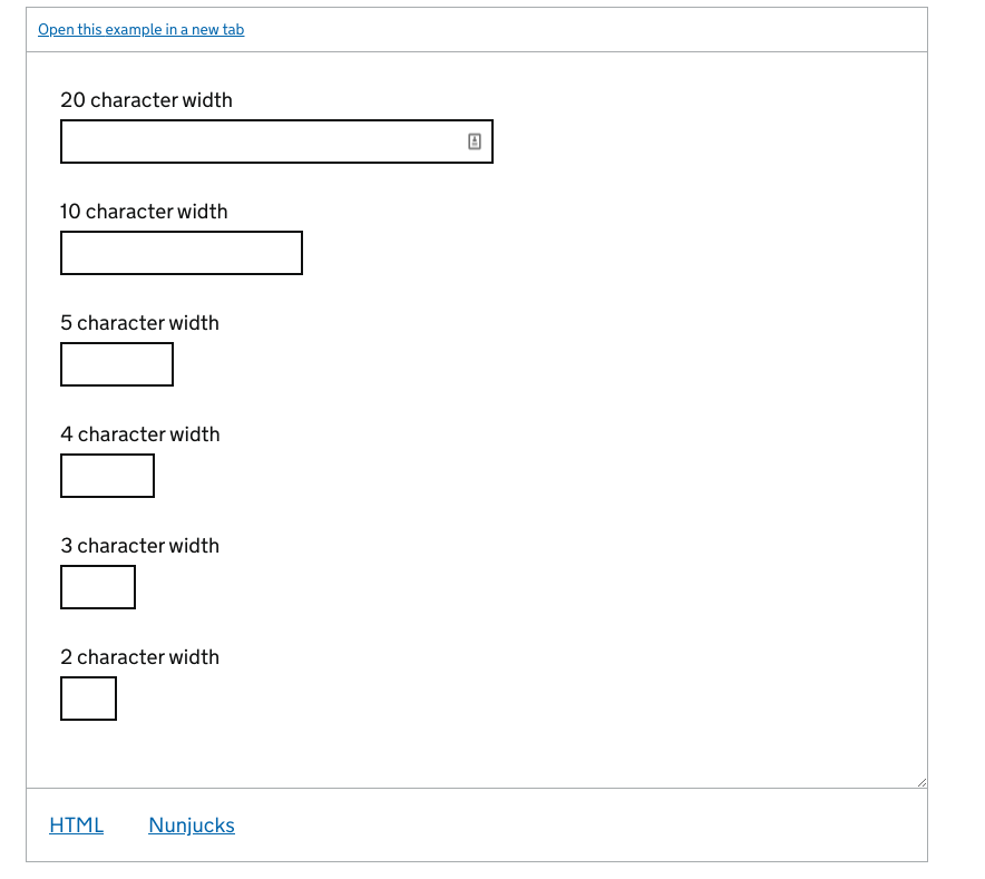
Setting the correct field size can help visitors guess what kind of content they need to input into your form, especially with content that has a known length such as postcodes/ ZIP codes and telephone numbers.

I would recommend reading the GOV.UK guidelines as their services are used by millions of people in the United Kingdom. Their text input guidelines have some specific rules around field lengths.
Takeaway: Review your form fields and decide what an average or optimal length should be. Each field should also be on its own line and shouldn’t look like a game of Tetris. Change field lengths and monitor the input speed and submission as well as error rates.
5. Make your button text answer “I want to”
Buttons are the last hurdle in your form optimization journey. But just because visitors have reached this stage doesn’t mean they are ready to commit. It’s easy for button copy to put people off and make them turn away or avoid completing.
How many times have you seen a button with the words ‘Submit’ written inside? This may have something to do with the HTML markup originally used to create them, as it’s the default value.
But, the problem with labelling a button with a generic statement is that it doesn’t associate itself with the task that the user is completing. The word ‘Complete’ is just as vague as it doesn’t explain the task and onward step. The same can be said for hyperlinks, especially ones which say ‘Click here’ or ‘Read more’.

Joanna Wiebe, founder of Copyhackers suggests your button copy should complete the sentence: “I want to _____”.
Takeaway: This is a nice simple one. Review your forms and try the “I want to _____”. exercise. There can be many ways to finish the sentence so try experimenting with a few against your current button copy.
Conclusion
Forms are often the key part of a user journey, imperative to get right if you want your users to sign up or buy. By using the above five techniques you can ensure that fundamental UX principles are implemented to help not only your businesses' CRO but your users too.
Author
Paul Randall is a CX Strategist at customer experience optimization agency Speero (formerly CXL).
For additional high impact form optimization tips check out Zuko's comprehensive guide.
For more process driven advice download our Step by Step Guide to Using Data to Optimize Forms.
Or, if you are in the financial sector you can read our White Paper on Optimizing Financial Forms.
We wrote the book on form optimization!
"The best book on form design ever written - 80 pages of PURE GOLD"


More from our blog:
Want to get started with Zuko?
Start a free trial that includes all features, or request a demo


