
The Big Guide to Form Optimization and Analytics: Section 2
Common Form Issues and High Impact Tips
This is section 2 of the abridged web version of Zuko’s free eBook on how to maximize your web form or checkout’s performance. You can download the pdf version of the whole guide here. Other popular downloadable guides include:
Using Data to Optimize your Forms (A Step by Step Guide)
This version of this guide is split into multiple sections to make it easier to parse. This particular page looks at common issues you’ll want to solve to reduce your form abandonment rate. The other sections can be reached via these links:
Section 1 - General Principles of Form Optimization
Section 3 - Best Practice Form Design
Form Analytics and Optimization Glossary
Navigation
Use these links if you want to skip to a particular tip:
Let Error Messages work for you
Leverage the power of Social Proof
Common Issues and High Impact Tips
This section looks at the specifics. This chapter sheds light on some of the most common problems that come up during form optimization. We’ll also share our best tips to help you maximize conversion.
1. Inline Validation
Inline validation is a technology that provides the user with instant feedback as they enter information into a form. Think of the password fields that tell you whether you’ve fulfilled the criteria as you type in the characters.
If you are interested in the technicalities behind this you can learn more from our specialist article on inline validation. In summary, this is one of the most powerful techniques you can use to improve form conversion. A classic study on the topic found that the use of inline validation delivered:
- 22% increase in conversion rates;
- 22% decrease in errors made;
- 31% increase in satisfaction rating;
- 42% decrease in completion time
(versus equivalent forms with no inline validation).
There are various ways to implement inline validation but our best practice principles are:
(i) Only trigger when appropriate
We’ve all been on forms that start out as a sea of red, inviting you to complete them if you want to remove all the pre-loaded error messages. Not a great user experience. You should only use inline validation when it aids a positive user experience and increases the likelihood of completion.
Generally, you want to use inline validation in the following scenarios:
- If the data has to be provided in a particular format, or with particular characters (think password, email address, etc)
- To validate an email address or user name (i.e. confirm whether it is already registered with your site)
- If a user skips over a required field (i.e. to remind them immediately that it must be completed before they head on through the rest of the form)
(ii) Validate at the right time
The main benefit of inline validation is that you can provide user feedback in real time. That doesn’t mean that you can just splurt out messaging continuously if you want to maintain an optimal user experience. There are many opinions on when it’s best to provide feedback. Our general advice is to deliver it once the field has been completed (i.e. immediately after they move to the next field). This avoids any distractions while users enter data. This is backed up by the aforementioned study which found users completed a form 7 - 10 seconds quicker when validation was shown after completion rather than during. The only exception we would make to this is for password fields with significant stipulations (special characters, etc). Here, it can be beneficial to let the user know when they have fulfilled the requirements. Even in this case it’s still advisable to allow a short time lag before validation, so the user is not prematurely annoyed by error messages.
(iii) Position the message optimally
You’d think that it was intuitive to keep the validation message as close to the field as possible. Not according to some of the forms we have seen. If the validation message is at the top or bottom of the form, it often gets missed. Typically, you should place the message immediately to the right of the input field (for a simple tick mechanism) or immediately below (if you need to impart more information about the nature of the error). There is a mini-trend to include the message within the error box but avoid this if you can - this usually doesn’t render well across all devices / browsers and can look odd or unprofessional.
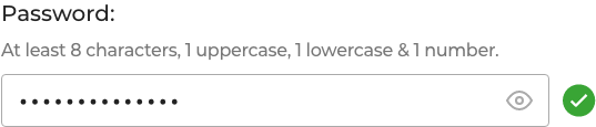
(iv) Keep green on the screen
Once users have successfully completed a field, you’ll want to keep that green tick (or equivalent) on there. Studies have shown that fading the success messages causes nervous users to worry the field has since become invalid. Slow typists sometimes miss the message altogether as they focus on their keyboard rather than the screen.
2. Let error messages work for you
Computer says no….
We’ve all had the big red X slap us in the face when we’ve entered a field incorrectly. It’s not nice - it reminds us of our worst days at school! Worse still is when the big X appears with no instructions on how to fix the problem, leaving us to try and work it out ourselves. Usually followed by rage-quitting. It’s innate - error messages drive us to produce cortisol which makes us stressed and more likely to abandon our form.

We’ve written about error messages in detail previously. The important thing to remember is that they are not the enemy. Done well, they can be the user’s friend, gently guiding them to the desired outcome with minimum pain.
(i) Indicate the error message clearly
If a mistake has been made you need to let the user know this unambiguously. Be clear where that error has been made. You can do this by:
- Highlighting the offending field, ideally with an outline around the input. Use a strong, impactful colour (there’s a reason teachers use red!)
- Using visual cues or icons to draw attention to the mistake (crosses and arrows are good)
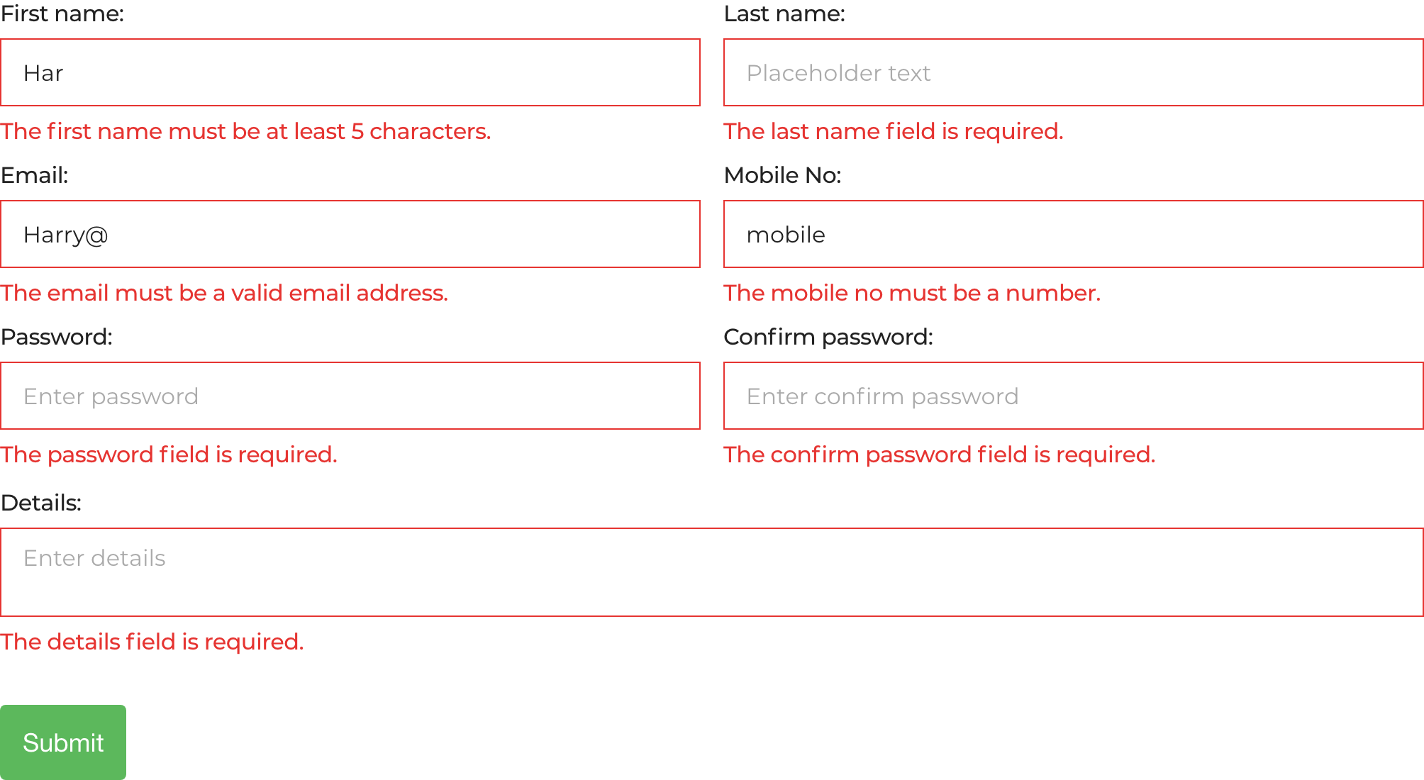
- Make sure the error message is next to the appropriate field. Don’t make the user have to memorise the error by putting the message at the top or bottom of the form and leaving them no option but to scroll to fix it. We've previously conducted some eye-tracking research that shows users "pogo-ing" up and down the page to try and find the error messages if you do this.
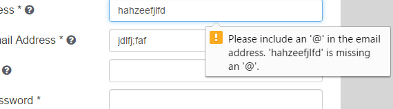
This is a better example of how to do things: the field itself is highlighted in red and there’s a clear explanation on what the issue is.

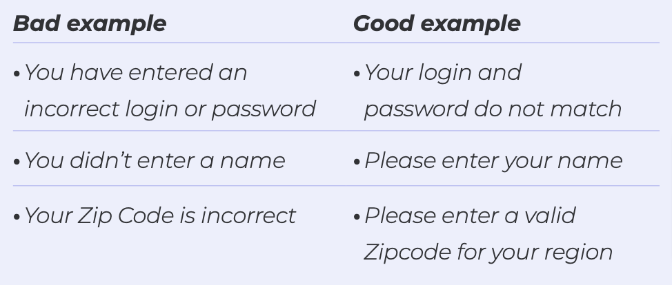
(ii) Be clear and helpful
A good error message should enable a user to quickly understand, read and fix the issue. Use the language of a good customer support representative. Give guidance, don’t just state there’s been an error.
Avoid:
- Tech language and jargon - most users are not qualified developers.
- Forcing the user to adapt to your setup - if something is wrong tell them why so they can fix it. They don’t know what Error356089 is...
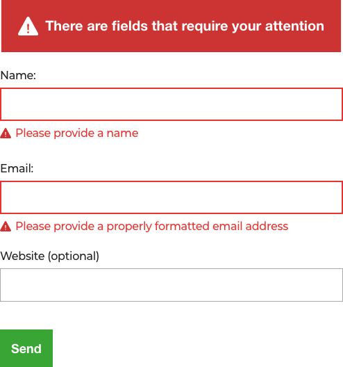
Some examples to avoid are shown below:

A better example is shown below, giving the user specific advice on how to solve the error.
(iii) Never blame the user
There’s an old saying; “If you don’t understand what I’m saying, it’s not your fault for not understanding me, it's my fault for not explaining things well enough.” This applies to forms. Never be tempted to imply the user has caused the error (even if they genuinely have!) as it won’t end well for you.
Pro Tip - Use passive language rather than accusatory:
(iv) Prevention is better than cure
You know what’s better than writing good error messages? Never having to display those messages in the first place because you’ve done such a good job with your form.
How do you do that? Our top tips are:
- Inline validation (again!)
- Make the form labels as clear as possible (e.g. “Delivery Address” Vs “Current Address”)
- Be more flexible in your data format (more on this later)
- Use microcopy (full section on this later)
- Be clear which fields are optional and which are compulsory
- Use smart defaults. Don’t let users pick dates in the past, choose a return date before a departure, or select products that their age prohibits them from purchasing
3. Get Passwords Right
Anyway you look at it, passwords are a pain. Either you make them so difficult, the user forgets them. Or you make them so simple there’s a risk they could be easily cracked and your security compromised.
Zuko has done a lot of research on passwords. On average, over 50% of users return to the password field at least once. Even the best performing forms have a figure of 30% returners so the potential for friction and dropouts is immense.
That said, there are ways to make things easier for both the form user and you:
(i) Minimise stipulations
We get the need for strong passwords. No-one wants a user base with “123456” as the only barrier between a hacker and your back end.
However, overly strict requirements guarantee a horrible user experience as they return to your site and can’t get back in. You’ll also get the “FFS” factor when users’ first choice passwords are rejected for want of a special character. While this rarely causes abandonment in itself, you don’t want a frustrated customer just before they’re ready to click the submit button.
You don’t have to go too far with this. While you do need some requirements, even Microsoft has advised against overly complex passwords.
The UK’s Information Commission Office offers some useful guidelines that you won’t go too far wrong if you follow:
- You should have a suitable minimum password length
- (Microsoft recommends 8 characters. Any more than 10 is unnecessary), but there is no need for a maximum length. If the user wants to go with “SuperCalifragilisticExpialidocious!129” then let them. We’re assuming that you are using a reputable encryption algorithm (if you aren’t then please do) to hash your passwords, so as long as you have an appropriate minimum length, longer passwords should not cause a problem. If you must set a maximum length (for example if the developers added one without thinking and now you’re stuck with it), then tell users this upfront.
- Special characters should not be compulsory. Password length is more important than complexity. However, you should let the user enter them if they want to.
- Blacklist weak passwords. This is how you can block the “Pa$$word” and “12345”’s from your database. It’s not hard to pick up these lists commercially and you should update them every year. When you implement this, make sure you explain to the users why they can’t use that password if you reject their input for this reason.
(ii) Be kind with your error messages
We’ve already covered this off in the previous section so won’t labour the point here.
(iii) Use inline validation
Again, this is a repeat but we’re going to keep banging that drum until you take notice. An average 22% increase in completions should get you moving on this.
(iv) Don’t use confirm password
Don’t do it. We get that you don’t want users to inadvertently forget their password. But we know they probably will anyway. Why add extra frustration at the point of commitment when a forgotten password tool can help them later?
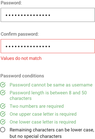
We learnt this from bitter experience. We used to have a confirm password on the Formisimo (our previous product) sign-up page. We removed it. Conversions went up 56% and we’ve never gone back. We’ve never had mass password forgetfulness because of it either.
(v) Allow unmasking
“If it wasn’t for you meddling conversion rate optimizers, I’d have gotten away with it”
Unmasking shouldn’t only be for Scooby Doo villains.
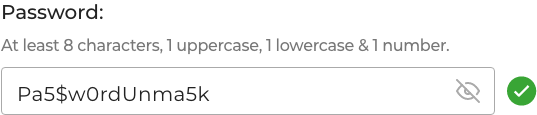
If you want the customer to have the best experience, allow them to unmask the password field. They are less likely to mess up the field if they can see what they’re typing.
Companies often mask passwords out of a misguided sense of security. But people don’t complete forms in crowded internet cafes anymore. In fact, research by Dr Jakob Nielsen suggests that masking actually makes passwords less safe and users less likely to become customers:
- The more uncertain users feel about typing passwords, the more likely they are to employ overly simple passwords or copy-paste passwords from a file on their computer. Both behaviours decrease security.
- Users make more errors when they can’t see what they’re typing. They feel less confident. This degradation of the user experience means people are more likely to give up or never log into your site at all, leading to lost business. (Or at the very least, cost you more in support calls).
Rip that mask off Velma...
Start Optimizing Your Forms with the Award-Winning CRO Analytics Platform
Zuko helps you understand why users abandon forms, identify friction points, and increase completion rates — faster and easier than Google Analytics.
(No Credit Card Required)


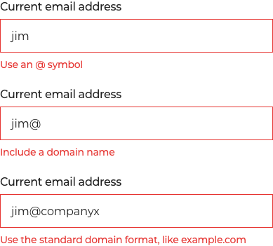
4. Accept all valid formats
Phone Numbers. Postcodes. Card Numbers.
These should be uncontroversial fields that users fly through with no problems. People know their own Zipcode, mobile number and can pull their card out from their purse to enter the number correctly can’t they?
You’d think so but in reality, these fields cause more friction than you’d expect. Sometimes enough for the user to quit the form altogether and go to a competitor.
The cause of this trouble is usually down to a mismatch between the format you want the user to input and the format they expect to enter:
- Should you use the international dialling code (+XX) for your phone number? Should you drop the 0 from the start?
- What happens if you include a space in your phone number or postcode?
- Should the date of birth be “DD MM YY”, “YY DD MM” or some other combination? Do you need to include the first two digits of the year or not?
- Is there a maximum length for a text field?
- When entering monetary amounts, should you enter the comma or period (different countries have different conventions for this)?
- Should I add spaces in my credit card number (like it appears on the card)?
All of this leads to unnecessary headaches. You may have a backend system that needs a certain format to be input but that shouldn’t be your customer’s issue. You need to stop it.
Pro Tip - The most successful forms accept inputs in all valid formats, doing the hard work themselves via a simple reformat at the backend. This meets the requirements of your system whilst prioritising the needs of the user.
5. Leverage the power of social proof
While we are data experts at Zuko, we do sometimes like to dip into the school of psychology. Understanding what makes people tick can be a valuable tool in nudging them through your form.
The choice to follow the herd is deeply ingrained in all but the most contrary among us. A classic study by Solomon Asche demonstrated that people are more likely to conform to the group decision, even if that decision is “wrong”. When Asch asked the participants why they conformed, he found that people follow social proof for two reasons:
- They want to fit in with the group
- They believe the group is better informed than they are
There are various ways that you can harness this instinct for conformity to improve your webform / checkout conversion. The most common are outlined below.
(i) Customer testimonials
While semi-anonymous customer comments can be effective (shoutout to “JB” from Boston), the more information you can provide about your champion, the more credible it will be. Name is crucial but if you can get location (B2C) or company + role (B2B) you’re off to a good start.
The content needs to be detailed enough to be relevant. “Product X is great”, won’t do much for you. “Product X really met my need for Y and the support team delivered upon every one of their promises” will subconsciously put the form user into the happy customer’s shoes and make them feel more positive about the product they are about to buy
For extra impact, if you can persuade customers to give you a video testimonial (although don’t put this in the form - too much distraction) so much the better.
(ii) Aggregated review scores
If you have independently verified positive review scores then use them. Placing them near the end of your checkout, ideally with glowing customer comments or testimonials will drive sales. A study by iPerceptions, an analytics provider indicated that 63% of people are more likely to purchase from a site that has user reviews. There are plenty of sites out there to help you harvest reviews. Google, Yelp, TrustPilot, G2 and Feefo are some of the most popular. Select your partner based on whether you are a B2B or B2C provider and get a feel for how easily they will integrate with your technology.
(iii) Trust Icons + Logos
It's amazing what the power of brands can do. If you’re a B2B service or product make sure that your most famous customer logos are front and centre of the buying experience. As the old saying goes, “No-one ever got fired for buying IBM”. While that statement needs updating, the sentiment is still valid. Herd mentality pushes us to follow the biggest and baddest - why would Coca Cola buy a service that is bad?
In both B2B and B2C spheres, don’t be shy about pushing your media coverage. A set of logos of the media outlets you’ve featured on will add to your credibility. Trust badges also work well for driving credibility.
Finally, if you’ve got awards, flaunt them!
(iv) Case Studies
Often the gold standard in B2B social proof. Case studies incorporate in-depth data driven outcomes for a trusted client. If you can pull one of those together alongside a positive quote, do so immediately.
(v) Customer numbers
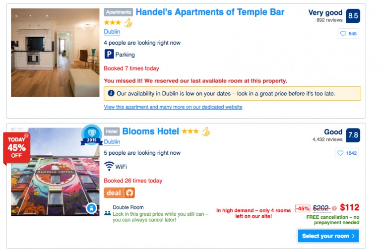
We’ve all experienced the prompt on travel sites “21 people booked this hotel today” while we’re enjoying our browse. This prompt is a less subtle form of social proof but one that’s effective. You don’t have to go quite this far if it’s not right for your business. Just stating an impressive number of customers, will work just as well.
6. Make use of Microcopy
Microcopy is the small pieces of written content that guide users through your online form. It cuts friction from the form experience and, done well, can make a massive difference to your abandonment rates.
The primary categories where you should include microcopy are:
(i) Giving users a heads up
It’s always good practice to let users know what to expect and what is expected of them. Much better than springing it on them after they’ve invested time in the form.
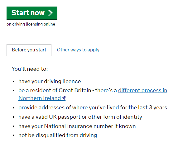
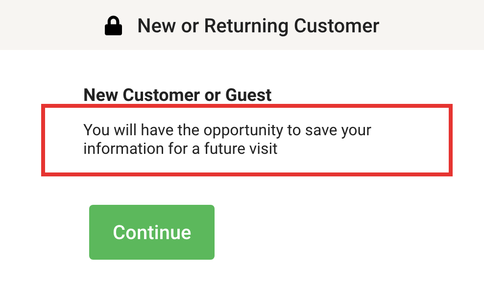
For example, you could prep them on what documents they will need later on, like in this from the UK driving license authority:
Or a simple prompt to let users know they have the option to set up a full account later, even if they start as a guest.
(ii) Being specific on the input needed
What’s the difference between, “Address”, “Current Address”, “Delivery Address” and’ Residence Address”? If you believe there’s no difference then you’re probably causing unnecessary confusion on your form. Use microcopy to be specific about what is necessary.
For instance:
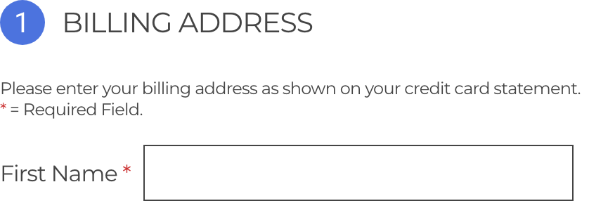
“....Billing address as shown on your credit card statement” to be clear what exactly is needed.
Recipient name rather than just “Name” to be clear in the case this is a gift for someone else.

(iii) Explaining why
A study by the Baymard Institute, indicated that customers grew suspicious if asked for what they perceive to be unnecessary personal information (especially phone numbers). Conversely, when forms explained why they needed the information, users were much more forgiving.
Firebox.com does this well - explaining, reassuring and bringing the brand tone of voice to life, all in one brief line.
(iv) Persuading
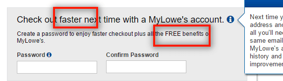
Microcopy is best put to use when it nudges users towards your desired outcome. This example from Lowes asks the customer to sign-up for an account and describes the tangible benefits of doing so (faster checkout, free benefits).
(v) Reinforce your brand
Many websites take the opportunity to inject a bit of brand levity into an otherwise dry message like this “Taken” inspired piece of microcopy from Firebox again. Whilst this may not have a direct impact on your conversion rate, it certainly improves your user experience.

(vi) Error messages
We’ve covered this above so we won’t dwell on it but, needless to say, this may be the most important use of microcopy. Make sure you follow the principles outlined above - be clear, helpful and unambiguous like this example from Ticketsellers.
7. Progress Indicators
It turns out that a progress bar is one of the most effective psychological nudges in preventing abandonment during the more long and complicated forms out there. The power stems from harnessing three psychological phenomena:
The stress of incomplet…
Gestalt’s law of closure implies that humans are innately predisposed to complete things. Lack of ‘completeness’ causes us stress. This is one of the reasons that video games with progress bars are so addictive. Players refuse to stop until they’ve hit 100%. This applies to forms too. The inner gamer in us won’t let us stop until the bar is complete!
Operant conditioning.
We’ve been conditioned to seek the positive reinforcement we gain, on completion of a task; form filled in and ticked off the list. We don’t like to see an unfinished task, so we press on for sake of completeness.
We find completeness intrinsically rewarding. Neuroscience from MIT (Dr Hugo Liu) has backed this up. He found that the brain releases large quantities of endorphins when we successfully complete a complex task.
While you can consult our blog on progress indicators for an in-depth overview, our key advice to maximise their impact is:
(i) Make them proportional to the journey
We’ve all used those forms with dodgy progress indicators. The ones that tell you that you’re 80% of the way there but you soon realise you are only 20%. Don’t be that form. That sort of hackery may work momentarily but they erode the trust of your users in the longer term. Ensure that whatever type of progress indicator you use (sections, numbered stages or percentage), it manages user expectations and aids a positive experience.
(ii) Clearly label each step
Manage user expectations throughout the journey. Each stage should be labelled clearly. Allow the user to understand exactly what they can expect and what they are likely to be asked. Generic labels like “Stage 4” or a naked percentage figure may help manage expectations relating to the overall length. But they don’t tell the user exactly what’s ahead.

(iii) Let the user navigate
One of the advantages of a progress bar with specified stages (instead of percentages) is that, in addition to setting expectations, it can further enhance the UI. Allowing the user to click between stages so they can go back to check or amend inputs, reduces the use of the dreaded back button. The back button often destroys previously entered data (if you haven’t coded your form to protect against this, you should), and causes customer meltdowns before inevitable abandonments.

8. Ask for financial information in the right way
Getting someone to share their credit card information is usually the penultimate stage of their checkout journey. Given the sensitive nature of this data, any friction or negativity within the process can destroy your chances of making the sale.
Data from across Zuko’s customer base reveals that between 40-50% of customers return to credit card number fields at least once. They are one of the biggest sources of field returns across most forms.
Our advice to minimise friction at this key stage of the process is to:
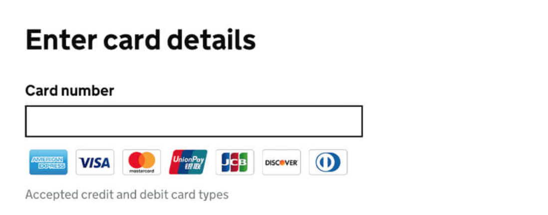
(i) Be clear what payment methods are offered
Have you ever tried to use a Diners Club card? Thought not. Though most of us have never seen these mythical beasts, they do apparently exist. Their users are so used to being knocked back (akin to a 17 year old trying to get into a nightclub), so they are understandably wary of entering their card details if they can’t see they will be accepted. Best to make this clear from the start. Here’s a good, visually clear example of how to do this from the UK government design system.
(ii) Don’t ask for unnecessary information
It’s not 1995 anymore. You no longer need to ask for some of the things we used to. Specifically, make sure your checkout has purged these elements:
Card types. Get rid of that ugly drop down menu.
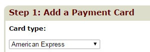
Your system can determine the type of card from the first digits entered so you can simply pull all the data from there:
3 - travel/entertainment cards (such as American Express and Diners Club)
4 - Visa
5 - MasterCard
6 - Discover Card
The same holds true for banks and their banking sort codes which removes the need to ask for the bank name and address fields
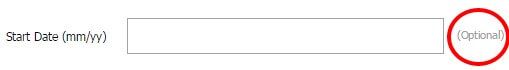
Start Date. This field is redundant and not needed to process any payments so cut it out with extreme prejudice.
(iii) Labelling Fields
We’ve mentioned this earlier so we won’t repeat the specifics but it’s important you don’t create any confusion in what information you are asking your user for. The relevant fields related to financial details are:
Card Holder. Always a source of confusion so be careful. You need to make sure you get the name of the cardholder, not the purchaser (if they are different). There are a few different options here but we prefer using just “Name on Card” as the simplest way to make this crystal clear.
Security Code. That simple 3 digit code (which, strangely, sits as part of a bigger 7 digit code) has various different names, depending on the card company.
- card verification value (CVV2, Visa)
- card verification code (CVC, Mastercard)
- card identification number (CID, Amex, 4 digits)
To avoid potential confusion amongst different card holders we recommend going broad with this label and using “Security Code” to cover all possible formats. Although these codes are now firmly established in the public’s awareness, simple visual explainers such as the one below will still help.
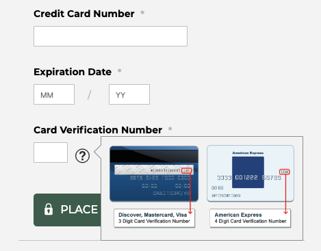
Pro Tip - Be careful with American Express. It has a 4 digit security code so you need to accommodate that. We’ve seen forms that only accept 3 digits for their security code, inadvertently excluding a whole class of users from buying their products.
(iv) Avoid dropdowns
There’s more of this in our design section. But remember, a single input box is much more user-friendly than a drop down menu.
(v) Card Number Formats
Users have a tendency to add spaces or dashes between the four digit blocks on their card (23% of them according to the Baymard Institute) which does break some forms. Again, we’ve touched on this previously but you should accept all of those submissions by reformatting at the back end. If that isn’t possible, you need to make sure your microcopy and error messages make it clear the user should not input any spaces or dashes.
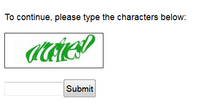
9. To Captcha or not to Captcha?
Spam generated through your website forms is horrible. It blocks up your team’s inbox and distracts them from more important tasks at hand. In the worst case, it can lead to bots swamping your system, leading to severe operational issues.
This is the background to why Captcha (“Completely Automated Public Turing test to tell Computers and Humans Apart” for any acronym geeks) was developed to root-out automated bot malignancy and prevent fake submissions. Any form user will know, however, the friction that Captcha causes to sign-up processes. How many of us have dropped out in frustration because we can’t decipher the random blurry letters?
This original study estimated Captchas prevented 3.2% of all genuine conversions.
So, how do we balance these competing concerns? It’s not easy but, fortunately, technology has moved on from “enter these letters” - you should NEVER use those.
The options a modern webmaster has to prevent spam whilst maintaining positive conversion levels are:
(i) Google No-Captcha (Now branded reCaptcha)
Full disclosure - this is the technology we use across Zuko’s website so we like it.
It’s the one where you’re asked to click a box to confirm you aren’t a robot. Google then scans the submitter to confirm and, if there is any doubt, asks them to select images from a collage based on certain criteria.
The latest version of the technology is “Invisible”. It can be bound to the submit button so the user does not see the tickbox. This produces a seamless experience for the user but there is a downside. The technology needs to sit across all of your site (with branding) and tracks user behaviour; including whether they have a Google account. This inevitably leads to concerns about data privacy. Many sites (Zuko included) are currently holding-off installing the latest version until we’re satisfied there are no issues to privacy protection.
(ii) Double opt-in
Rather than an onsite mechanism, double opt-in creates a confirmation email which is sent to the user. Their registration is only confirmed once they click on a link within that email.
This will reduce, if not eliminate, spam sign-ups and provide you with a more engaged audience. There are downsides though. Aside from the additional engineering required to make this work (hooking into your system to create a link for the email), it’s likely you will see a reduced volume of genuine sign-ups compared to using single opt-ins. This is because users do forget or decline to click your link. Or the email ends up in spam and is forgotten about. The available studies estimate this accounts for 20% of all users; a hefty chunk of potential customers.
Generally, we recommend holding back on double opt-ins, unless there’s a fundamental need such as:
- You are processing extremely sensitive data
- You’ve experienced deliverability issues with your database in the past (i.e. have been logged as spam)
- You are a potential target for malicious intent
(iii) Honeypot method
The whole point of captcha is to distinguish the bots from the humans. The honeypot method does this in a rather sneaky way. It codes fields into your form that are invisible to the human on their browser. However, the bots can see them and eagerly fill them in. Any submissions that include an entry to these invisible fields are marked as spam and filed in the trash.
So far, so good then?
Well no. The solution isn’t perfect for two reasons. The first is due to those pesky autofill browsers. Sometimes a user will click on autofill and the browser will fill in the invisible fields, causing the genuine submissions to be rejected. The second is that you inevitably end up in an arms race against the spambots. The bots are constantly refining their spamming techniques and have been re-coded to identify and ignore the honeypot fields so the effectiveness of the technique degrades over time.
That said, it still provides some degree of protection. So if you are dead against using reCaptcha, it's better than nothing.
(iv) Social sign-up
Social sign-up is where you use an integration with a third party (usually Social but it can be others - Facebook, Google, LinkedIn, Microsoft & Twitter being the most common ones) to allow the user to sign up using their social account rather than the user needing to provide the details directly.
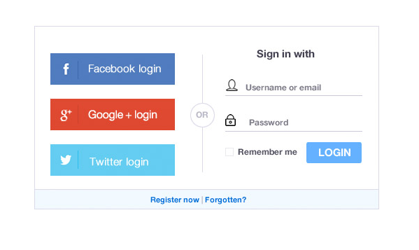
This has a number of advantages to the standard form sign up, namely:
- It overcomes the reticence of some users to provide their personal details. Blue Research report 86% of people are bothered by the need to set up new accounts on websites and 54% may leave a site and go to another rather than complete another registration form.
- Customers don’t have to remember a new username and password, making it more likely they will return successfully.
- Integration with social media allows for easier shares and that’s often important to businesses.
- Verified data. Users tend to share accurate data with their trusted social network. So assuming the correct permissions are set up, you should reduce the number of “Mickey Mouse” sign-ups for your site and get good quality personal data for your CRM instead.
Seems like a no-brainer then? While we’re fans of social sign-ups in the right circumstances, there are a couple of things you should be wary of:
- Age group variance. Data from LoginRadius’ social platform showed that only 11% of users aged 50+ opted for social sign-up (compared to 38% of those aged 18-25). If your product or service is aimed at an older demographic social integrations may not be effective for you.
- B2B Vs B2C. Speero, the CRO experts note that adoption rates are significantly lower for B2B enterprises than for those in the B2C market. This is because business users’ are reticent to share their personal social details in this context. If your customers are businesses you will be rightly, less enthusiastic about social sign-ups.
Pro Tip - Social sign-up is a positive for many B2C businesses but we never recommend it in isolation. Even if you have a great take-up rate for social integrations, always offer a standard email sign-up too.
For more in-depth analysis on Captcha check out our equivalent blog post.
"We have used the services of Zuko for the last 2 years and have benefited from their vast knowledge and experience in digital journey optimization. As a company they are very easy to work with and be connected to and we value the input they have given us when developing new digital journeys and enhancing our existing digital propositions."
Stephen Paton, Digital & Customer Experience Manager, Sainsbury's Bank

“Zuko has enabled us to improve visitor to conversion rates for a series of clients. An example of this is a website increasing their click to enquiry rate by 25% through form changes highlighted to us through Zuko as ‘sticking points’.”
Steve Tarbard, Owner, Beyondclicks.co.uk

"Zuko was a game changer for us. It was the only form analytics software we could find that tracks data from Pardot iFrames. The depth of the data is impressive and easy to digest. Their account reps are very responsive and helpful. Overall, a great experience."
Addison Witt, Digital Marketing Manager, Emplify

"The insights we gained from Zuko have been very helpful in pinpointing the issues we are having in our form, and the team has been very helpful in gathering those insights!"
Matthias Ferlings, Online Marketing Coordinator Web Analytics, Lebara

"We're a B2B lead generation business and our forms are critical to driving quality leads to our sales teams. Zuko is by far the best tool to analyse and optimise form flow in order to improve our conversion rates."
Bryan Hunter, Head of Digital Marking, The Instant Group

“Zuko made it possible for us gain further insight into the behaviour of consumers in our forms. This gave us a lot of valuable learnings and input for conversion optimization. It’s probably the quickest way to improve your conversions!"
Robert Veltkamp, Manager Online Marketing, via Bovag.nl

"Zuko helped us decide where to put our development efforts on at the most important part of our website: our checkout forms. The new and improved checkouts, based on many valuable usage insights from Zuko, are now being built by our front-end team."
Stefan Sleutjes, Digital Strategist, Verzekeruzelf.nl

"Formisimo's easy to implement tool enabled Udacity to easily identify the outages when customers fill out lead generation and check out forms.
Zuko rocks."
Scott Wilder, Global Head of Life Cycle and Growth Marketing, & Demand Gen , Udacity

10. Get them to commit - the submit button
You’ve managed to guide your user through the form, successfully entering their sensitive personal data as they approach the end. The final hurdle is the submit button. Just one click on that nice, shiny, precious button before they are yours, all yours….
As much as it seems your job is almost done, it’s still surprisingly common to witness the user still abandoning your form and going elsewhere.
In the General Principles section we talked about how to diagnose why a user drops out before clicking submit. Here, we discuss how to get them to commit at the final step and click on the submit button. Fortunately, there’s a universe of super-smart CRO experts out there who have published their findings, so there’s plenty of evidence to share on this topic.
While you should be testing everything - the submit button is an easy and effective element to A/B test. There are a few areas of general consensus on where to focus:
(i) Labelling
When is a submit button not a submit button?
Counter intuitively; All the time.
One thing that the CRO experts are unified on, is that you should never label your completion button “Submit” (despite what the developers say). A straight submit does not tell the user what their action achieves. “Submit” is a technical action rather than a consumer-led one.
Pro Tip - Your label should tell users what the button does. You can get away with a “Submit Registration”, “Submit Request” or “Submit Details” but better to be even clearer with “Create Account”, “Reserve my Seat” or “Download the Report Now”.
You can also build on this by adding in positivity tailored towards the user’s experience - “Yes, start my free trial” - can give a further nudge towards conversion.
(ii) Visibility
While this seems obvious, we see many webmasters fall into the same trap. Your Call to Action should be the most prominent element on the page. If your user can’t see it they can’t click it.
Your Submit button is just that. A button. It should not be a text link, an image, or a guessing game. Users have been conditioned to expect their final step to be a button. Now is not the time to challenge their conditioning.
The rest of our advice on visibility is not absolute. It will, in the main, depend on your specific site visuals. However, here are some general points to consider:
- Colours: While many studies have shown that making your button red can have a positive effect on click though, there are other advocates for orange or green. Generally, button colour should depend on your site design. The main factor is to ensure that it stands out from the rest of the site and it’s clear what its function is.
- Positioning: Again, this is not the time for originality. The button should be where users expect it to be. 99% of the time this is immediately after the last piece of data they inputted.
- Sizing: The rule of thumb is to make the button big enough to be impactful and clear. However, there are instances where increasing the size of the button has led to a negative impact on clicks so be mindful.
As we mentioned earlier, much will depend on your own site and your messaging so be sure to A/B test your submit button visuals, copy and surrounding microcopy to continually improve performance.
Interested in more advice? Check out Section 3 - Best Practice Form Design.
Don’t have time for that just now? Download the pdf eBook to digest the advice at your convenience.