Best Ways to Ask for Credit Card Information in Online Forms
Best practice and things to avoid when ask for credit card information online to help optimise your conversion rates.
Advice on how to ask for credit card details on web forms and checkouts
Asking for card payment information online is a vital part of any online transactions journey. It is therefore commonplace, but surprisingly difficult to get right and make it as simple as possible for users to optimize your checkouts and forms.
This article provides some best practice form design advice and things to avoid when designing inputs to ask for credit card information. We will not cover trust symbols or signalling in this blog, or social proof, as they deserve articles that go into more depth. This will focus instead on the necessary inputs required to take card payment and how to make them as good as possible.
Discover whether your credit card fields are causing users to abandon by getting started with a Zuko free trial or demo.
Some data
Take the following form tracking data for a credit card field, taken from Zuko's form analytics:

We can see that over 40% of users who interact with either version of this card field have to return to it at least once. We can also see that for abandoned sessions in this form, users return to the Credit Card field at least twice - that trying to enter credit card information three times (2 field returns means a user interacted once, then came back twice, making 3 in total).
Across a sample of Zuko clients, we saw that between 40 and 50% of users return to credit card fields at least once. This is a fairly significant number of people who do not enter their information correctly on the first attempt. For a smooth checkout experience, it should be a priority to reduce this.
Which payment cards are accepted?
Ideally your website accepts all common card types, but those with more unusual cards may seek reassurance that their card is accepted - for example, those with Amex or Discover cards may have experienced real life situation where their card have not been accepted, so will look for a logo or image to reassure them it is accepted online.
Often these symbols appear before entering the information itself, at the point where a customer initially selects what type of payment they are choosing (for example if you offer the option to pay via Paypal, credit, or Klarna):


What information do I need to ask?
In order to process a payment via credit card, you need the following information:
- Card number
- Cardholder Name
- Expiry Date
- Security Code
- Billing Address
Cutting out unnecessary fields
In recent years we’ve seen an improvement in this regard, but there are still forms out there that ask for additional and unnecessary information.
Two examples:
Card type

You (the merchant) can determine the payment type from the first digits entered, and you therefore do not need to ask for this extra information from users.
For example:
3 - travel/entertainment cards (such as American Express and Diners Club)
4 - Visa
5 - MasterCard
6 - Discover Card
Start Date

This may have been a requirement in the past, but is no longer needed in order to take payment, so cut it.
Each additional field in a form adds to the cognitive load of a user, even if they don’t fill it out - in other words, the form requires more effort the more information you’re asking for, even if it is not requirement. Trim where possible.
We will not cover address fields in this article, as they deserve a blog in their own right. That leaves us with Card Holder Name, Card Number, Expiry Date and Security Code.
How should I label my fields?
This sounds like it should be extremely straightforward, but there are a couple of traps here.
Card Holder
Remember, you’re looking for the name, as it appears on the card not the person’s full name or name on the bank account. So labelling your field like this:

May in fact be confusing. Is this asking for my full name? Stick with either ‘Name on Card’ or ‘Name (as it appears on card)’
You can also use help text:

The above is a long winded way of asking for the same information.
Security Code
Those extra numbers you need in order to be able to take card payments. Different companies have different naming conventions:
- card verification value (CVV2, Visa)
- card verification code (CVC, Mastercard)
- card identification number (CID, Amex, 4 digits)
Rather than picking one of these and potentially confusing users who refer to it by a different name, it's best to go broad (“Security Code”) and then help users.
An image like this is very useful:

Remember that these codes site in different places for different card types and for AMEX users, this code is 4 digits long (we’ve seen security code fields that limit you to three characters and therefore break for AMEX users).
General field labelling best practices also apply - labels should be visible at all times, even after a user enters information into fields, and at no point should you rely only on icons, like the below:

What does a padlock symbol mean? My pin number? A password? Icons can be ambiguous and unhelpful - side with clarity, and have labels be always visible, and as descriptive and clear as possible.
What format should data be provided in? Accepting user inputs and reducing errors
Card numbers can be typed by users:
- As one single long number
- As four sets of four numbers separated by dashes
- As four sets of four numbers separated by spaces
You have two choices in how to deal with this
- Inform users of what format to type their card number in and restrict their inputs
- Allow users to type information how they want, and you accept it and transform it into a format that fits with your data
For option 2 above, you can either transform the data ‘in real time’ as the user is typing, or change the data at the point of submission. Our advice would be the latter, since the former is effectively just a way to restrict user inputs, the difference being that you are explicitly showing the user how you are doing this.
However, if you are only going to accept one format, help users avoid mistakes. One way to do this is to restrict inputs within a card field to numeric characters only (since you know alpha and special keys will always be invalid) - this will also ignore space bar presses too.
This form, adds spaces in as you type them, so the number reflects the layout on the front of a card:

Avoid drop downs wherever possible
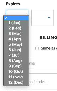
For payment details, you may be tempted to ask for the expiry date in the form of a drop down:


Try and avoid this, as drop downs can be problematic for users, as we’ve discussed elsewhere. Instead, a single input box is quicker to complete:

Be sure to set the field type as ‘tel’ in the HTML so that mobile users will see a numeric keyboard by default too:

If you'd like to find out more about why drop downs are bad for online users, head over to our blog about it.
Error messages - clear, unambiguous, helpful
Despite your best efforts, users will still occasionally make mistakes. When they do, it is vital that you help them notice and correct their errors quickly and easily.
Our criteria for error messages is that they be clear, unambiguous and helpful. Many error messages fail to meet this criteria. For example:

I have entered a card number that is too short, but the error does not highlight exactly where I’ve made my mistake. The message is also confusing and deeply unhelpful.
On the same site, if I enter a two digit Security Code:

This is ambiguous, since the actual error is that I’ve only entered two digits instead of three. The site knows this and could take steps to be more helpful.
Compare the above to this:

Next to the field in question, highlighted in red, with a very helpful guide as to why exactly I cannot enter this card number.
Card number errors are often unhelpful:

In the above case, I have entered dashes (and too many of them at that). A more helpful error message might be ‘Please only enter numbers and avoid special characters or dashes’.
Here are some more unhelpful messages:

Being ‘not valid’ is something computers say, and doesn’t help users correct their mistake. Is the number too short, or too long? Have I missed it entirely? Have I entered spaces when I shouldn’t have? Is the date in the past? Your error messages should not only highlight mistakes but help fix them too. Checkout our dedicated article on implementing error messages correctly for more information.
Pulling it all together
When building your form and asking for card information remember these key points:
- Ask for the minimum amount of information you require
- Label fields clearly, and provide additional information where needed (for Security code for example)
- Accept multiple user inputs and formats if possible. If not, help users avoid mistakes by restricting inputs that are not valid
- Make error messages clear, unambiguous and helpful
And always use data to identify your problem form fields rather than relying on guesswork.
If this has been of use to your CRO efforts and you would like to know more about how to improve your form and checkout conversion, contact us on sales@zuko.io or sign up for a demo or trial
Common Questions about Optimizing the Payment Field on Forms and Checkouts
Does asking for credit card details reduce form conversion rates?
Asking for credit card details can reduce conversion rates, especially if users are not yet ready to commit or don’t trust the process. Zuko Analytics data shows that introducing payment fields too early or without clear value can increase drop-off. However, when users have strong intent and trust signals are present, requesting card details does not necessarily harm conversion and can even qualify higher-value users.
Why do users abandon forms when asked for credit card information?
Users often abandon forms when asked for credit card information due to trust concerns, perceived risk, or lack of clarity about why the details are needed. Zuko Analytics insights show that friction increases when forms feel intrusive, when security reassurance is missing, or when users encounter unexpected errors while entering card details. These issues can cause abandonment even at the final stages of the form.
How can you optimize forms that require credit card details?
To optimize forms that ask for credit card information, clearly communicate why the details are required, provide strong trust signals such as security messaging, and minimise friction in the payment fields. Using real-time validation, clear formatting, and intuitive input design helps reduce errors. Zuko Analytics can identify where users struggle such as high drop-off or repeated corrections in payment fields so you can improve completion rates without sacrificing necessary data collection.
We wrote the book on form optimization!
"The best book on form design ever written - 80 pages of PURE GOLD"


More from our blog:
Want to get started with Zuko?
Start a free trial that includes all features, or request a demo


