How to Use Error Messages in Online Forms
Advice on how to make error messages in forms your friend and improve your checkout conversion.
We all make mistakes from time to time when completing online forms, for a variety of reasons. Forms are an obstacle to overcome before we get to what we really want, be that to purchase something, sign up for a mailing list or register an interest in a service, so we often rush them and make careless mistakes along the way - for example, I might type “tomf@ormisimoc.om” instead of “tom@formisimo.com”. User errors like this are unavoidable.
More avoidable are errors caused by:
- Unclear or confusing field labels
- Complex requirements for the data entered (for example password fields)
- Unnecessarily strong validation on fields
Some fields by their very nature are more prone to users making mistakes. They tend to be fields asking for information that a user may not have memorised, is more complex, or can be given in more than one format:
Date fields - if you’re using a free text field (instead of a drop down) - do you allow US users to enter the month first, and should the year be entered as two characters, or four?
Phone numbers – Do you allow international dialling codes (+44), brackets around area codes, or even simply spaces within the number?
Credit card/bank details – do you allow users to enter spaces so the numbers so they can reflect how they appear on a physical card?
Password fields - we’ve spoken about password issues elsewhere, but these tend to be hard to get right the first time.
So, from a conversion rate optimization perspective, if you understand that user mistakes are inevitable, how can you best help them correct their mistakes and submit your form successfully? With error messages of course, but how best to implement them?
Understand whether your error messages are causing users to abandon your form by getting started with a Zuko free trial or demo.
Error messages should be clearly indicated
When a user makes a mistake, you should let them know. And you should be clear where that error has been made. You can do this by:
- Highlighting the field in question visually, usually with an outline around the input in a bright noticeable colour (usually red)
- Adding additional icons or visual cues to draw attention to the mistake
- Stating clearly that there has been an error in the same bright colour (usually red)
These sounds fairly intuitive, but many forms fail to get these basics right.
For example, if you are listing the mistakes made at the top of the form (as a summary that one or more mistakes have been made and drawing attention to this fact), do not think that this means you should not also highlight the fields in question.
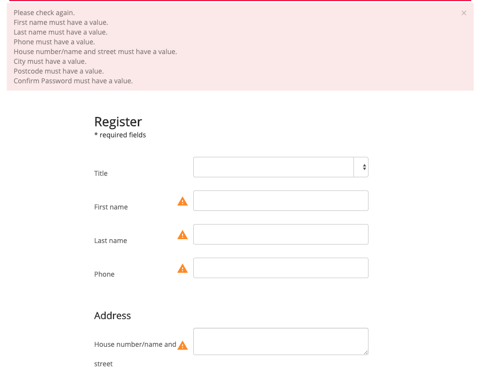
For example, in this form, the errors are listed at the top of the form:

But the fields themselves contain no visual cue that the error applies to that field - no highlight, no message next to the field.
In the following form, the input itself has not been highlighted, a red cross has been added, but the error message text blends in with the other help text and labels on the form:

There is a risk here that a user would not identify the text as error message text and simply not read it, assuming it had been there the whole time.
Compare the above with the following:

The field is highlighted in red, and the error message displays next to the field in red, using italics to distinguish the error message from other text on the form.
Error messages should be unambiguous and helpful
So you’ve shown an error message next to the field in question - what should the message contain?
A good rule of thumb here is to try and emulate how you would help a person if you were sat next to them assisting them to complete the form. You would want to speak to them clearly, helpfully, and avoid jargon words. You would not assume the person was a developer, and yet error messages are often implemented in a way that seems more befitting of a computer than a human. For example:

Does this mean my name should have or be a numerical value? Should there be numbers at the end? Similarly, ‘valid’ is a word we talk about when designing error messages, but it not common parlance for regular folk in the world:

What does an invalid email address mean? What are the email address validation rules of which you speak?
Some words then to avoid if possible:
Value, invalid, error, required
So messages like the following are better:

Or this:

Or this multi-message approach to guiding a user through entering an email address:


Special points go to this form, which also suggests a potential fix to a possible error:

If you do include some of those jargon words, ensure there is more information contained within the error message - guide them to get it right, not just show where they got it wrong.
Mistakes may be inevitable, but your error messages should help users get it right the second time.
Users should not have to memorize the fix
Listing error messages at the top of a form can in some circumstances be beneficial. For example if you have a long form on a single page and do not have a top list, a user may miss some of the errors by scrolling past them. Having them listed, and a user taken to the top of the page encourages them to review the total number of errors, then work their way through them.
However, you must always display both the list and the errors next to the fields, otherwise you may find a situation where the user reviews the list at the top:

And then scrolls down to start the process of correcting them:

The messages are gone, and the user has to remember the mistake they made as well as any guidance as to the fix.
Equally, you want to keep any helpful ‘corrective’ information visible next to the field whilst a user is fixing the issue. If you make the error message disappear when a user returns to a field (but before they’ve fixed the issue), they may simply forget their exact mistake and have to try to submit the form again to make the error message pop up again.
However, you will want to remove the error as soon as possible. For example in this field:

I left the email field blank, then returned to it after seeing an error. Even after exiting the field, the message remains. I, as a user, might think that there is still some issue with my email. The first message can be removed as soon as I type any keys in the field, and the second can be removed as soon as the user focusses-out of the field.
For example in this form, the error messages disappear as I fix them:

Inline validation and errors are great
You can read an in-depth article about the benefits of inline validation, but the TLDR is this:
“Inline validation can help users correct incorrectly formatted data as they progress through the form, hopefully resulting in less attempts to submit the form for a final time. However it should not be used as a bandage, as your ultimate goal should be to try and help users avoid mistakes in the first place, especially if their ‘mistakes’ are simply a result of your form being unnecessarily inflexible in the data it accepts.”
Which brings us nicely onto the next point:
Prevention is better than cure
You can’t talk about error messages without recognising that prevention is the best course of action. You want to try and reduce the number of avoidable mistakes people make, and you can do this with good form design.
The Baymard Institute found that “92% of top ecommerce sites have inadequate form field descriptions in their checkout process”, driving up errors. That’s just in ecommerce - the number is likely to be similar for all forms.
You should review your form, asking:
- Are the labels on each field as clear as possible? E.g. “Name as it appears on card” instead of “Name”.
- Do you have strict data format rules? Could you be more flexible? To understand this, try filling out your form with a variety of different data e.g. a really long name, a really short name (two characters), different phone number formats etc.
- Are strict data formats explained? E.g. An example of the required format shown.
This won’t reduce your error rate to zero, but it will help.
Using Zuko to track error messages
Zuko’s Custom Event tracking allows you to push the occurrence of error messages into Zuko as custom events.
This will give you an overview of which error messages are being shown most often, which occur most frequently in both abandoned and completed sessions, and also show you how many times on average they occured:

Here, you’ll want to keep an eye out for both error messages that occur for a wide percentage of people (is the field label unclear?) and also for errors that occur multiple times (is the validation broken for this field?).
This powerful feature gives you the ability to pinpoint quickly what mistakes your users are making and improve your UX by helping users correct their errors quickly and easily.
For more technical error tracking and reporting you might want to try something like Noibu eCommerce monitoring.
Some further reading:
Zuko's Big Guide to Form Optimization and Analytics -Section 2 (Top Tips and Common Form Issues)
Ux Design - Four Ways to Display Error Messages - Nomensa
Adaptive Validation Error Messages - Baymard
Error Messages - ConversionXL
Common Questions about Error Messages in Online Forms
How do error messages affect form conversion rates?
Error messages have a direct impact on form conversion rates because they appear at critical moments when users are trying to complete a form. Poorly designed or unclear error messages can create confusion and frustration, leading to abandonment. Zuko Analytics data shows that when users encounter errors they don’t understand or can’t easily fix, they are far more likely to drop out instead of completing the form.
Why do users struggle with error messages in online forms?
Users struggle with error messages when they are unclear, poorly timed, or difficult to act on. Common issues include vague wording, errors that appear only after submission, and messages that don’t clearly indicate how to fix the problem. Zuko Analytics insights show that this often leads to repeated corrections, increased time in fields, and higher abandonment rates, especially on critical fields.
How can you optimize error messages on forms and checkouts?
To optimize error messages, make them clear, specific, and actionable so users know exactly what needs to be fixed. Display errors in real time where possible, highlight the affected fields, and use simple language. Zuko Analytics helps identify where error messages are causing friction (fields with high correction rates or repeated errors) so you can refine messaging and improve form completion rates.
We wrote the book on form optimization!
"The best book on form design ever written - 80 pages of PURE GOLD"


More from our blog:
Want to get started with Zuko?
Start a free trial that includes all features, or request a demo


