
The Big Guide to Form Optimization and Analytics: Section 3
Best Practice Form Design
This is the final substantive section of the web version of Zuko’s eBook guide on web form optimization and analytics.
The web version of the guide is split over multiple sections to make it easier to parse. This page contains advice on designing your form. The other sections to check out are:
Section 1 - General Principles of Form Optimization
Section 2 - Common Form Issues and High Impact Tips
Form Analytics and Optimization Glossary
Navigation
If you are interested in a particular piece of advice you can navigate to it by clicking the appropriate link:
Clearly Identify Optional Fields
Set HTML types to the appropriate format
Be careful with Static Defaults
Best Practice Form Design
Our final section gives you specific tips on the design / UI of your form to help you optimize form conversion. There’s a wealth of advice out there from the UX professionals. We’ve collated only the most impactful points on best practice. Rather than going deep into each topic, we’ve opted for a “quickfire” overview of each tip. By providing you with the essential starting points, you can make your own mind up whether you need to dig deeper.
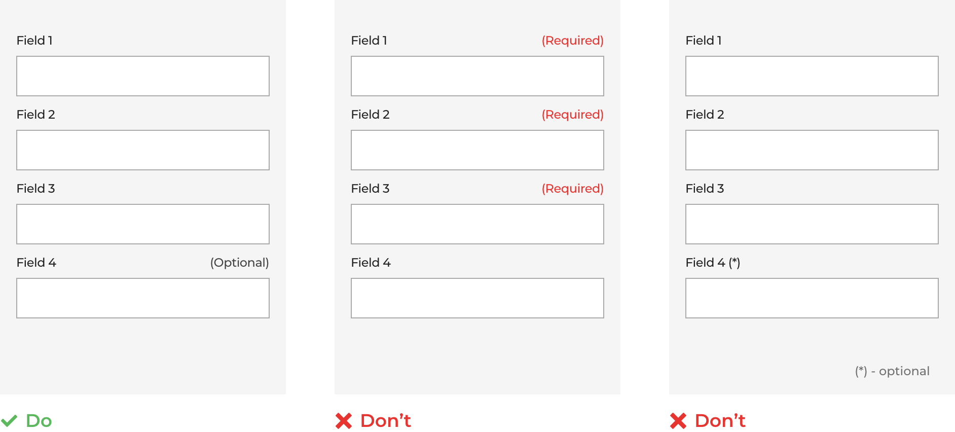
1. Clearly identify optional fields
Before you include optional fields, be darn sure you need them. Don’t lengthen the process with information that isn’t necessary.
Assuming there is a good reason to include the field, the key things to remember are:
- Never only use an asterisk. You may think your asterisk clearly denotes a “required” field but the user may not see it that way. They may think it means “optional” or that they should start looking for explainer text at the bottom. Make it clear with text which fields are optional.
- Make a decision on which fields to mark based on their relative frequency. If you have ten fields, one of which is optional, you shouldn’t mark the nine required fields. Simply label the other field “Optional” and leave it at that. If the scenario was reversed you should only label the mandatory one.
- Don’t use a negative. “Optional” is a better label than “Not Required”, which pretty much guarantees the user won’t fill it in.
2. Avoid Drop Downs
Who wants to scroll through a list of 195 countries to find the right one? Drop down menus are notorious for negatively impacting user experience. The problem is exacerbated further in mobile where fat finger syndrome adds another layer of potential mis-taps.
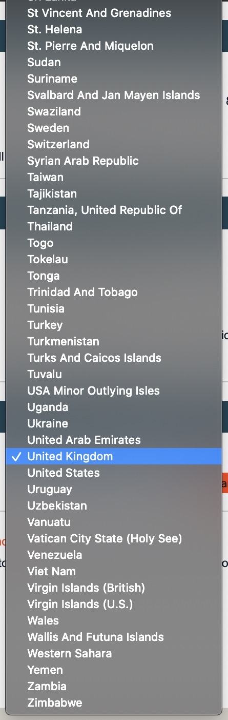
The pitfalls of dropdowns are:
- Not all users know how dropdown fields work
- Dropdowns require a higher number of minimum interactions to select a value (tap, scroll, scroll, tap Vs a single tap)
- Only a small number of options are visible at any one time on mobile screens
- If lists are not ordered, finding the correct value can be time consuming and tedious
Unless absolutely necessary, we recommend avoiding dropdowns and instead, try one of these alternatives:
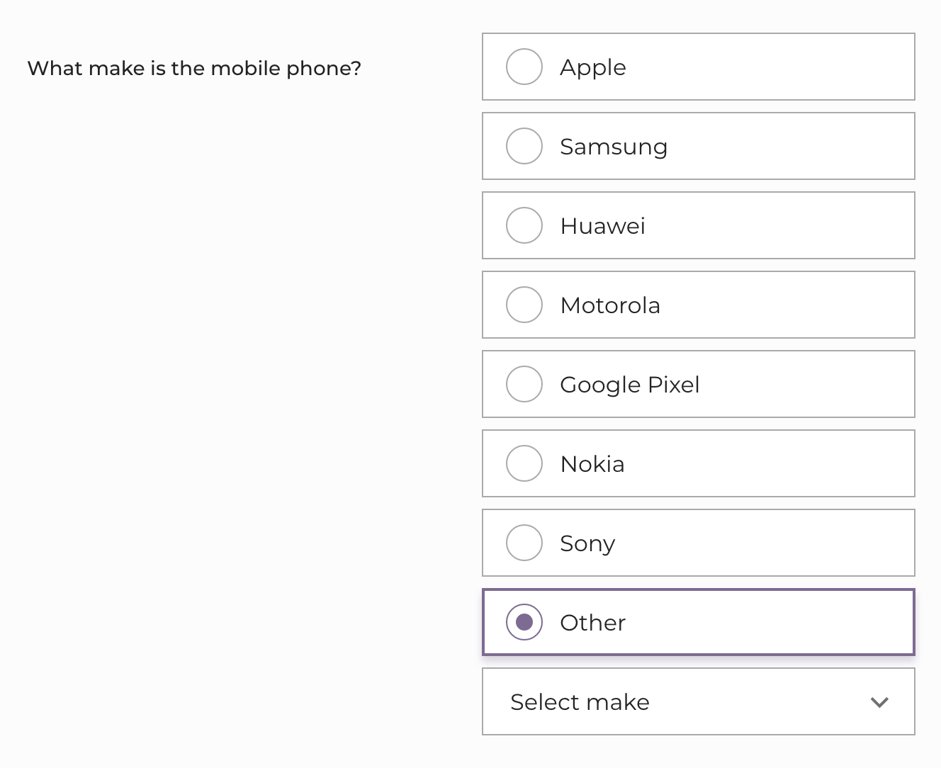
(i) Radio buttons
Let your user pick from the options displayed on screen. It’s a one click solution compared to the 4+ interactions needed for a dropdown. If your list of options is so long you think it is unmanageable, consider using an “Other” button alongside the most popular options.
(ii) Slider or increase / decrease buttons
If your field is numeric with a wide range of possible values, these give a great degree of flexibility whilst keeping the user experience as seamless as possible.


(iii) Autofill text field
If you have a huge list of options that are specific and well known (think countries), you are best using an auto search / auto fill text bar. Users know their own country so it’s a much easier experience for them to tap in the first few characters and select from a smaller range of options, rather than giving them no option but to trawl through a list of 200.

(iv) Simple text box
When you’re looking to capture a date of birth or something equally simple, just stick with a text box. It’s 6 key presses and done. No messing about with scrolling or other interactions.
Eye-tracking research commissioned by Zuko revealed that simple text boxes that were clearly labeled, distracted the user least and were completed in the shortest time.

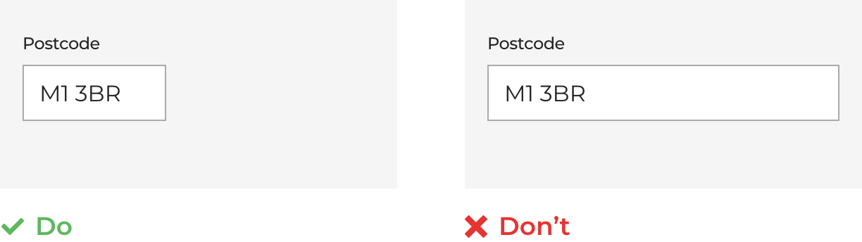
3. Size Form Fields Accordingly
A field’s input box should be in proportion to the amount of information required. This acts as a visual constraint and manages the users expectations on how much text to enter (rather than having to give them complicated instructions). As an example, a “House Number” input box should be much shorter than a “Street Address” one.
Start Optimizing Your Forms with the Award-Winning CRO Analytics Platform
Zuko helps you understand why users abandon forms, identify friction points, and increase completion rates — faster and easier than Google Analytics.
(No Credit Card Required)


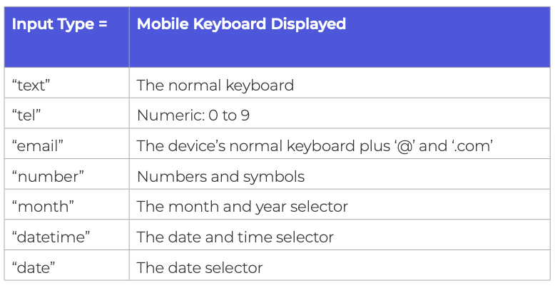
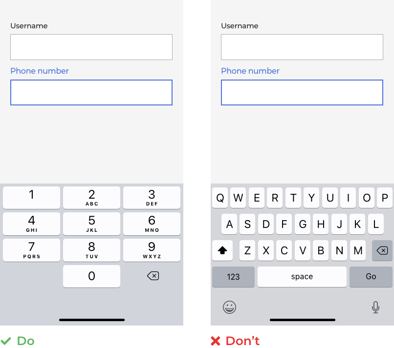
4. Set HTML types to the appropriate format
To optimize the mobile experience of your form, you need to make sure the end device renders the most appropriate keyboard for each field.
To do this, you must set the field to the appropriate input type. The relevant types you should be using are:
5. Be careful with static defaults
Static defaults are the answers the system pre-selects for all users. The user must then make an active effort to change this default. This way of doing things is popular with dropdowns (another reason not to use them). The danger is that the user sees an answer and hops quickly on it, without checking it properly. This leads to error messages later in the form and inaccurate information within your CRM system.
Only use static defaults if the vast majority of your users fall into that category (think country if you only sell into one geography). We’d only consider using them if 90%+ of your users fall into the default.
Pro Tip - If you need to add defaults, it’s much better to use smart defaults. They suggest an input based on what you know about the user already. For example, if you know the user identifies as male, you can set the default Title field to “Mr”.
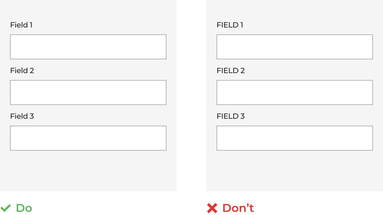
6. Don’t use CAPS for labels
We’ve discussed how to make sure your labels are clear and next to the relevant input box. You should also avoid going into SHOUTY mode. Studies, such as this one by Miles Tinker show that the use of all capitals slows down the user from scanning and processing the label. They create unnecessary delays in form completion.
7. Use Mobile’s native features
With all the inbuilt functionality that mobile devices have today, it would be crazy not to take advantage of it and use it to improve user experience. Specific functions worth exploiting are:
(i) Camera
The mobile devices camera can be used as a scanner to pick out relevant information from a document. Rather than forcing a user to manually input their passport, drivers license or credit card details, why not scan them and have the form fill them automatically? (Make sure you allow access to review and edit afterwards though).
(ii) Voice
Google reports that 27% of the global online population are using search on mobile. If you have a form requiring particularly heavy text input, why not provide a voice option for completion instead? Or make the whole form interactive so users can complete it while on the move (useful for takeaway food or ordering a taxi perhaps).
(iii) Location Services
If you’re using smart defaults for a location field, you can hook into the user's GPS location (assuming it is enabled) to display the most accurate options.
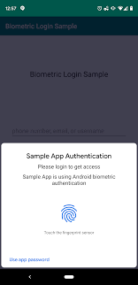
(iv) Biometrics
We’ve discussed the issues around passwords at length. If you have a form that users need to return to regularly, a biometric login will cut out all associated problems with forgotten or misspelt passwords.
8. No “Nuke” Buttons
Under no circumstances should you add a reset button that allows the customer to remove their previous work. You may think it’s a handy little shortcut, should the user change their mind on some inputs. But believe us, the amount of customers who rage quit after pressing it accidentally, means its inclusion will significantly outweigh such perceived benefits.
9. Use single column layouts wherever possible
The CXL Institute found that layouts consisting of a single column were completed 15.4 seconds faster than multi-column formats.

The multi column layout requires eyes to jag back and forth, disrupting the experience. Stick with a single column if you can (particularly true for mobile devices).
"We have used the services of Zuko for the last 2 years and have benefited from their vast knowledge and experience in digital journey optimization. As a company they are very easy to work with and be connected to and we value the input they have given us when developing new digital journeys and enhancing our existing digital propositions."
Stephen Paton, Digital & Customer Experience Manager, Sainsbury's Bank

“Zuko has enabled us to improve visitor to conversion rates for a series of clients. An example of this is a website increasing their click to enquiry rate by 25% through form changes highlighted to us through Zuko as ‘sticking points’.”
Steve Tarbard, Owner, Beyondclicks.co.uk

"Zuko was a game changer for us. It was the only form analytics software we could find that tracks data from Pardot iFrames. The depth of the data is impressive and easy to digest. Their account reps are very responsive and helpful. Overall, a great experience."
Addison Witt, Digital Marketing Manager, Emplify

"The insights we gained from Zuko have been very helpful in pinpointing the issues we are having in our form, and the team has been very helpful in gathering those insights!"
Matthias Ferlings, Online Marketing Coordinator Web Analytics, Lebara

"We're a B2B lead generation business and our forms are critical to driving quality leads to our sales teams. Zuko is by far the best tool to analyse and optimise form flow in order to improve our conversion rates."
Bryan Hunter, Head of Digital Marking, The Instant Group

“Zuko made it possible for us gain further insight into the behaviour of consumers in our forms. This gave us a lot of valuable learnings and input for conversion optimization. It’s probably the quickest way to improve your conversions!"
Robert Veltkamp, Manager Online Marketing, via Bovag.nl

"Zuko helped us decide where to put our development efforts on at the most important part of our website: our checkout forms. The new and improved checkouts, based on many valuable usage insights from Zuko, are now being built by our front-end team."
Stefan Sleutjes, Digital Strategist, Verzekeruzelf.nl

"Formisimo's easy to implement tool enabled Udacity to easily identify the outages when customers fill out lead generation and check out forms.
Zuko rocks."
Scott Wilder, Global Head of Life Cycle and Growth Marketing, & Demand Gen , Udacity

10. Easy before difficult
Ever been asked to write a 1,000 word essay at the start of a form? Of course not, that would be a horrible experience. There’s a reason that forms ask the easy questions first. By easing the user into the form with simple requests, you make them comfortable and increase the probability they’ll answer more involved questions later on.
Pro Tip - The psychological principle of consistency means users want to follow through once they’ve committed to something. By getting them to commit to something small upfront, you increase the chances of them becoming a paying customer.
11. Finger friendly touch buttons
The average adult index finger is 16-20mm wide according to the Massachusetts Institute of Technology. You need to accommodate for that when designing your mobile form. Specifically:
- Unless your target market is babies, you need to make your buttons larger than you think. Guidelines often recommend touch targets roughly 9mm x 9mm but, in reality, they should be larger than that.
- Ensure that your buttons are spaced appropriately or you will get “fat fingers” tapping the wrong one. Ideally they should be at least 8 density pixels apart.
12. Accessibility for All
This is a bit of a passion of ours at Zuko and is critical for all forms. There are numerous studies analysing the money left on the table because of the lack of accessibility on websites.
Our key recommendations to make your form more accessible are:
- Optimize your form’s tabbing navigation. Users who struggle with accessibility may use tabs to move through your form. Make sure that every field in your forms is accessible through tabbing and that the tab flow is intuitive and comprehensive.
- Label your fields well. As we mentioned earlier, this is important for any user, especially those who may be visually impaired. It should be clear which labels apply to which input boxes and they should be legible enough for all users.
- Don’t use icon fonts. These are the fonts that contain symbols / glyphs rather than letters or numbers. Some of the software used by dyslexics to help them navigate the web can’t read icon fonts. Instead the user is left with a series of confusing rectangles. With one in ten estimated to have some form of dyslexia, this audience is too big to alienate.
- Avoid dropdowns. We’ve said it before but it’s worth repeating. Long lists of options on a small mobile screen don’t work well with impaired vision.
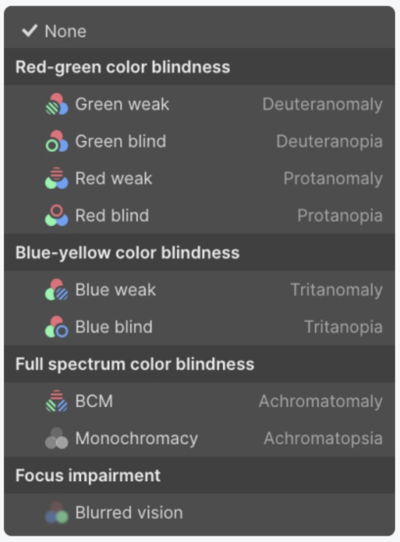
- Test your form using a vision preview tool. This lets you see how it would appear for a visually impaired person such as this one from Webflow.
That’s it for now. Thanks for getting this far! If you want to check out the other section of the guides you can use these links.
Section 1 - General Principles of Form Optimization
Section 2 - Common Form Issues and High Impact Tips
Form Analytics and Optimization Glossary
Alternatively, to download and keep a permanent copy of the guide that you can share with your colleagues, click here for the eBook download landing page. You may also be interested in Zuko's Step by Step Guide to Using Data to Optimize Forms or our White Paper on Optimizing Financial Forms.