
The Big Guide to Form Optimization and Analytics: Section 1
General Principles of Form Optimization
This web guide is an abridged version of Zuko’s comprehensive eBook on how to optimize your form’s conversion rate performance. You can download the pdf version of the optimization guide here.
The guide is split into multiple sections to avoid overload. This page focuses on general principles to improve your form performance. You can read the other sections using these links:
Section 2 - Common Form Issues and High Impact Tips
Section 3 - Best Practice Form Design
Form Analytics and Optimization Glossary
If you are looking at improving the conversion of a form in the financial industries, you'll also want to check out our White Paper on Optimizing Financial Forms. We also have a more practical Step-by-Step Guide that will show you how to use data to identify and fix the issues on your forms.
Navigation
Use these links if you want to skip to a particular principle:
General Principles for Form Optimization + Measure Improvements
Look at the form through fresh eyes
Optimize for Mobile as well as Desktop
Length doesn’t matter as much as you think
Why Form Analytics?
As Form Optimization specialists, Zuko are often told that we occupy a very specific niche.
That’s true but it is a very important niche.
Companies spend millions on driving traffic to their website but considerably less on making sure their site will convert that traffic when it arrives. The most clued up businesses are becoming wise to this and conversion rate optimization is now a hot topic. Forms are at the cutting edge of this. Like it or not, successfully getting users to enter their details into your form or checkout will determine whether your website or eCommerce checkout is a success or failure.
This is where specialist form analytics comes in. By identifying when, where and why your users are abandoning your web form you can make informed decisions on how to alter your site in order to improve your conversion rate and, ultimately, positively impact your business's success.
At Zuko, we see millions of pieces of form data flow through our systems every day so we know that even the best designed forms can improve their conversion performance further. Our latest benchmarking study indicated that a third of users that start a form never successfully complete it. That’s a lot of room for improvement and, if you’ve never even considered form optimization before, it’s likely that your form performs a lot worse than that.
That said, this guide isn't about reviewing Form Analytics products. We’re not going to push Zuko at you (although if you want to give us a trial we’d love to have you). Our goal is to give you a practical guide to immediately improving the performance of your own form and checkout.
We know that no form is the same, so we start out with guiding principles that you should follow when undertaking a form optimization. We then delve into some common issues that cause form abandonment and how to rectify them. Finally, we share some best practice in achieving strong form design to make the user experience as frictionless as possible. We even provide a handy glossary for you to refer to.
We’ve based our advice on the principles used by our consultants when they deliver their optimization projects. Therefore we’re confident this advice can be employed for pretty much any form with positive results. Our goal is to make the web less frustrating. We want you to become your own mini-consultant, able to use our advice to make forms better for users in your own organisation and beyond.
If you want to take a step back and work from first principles before you get into the more advanced content, you can also check out our article on the basics of form analysis.
The Importance of Form Analytics: A Case Study
If you’re still doubting whether it is worth sparing the resource to improve your forms, here’s a real life story that shows just how effective form analytics can be.
One of Zuko’s financial clients (name withheld to protect the guilty!) was frustrated by lacklustre conversion rates for their application form. By implementing form analytics over a period of two months they were able to identify where and when users were abandoning the form and produce credible hypotheses as to why they were dropping out.
From the data, they were able to pinpoint form amendments that were likely to reduce friction in the form. Specifically, they implemented these actions:
- Changed the wording of an error message that seemed to be causing user confusion
- Added functionality that recognised misspellings of common email address providers (e.g. converting “gnail.com” to “gmail.com”)
- Reduced the size of the cookie acceptance box on mobile that had been obscuring parts of the form
- Optimized the touch keyboard defaults for mobile users to make sure the right keyboard was shown at the right time
- Updated the size of tick boxes that were delivering a clumsy user experience for both desktop and mobile users
The results were monitored and the success of the project was confirmed when it was revealed that:
- Completion time for the form dropped by 11%
- User corrections users fell by 37%
- Form abandonment fell from 61% to 19%
- Overall conversion doubled from 39% to 81%
Admittedly, this is a cherry picked example from amongst the best form analytics implementations we have witnessed, but even the low to medium impact projects we have seen (for example, when form performance is high to start with) have shown a significant return on the time and resource invested in them.
General Principles for Form Optimization
For anyone about to start a form optimization project, here’s our advice and general best practice. Following these guidelines will help your optimization be a success and you’ll also be able to prove it to your colleagues (often just as important!).
1. Measure Improvements
This is one we’re very passionate about. To evaluate whether the project has been a success, you need to measure the right metrics from the get-go, While you could just apply the tips we share in this ebook and, you know what, your form would almost certainly get better, without appropriate tracking, you would never be certain. Rather than making blind changes and hoping for the best, measurement is key.
So, you need the data, but where do you get it from? We obviously have a preference ;-), but there are many Conversion Rate Optimisation products out there that could do the job. In a pinch, if you don’t have any budget for software, you could use Google Analytics. But keep in mind this only gives you a topline view. It won’t enable you to dig deeper to identify the problem areas within your form.
As a minimum, we recommend that your form analytics tool includes:
- The ability to track topline form performance and conversion over time so you can identify whether any changes you make are effective
- A breakdown of each field within your form so you can know which ones are driving abandonment, how long users take on each field and which ones users end up returning to
- A user flow metric or visualisation - how does the user move through the form, where do they get stuck and what may be causing them to abandon?
- Segmentation analysis - more on this later but it’s crucial that you can segment your data to see whether your conclusions apply to all users or just to specific groups. You should be checking whether your provider can segment by browser, device, traffic source, product, geography and A/B test variants as a minimum.
2. Track your ROI
In order to get the resources you need to get your optimization project underway you’re going to need a business case. Fortunately, this shouldn’t be too tricky. You just need to know your basic metrics on current conversion rates plus the average value of a conversion and plug it into the equation:
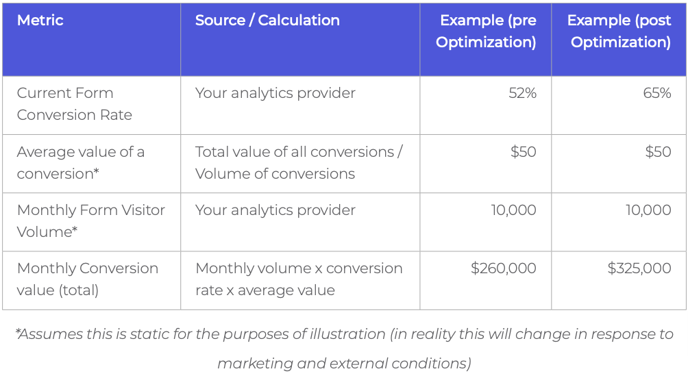
In our hypothetical example above, monthly revenues through the form or checkout increased by 25% due to the optimization project. If you want to go further you can calculate a return on investment ratio. Divide the revenue improvement by the amount you spent on the project (likely a modest amount on your form analytics tool + an allowance for the time spent by individuals to run the project). Remember, though, that optimization is the gift that keeps on giving. Once you have made those adjustments you’ll see the conversion rate improve every month. Be sure to account for that in your revenue increment figure (we generally recommend basing it on the first year’s uplift for simplicity).
We’re often asked how much you can expect an optimization project to deliver. Which brings us nicely to our next principle….
3. Benchmark your performance
We have to be careful on this one. Every form is unique. Each has different questions, varying length, and particular visual design. Most importantly they all have disparate audiences who may react differently to particular form features. Our general advice is therefore to benchmark your form only against itself. Is it performing better after a change or not?
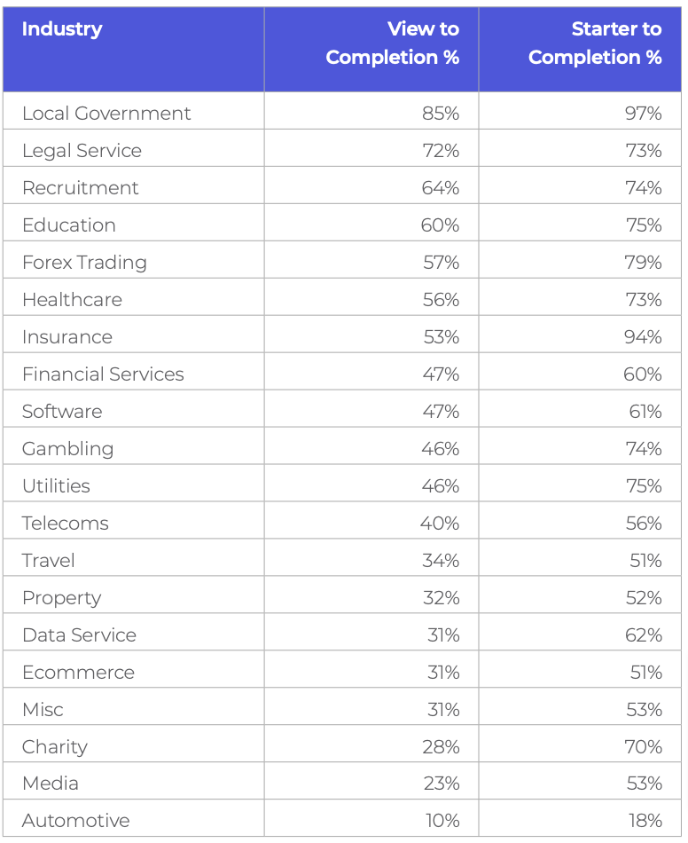
Having said this, “Is my conversion rate good?” is probably the next most common question we get asked by clients. In acknowledgment of this, we’ve made Zuko’s aggregated form data available to all through an open source form benchmarking database You can take the benchmarks shown within it and make your own mind up on how to use it and whether you use it as a benchmark for your business.
You’ll also see we’ve given you the topline conversion data for different industries and form types below. Just remember though: these data points are averages. There will be many forms performing better or worse than the metrics we share here.
Pro Tip - Don’t get too hung up on these numbers lest you become vain or bitter. They‘re a rough guide only; each category contains a broad range of diverse forms. Start simple - compare your form’s performance this month to last month’s and take it from there.
Average form conversion by industry
Average conversion by form type
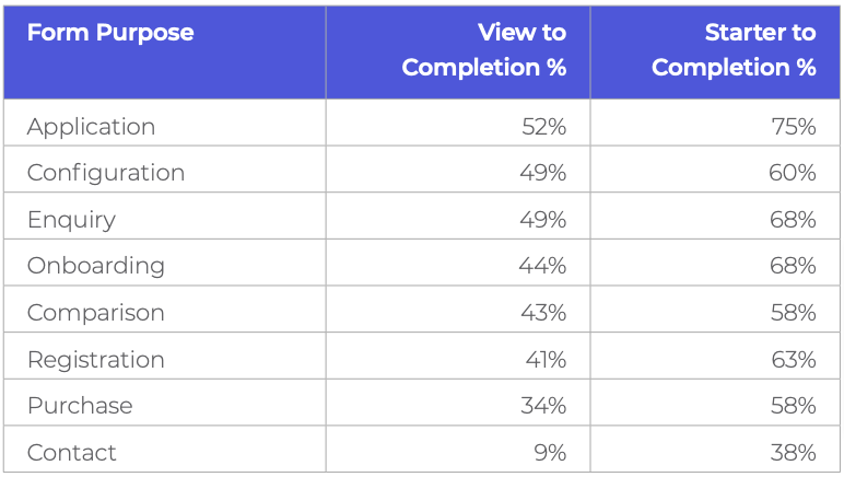
View to Completion % = Proportion of users who view the form (i.e. arrive at the form page) who end up completing it.
Starter to Completion % = Proportion of users who start to fill in the form that end up completing it.
Start Optimizing Your Forms with the Award-Winning CRO Analytics Platform
Zuko helps you understand why users abandon forms, identify friction points, and increase completion rates — faster and easier than Google Analytics.
(No Credit Card Required)


4. Look at the form through fresh eyes
Sitting in our marketing bubble, it’s easy to forget that our users don’t look at things the same way we do. What we see as industry-standard password instructions, users see as arcane hieroglyphs aimed at confusing them. What we see as a standard pathway to completion, they see as a journey fraught with the potential to get things wrong.
Pro Tip - When assessing the usability of your form, it’s essential that you put on a fresh pair of eyes in order to identify what could be confusing the user. Summon the inner spirit of your grandmother and try to navigate your form as if you had no prior knowledge. Better still, get your grandmother to do it herself. Double better still, get a whole cohort of your target users to test out your form and help you develop hypotheses on how to improve.
5. Break the form
Again, with our “Star Marketer” hats on, we have to be careful we don’t put our own assumptions about how and why users should behave in our forms into our analysis. You can guarantee if it’s possible for someone to inadvertently tap on a button you don’t want them to, or click multiple times on something or press “back” despite you telling them not to, it will happen. A lot.
When reviewing the usability of your form leave no stone unturned. Despite that voice at the back of your head saying that no-one in their right mind would submit a form with no input, you need to do it and see what happens. Breaking the form is good! If it's repeatable, it means customers will be having the same issue. Fixing it will lead to an improvement in user experience and conversion rates.
With that in mind, here’s our general tips for putting your digital hardhat on and taking a sledgehammer to your form’s UI.
- Submit the form blank (without entering anything). What message does the user get? Is it clear what they’ve done wrong? Are they told how to fix it?
- Miss out certain fields and try to submit. What happens? Are all errors shown clearly? What do the errors show? Are they easy to understand?
- If your form is a multi-step journey, go forwards and backwards multiple times to see what happens. Is data wiped or kept? Does a customer have to repeat information they’ve previously entered?
- Leave the form for 20 minutes. Are you timed out? What happens? How frustrating is this for users? Are they warned about this at any stage?
- Error messages should be as helpful as possible. Most are not (see later). Do they describe what went wrong? Do they help a user to fix it?
- If there is a number field, try to enter letters and symbols, see what happens. Does the form accept it and cause problems at your back end? Or does it reject the input? If so, how clear is the error message?
- Similarly, if it is a letter / text field, try to enter numbers to see what happens.
- Try to put spaces and brackets in where possible. Does this cause issues (e.g. with phone numbers)? What would the customer expectation be? Would they normally be able to use spaces?
- Deliberately misformat emails, phone numbers, credit card numbers, etc. Enter too few and too many characters to see how the form handles it.
- Password fields - put too few letters, only letters, basically ignore any best practices and see what the error messages are (if any).
- Buttons - do the button explain clearly what they do when you click them? Do they work all the time? Pay special attention to the navigation buttons. Can you use them to go anywhere in the form without losing your data? Do inactive buttons look inactive or do they look like you can click them and get a response?
For each of the points above, always try to channel what a user would think (your grandmother again!) What would they do in response to something unclear? Would they abandon? How much would they struggle? Watch our Crimes of Form Design webinar for more inspiration.
6. Optimize for Mobile as well as Desktop
Most web designers and marketers work primarily on a PC or Mac so their first instinct is to optimize for the device they are currently using. If not checked, this impulse can serve you poorly.
A 21” monitor screen will provide a very different user experience than a 5” phone screen and should almost be treated as a completely different form when it comes to design and UI.
With over half of all of web traffic now coming from mobile users it’s imperative you always consider mobile in your user journey.
The positive news is that Zuko’s latest data shows that mobile form conversion is now approaching that of desktop so the web form community is getting the message that mobile matters.
Section 3 provides some specific design tips to help you get the best out of the mobile environment but ahead of that, here’s our most important advice (over and above what you would do for any form):
- Prioritise legibility and responsive design. We’ve lost count of the amount of forms that are just ported over lock stock from desktop to mobile. Some of those forms are barely legible on the big screen so how do you think they fare on a pocket device?
- Leverage mobile’s strength. That device in your pocket has more computing power than the one used to fly astronauts to the moon. More importantly it has a number of features that your laptop or desktop PC does not have and that can be used to expedite the customer’s form journey. Most prominently, your phone has a camera / scanner that can be put to good use. We’ve seen hundreds of forms that have benefitted by allowing users to scan in their details (from a driving license, QR code, credit card or passport) that can save time and prevent errors. Make sure you audit your form journey to see if you can incorporate this function to improve your conversion rate (see later for more detailed advice).
- Consider processing and 4G speeds - simplify. Mobile devices have lower processing power than desktop computers. They also (if using 4G) have slower web connections than broadband. This means they’re less able to download bandwidth hungry images and animations so cut them out.
7. Length doesn’t matter as much as you think
It’s long been an axiom for form designers to rip out as many fields as possible to try and maximise conversion rates. The received wisdom goes that, every field you add increases friction for the user making it more likely they’ll abandon.
This isn't necessarily the case. One recent study indicated that by reducing the number of fields from 9 to 6, conversions for one form actually fell by 14%! Shorter isn’t always better and this is backed up by Zuko’s real-world data.
Take a look at the graph below.
It plots a form’s conversion rate against the number of fields it contains. The straight line is the trend across all the forms and, you know what? It’s flat. This implies that, on average, the number of fields in a form makes no difference to its conversion rate.
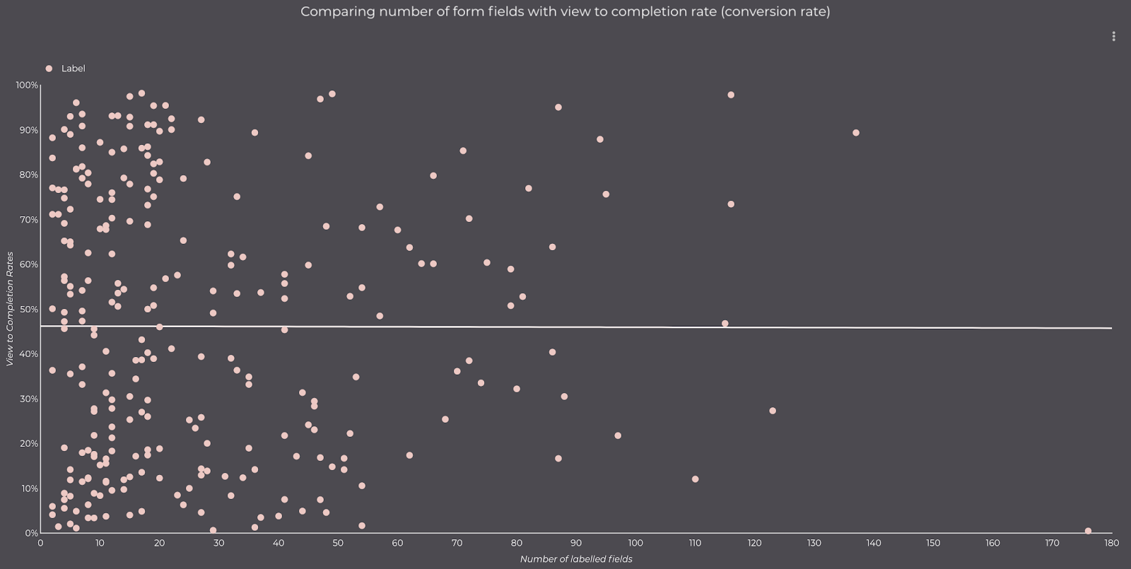
Mindscrew anyone? That’s the feeling you get when something you always believed to be correct is not the universal truth you thought it was.
Of course, we’re not suggesting you should add extra fields to your form willy nilly and it will make no difference to conversion. We’re simply saying that form length, in and of itself, doesn’t impact greatly on conversion. It’s more important to focus on whether the fields are appropriate. How engaging are they? How relevant are they to what the user is trying to accomplish? As ever, focus on the user and what your actual data is telling you rather than relying on outdated axioms.
8. Focus on the Submit button
If you only take one thing from reading this guide it should be this: Always look at what happens when people abandon after clicking your submit button. This is the digital equivalent of leaving money on the table. These users have spent the time filling out your form. They have clicked “submit”, suggesting they’re happy to give you their valuable personal information.
Yet you still don’t make the sale. Why?
Across the Zuko database, we see that solving this issue usually provides the biggest uplift in form performance over any changes that form owners can make.
To solve this conundrum and find out what causes valuable users to abandon, once again you need to turn to your form analytics data. Look for answers to these questions:
- What error messages did they see after submitting? Are these potentially misleading or, worse, likely to scare them off altogether? (financial forms are often guilty of this)
- Which form fields did they return to? By seeing where they went after submit you can see where your form friction is.
- Did they return multiple times to particular parts of the form in an effort to get things “right”? If they go back more than once to a field and still can’t get it right there is likely an issue with either the messaging or the inputs that you accept.
- Did they go elsewhere on your site? Are there distractions on the form that may tempt them away, even if they are just doing it to try and work out how to progress?
- How many times did they try before giving up? If users are trying multiple times to complete your form they must really want what it delivers. While this is positive (you have created genuine demand), multiple interactions with the same field do indicate an underlying issue.
Once you’ve identified what the issue is, you can remedy it. Smooth out the customer journey and avoid your most enthusiastic users dropping out unnecessarily in the future.
9. Identify your problem fields
One of the main advantages of a data driven approach is that it's easy to identify which fields your users have problems with. The ones that are driving abandonment rates higher than they need to be.
How do you identify which fields are causing the issue? There are various different indicators that, together, give you a good idea of where improvements can be made. Looking at what users do after the submit button gives you a great starting point. But also consider these data points:
Abandonment
What is the raw abandonment rate for each field? I.e. What percentage of all abandonments happen at each field. This is typically the first metric to look at but don’t take it as the be-all and end-all as it can be misleading. Just because a form element was the last thing to be interacted with before a user left a form does not mean that it was the crucial factor in abandonment. The most common scenario is if there's a high abandonment figure against the “submit” button. In these cases it's usually the error messages generated by pressing submit that drive abandonment rather than the button itself.
Field Returns
How many times do users return to the field? If that number is high then it’s likely users are having trouble completing the field in the format required. For more advanced analysis, you should isolate the user journey for people who have to return to this field (using the functionality of something like Zuko’s Session Explorer). This way, you’ll be able to see where they are being driven from (is it due to error messages triggered by the submit button or something else)?
Again, be careful here. A high number isn’t necessarily a bad thing. Some fields (think personal statements for university applications) will naturally involve a high degree of returns - although if your basic fields such as name, email or phone number have field returns averaging 2 or more you should definitely be concerned.
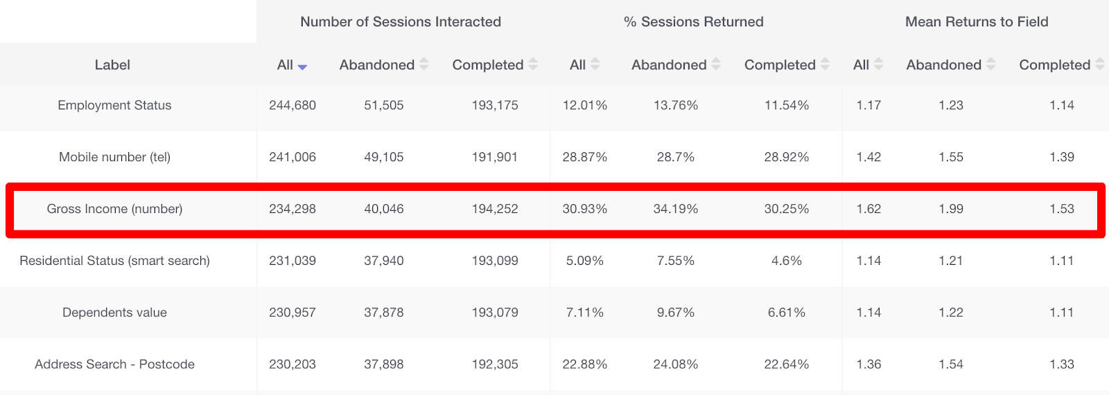
Pro tip - don’t focus on the absolute figure for field returns. Instead, look at the difference in the stats between completed sessions and abandoned sessions. A significant difference between these figures indicates this particular field is likely contributing to abandonments.
This Zuko screenshot shows a field (Gross Income) with a large difference in returns between abandoned and completed sessions. This is a clear indicator of friction in this field.
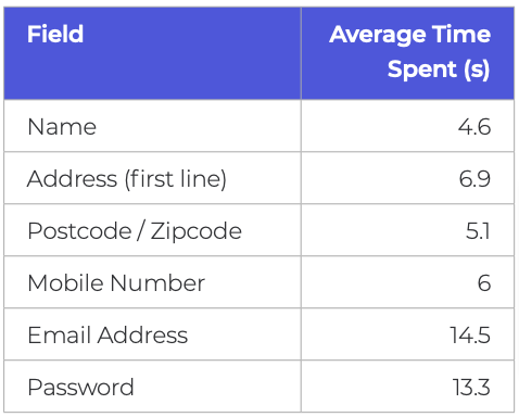
Time Taken
How long are users taking to fill in each field? Generally, the longer the time taken, the more problematic the field is. However, at the risk of sounding like a stuck record, this isn’t an absolute rule. Some fields just take longer to complete than others (see below for Zuko’s time taken benchmarks for common fields). It’s the difference in the length of time taken in abandoned and completed sessions that is important. If users spend significantly more time on a field in abandoned sessions than they are in completed sessions, there is a strong likelihood that the field is causing them issues. If the situation is reversed (users taking longer in completed sessions), this is an indicator that the user probably isn’t interested in the field or it looks too daunting to even start it.
"We have used the services of Zuko for the last 2 years and have benefited from their vast knowledge and experience in digital journey optimization. As a company they are very easy to work with and be connected to and we value the input they have given us when developing new digital journeys and enhancing our existing digital propositions."
Stephen Paton, Digital & Customer Experience Manager, Sainsbury's Bank

“Zuko has enabled us to improve visitor to conversion rates for a series of clients. An example of this is a website increasing their click to enquiry rate by 25% through form changes highlighted to us through Zuko as ‘sticking points’.”
Steve Tarbard, Owner, Beyondclicks.co.uk

"Zuko was a game changer for us. It was the only form analytics software we could find that tracks data from Pardot iFrames. The depth of the data is impressive and easy to digest. Their account reps are very responsive and helpful. Overall, a great experience."
Addison Witt, Digital Marketing Manager, Emplify

"The insights we gained from Zuko have been very helpful in pinpointing the issues we are having in our form, and the team has been very helpful in gathering those insights!"
Matthias Ferlings, Online Marketing Coordinator Web Analytics, Lebara

"We're a B2B lead generation business and our forms are critical to driving quality leads to our sales teams. Zuko is by far the best tool to analyse and optimise form flow in order to improve our conversion rates."
Bryan Hunter, Head of Digital Marking, The Instant Group

“Zuko made it possible for us gain further insight into the behaviour of consumers in our forms. This gave us a lot of valuable learnings and input for conversion optimization. It’s probably the quickest way to improve your conversions!"
Robert Veltkamp, Manager Online Marketing, via Bovag.nl

"Zuko helped us decide where to put our development efforts on at the most important part of our website: our checkout forms. The new and improved checkouts, based on many valuable usage insights from Zuko, are now being built by our front-end team."
Stefan Sleutjes, Digital Strategist, Verzekeruzelf.nl

"Formisimo's easy to implement tool enabled Udacity to easily identify the outages when customers fill out lead generation and check out forms.
Zuko rocks."
Scott Wilder, Global Head of Life Cycle and Growth Marketing, & Demand Gen , Udacity

10. Use the data to remedy your problem fields
If you’ve followed the steps in section 9 using your form analytics data, you should now have a good idea which fields are an issue and need to be “fixed”.
This should be done through a “test and refine” approach (more on that later) but first you need to generate hypotheses to test.
Use the data to create your theory on what is causing the user friction.
If you’ve been looking at the form through your users eyes and fully understand what the data is telling you, you should be able to have a good go at creating these hypotheses. However, as a starter, we’ve included below some of the more common issues and the remedies that we frequently see fix them.
Abandons
A large volume of abandonment on a field is never a good thing. Potential reasons and remedies include:
(i) The customer is unwilling to provide the information that your field is asking for in order to progress in the form journey.
This may include sensitive or overly personal data that the customer decides is not worth the risk of providing.
Potential remedy - remove this field, or explain why you’re asking for this data with some microcopy or help text.
(ii) The field requires data the customer is unable to provide right now.
Commonly, this includes complex information such as Social Security numbers, credit card info, or tax IDs as well as expiry dates for current products (e.g. insurance). Your user may not have been aware that they were going to need this information so didn’t have it to hand and decided to leave. They may return at a later time but it’s best not to rely on this. They could just as easily be tempted away by your competitors in the meantime.
Potential remedy - make it clear at the start of the form journey what information will be required. If the relevant data is available on national databases (such as this one for UK car owners), then provide a link for your users to follow. If possible, allow the user to make some submission/commitment without this info, and then get them to provide it later on.
(iii) The user wants to provide the information required but is unable to, as your form is broken.
This is a big, completely unnecessary bug that should be easily solvable. If your field is asking for relatively simple information that’s not overly sensitive yet still has a high level of abandonment, it could be there’s a breakage.
Potential remedy - you need to involve your developers in the solution. However, the easiest way to diagnose the bug is to open the form yourself and interact with the field in question. Try out different data formats and run tests across multiple device and browser types. If you still can’t work out what’s wrong with the field, try submitting the entire form. What happens?
(iv) A field in your form is visibly complex or intimidating. So much so, the user doesn’t want to attempt it.
This may create a large abandonment rate for the preceding field. As an example, if you ask for simple information such as name, then follow with a large field asking the user to write 500 words on why they should be accepted into your exclusive club, you should expect an artificially inflated abandonment figure for the “Name” field.
Potential remedy - make your complex field less intimidating. Let the user save and come back easily or make it clear from the start what’s required so they are prepared.
(v) Coupon or voucher code fields are driving users away.
It’s a common phenomena for coupon code fields in eCommerce checkouts to actually increase, rather than reduce abandonment. The mere presence of a field gets the user excited about the potential for reductions so leaves the site to try and find one. In the process they are tempted away by a better discount from a competitor or, worse still, come back and rage quit after their hard found coupon code is callously rejected by your checkout.
Potential remedy - reduce the visibility of the discount code field, or make it only accessible to those that have been referred from affiliate sites.
Field Returns
For some fields you may expect a large proportion of field returns. For example, forms that generate quotes for particular products (travel, insurance, etc) will often see high returns as users go back and “tweak” fields to check the impact on the final price.
However, there are some fields where users shouldn’t have to keep returning. If you see high returns for name, address, email, phone number or password, you know something is wrong as users generally get them right the first time around.
In Zuko’s experience, if these fields have high returns it’s usually due to validation restrictions. You ask for information, users try to answer, but your form rejects the way in which they provide it. Occasionally, this will be because the user makes a genuine mistake but a high number of returns may indicate one of the following:
Password - your requirements are too restrictive, or not stated clearly enough (see later for more advice on this issue).
Phone number - are you forcing the user to add spaces, brackets, and international dialling codes? Or are you preventing them from doing so? Allow users to enter a phone number how they want to, and do the backend work to reformat this to your requirements.
Zipcode / Postcode - As with phone number fields, are you requiring them or blocking them from including certain elements they would expect (e.g. spaces, letters as well as digits, etc). Make it as easy for them to submit the information in as many relevant formats as possible.
Email - do you block some unusual domain names? Some forms forbid email addresses ending in things like ‘example.business’ or ‘example.company’. You should be accepting these, as they are valid email addresses.
Time Taken
The time spent in a field tends to be correlated with returns (high returns tend to drive a higher time spent) so should be looked at in conjunction with that data. Look at the difference between abandoned and completed sessions as noted previously.
Pro Tip - In addition to looking at the relative data, you should also pay attention to absolutes. If the data for a field takes you by surprise in how long users are taking to complete it (high or low), compared to how long you expect (ideally based on your pre-testing), there may be an underlying problem that needs to be fixed. This could be technical (users can’t submit so are taking longer in the field) or UI based (are the instructions clear?).
11. Test and refine
Once you’ve identified and fixed the biggest issues with your form, there’s a tendency to sit back and move onto the next item in your in-tray. Problem solved, right?
Wrong. The thing that separates the best performing forms in Zuko’s database versus the merely average, is a willingness to commit to continual improvement. A half percent improvement here, a one percent decrease in abandonment there, compounds over time to make significant impacts on your business’s bottom line.
This essentially means testing, either A/B (testing one form variant against another with one variable changed) or multivariate (testing multiple variable changes at the same time). These techniques show similar user groups different versions of your form and see what the result is on behaviour. Is conversion up or down? Which fields were positively or negatively impacted? By testing a small number of changes at a time you can build up learnings on what works and what doesn’t.
Pro Tip - Trial these changes in your A/B tests to see whether they make a difference: (i) Remove non-essential boxes or move them to later in the form; (ii) Change the way you ask for information (perhaps "Email" rather than "Work Email", "Cell Phone" rather than "Work Phone"); (iii) Add microcopy to reassure the user what will be done with their data.
You may want to use a specialist A/B testing tool to get the most out of this technique. Google Optimize, Optimizely, Sitespect and Convert.com are among the most popular of these. Read our in-depth article on how to A/B test your online form for a more detailed overview on how to go about this.
You can find more useful resources and tips on A/B testing at Guess the Test, a resource repository for conversion testers.
Pro Tip - In order to gain the most from testing, your form analytics solution should integrate with your A/B testing tool. This facilitates a deeper dive into the data. Be sure to check it does before committing to a subscription.
12. Segment your analysis
We’ve hopefully given you some sound advice that’s already helped you improve your form conversion. Or even gotten you some internal fame within the business (maybe even a nice new work chair as a thank you from the CEO!). To truly level up and become a form optimization ninja you need to heed this final point.
Segment, segment and segment again.
This is an article of faith for McKinsey consultants (and their competitors) and is equally important for you too. All the topline data you view about your form is an aggregate or average. That’s great if you want a general overview and it will still surface your biggest issues. If you want a proper deep dive, however, you need to segment your data to find out what’s going on within different user groups. It’s very common that different groups make their way through your form in different ways and respond contrastingly to Calls to Action.
Some of the key segmentations you will want to run are:
Device - Forms are rendered differently on mobile devices and users interact differently. You need to segment by device to discover if your mobile, desktop or tablet users are more likely to abandon at specific points.
Browser - Whilst developers try to make the form render successfully across all browsers, we often see some slip through the net. You don’t want Firefox (or Safari, or Edge) to have a difficult time with your form just because of your browser choice. Segmenting by browser lets you identify, and rectify, this.
Geography - Do users from different countries behave differently in-form? Perhaps you should serve them a version adapted to their location.
Traffic Source - We have consistently found across our user base that organic traffic behaves very differently to paid-for traffic (they tend to convert at much higher rates). By segmenting by traffic source (ideally down to exact referrer) you can determine whether a channel is working for you and whether you need to build specific forms or make some subtle changes for different sources.
Demographics - Are user’s personal characteristics important enough for you to track? Pull them through into your analytics provider so you can segment by them. You can then see clearly how each of your segments behave.
Product - Do users select a product on your form? Retrospectively apply that segmentation to understand the hurdles for each product group and whether you need to adapt the journey for some of them to improve conversion.
Like these tips? Read more in Section 2 - Common Form Issues and High Impact Tips.
Or download the pdf eBook to take away and read at your leisure.