Using Data to Optimize your Forms and Checkouts
A Step by Step Guide
Welcome to the abridged web version of Zuko's step by step guide on using data to optimize your form's conversion rate. For the full pdf version you can download the optimization guide here.
Navigation
Skip to a particular subject using these links:
Step 1: Gathering Data and Setting Benchmarks
Step 2: Identify Problem Areas
Foreword and Overview
Zuko has previously published two guides aimed at helping businesses improve the experience of their online forms. The first, Zuko’s Big Guide to Form Optimization and Analytics, provided a comprehensive overview of common problems found in online forms and ways to mitigate them. The second, Optimizing Financial Forms, was a white paper focused on issues specific to the banking, insurance, forex, and credit card industries.
These guides were well received by the CRO/Experimentation community, but there were requests for a more detailed guide taking businesses through a step-by-step process to optimize forms. This feedback formed the genesis for this white paper.\In the paper, we share the practical process of improving the conversion
In the paper, we share the practical process of improving the conversion rate of your web forms and checkouts. The use of data in this is crucial. Without proper hypotheses and the real life data to test them, you’ll never know if your form changes are working. The paper is structured by the different stages in the process, taking you through how to identify where the issues are in your form, formulating hypotheses to test, running those tests, and assessing the results. We hope that it helps you develop your optimization process. If you have any questions, we’d love it if you get in touch.
Step 1: Gathering Data and Setting Benchmarks
(but be careful)
“What is a good conversion rate for my form?” is perhaps the most common query we get asked at Zuko. This is the classic unanswerable question. Every form has different elements, audiences and objectives, so the only truly honest answer is “better than last month.”
That said, there are ways you can set benchmarks to measure your form optimization progress.
At the macro level, Zuko has aggregated data from thousands of forms that have added our anonymised tracking, giving us an idea of prevailing conversion rates across various sectors. This data is available on Zuko’s benchmarking page.
However, as your mother should have told you, never judge yourself based on others; you’ll only end up vain or bitter. It’s much better to gauge your success by comparing yourself to your past performance. To do this, you’ll need to set an internal benchmark based on actual data.
Ideally, you’ll want to use an A/B test when making any changes to your web forms. This allows you to directly compare the results of a new version of the form against the status quo and be certain that the changes are causing the uplift rather than external factors. We examine A/B testing in more detail later, but in cases where such a test is not possible, you’ll probably end up running a linear
test. This involves making changes and seeing if your metrics go up or down. If you use linear tests, you need to make darn sure that you’ve got robust benchmarks in place, or you’ll never be able to conclude whether your test is a success (or a “failure”).
So which metrics should you include in a benchmark? The most obvious one for forms is completion rate - the proportion of visitors who submit the form or checkout successfully. A note of caution, however. It can be relatively easy to increase this metric if you don’t
care about the quality of your conversions.
You should also include metrics such as average order value (AOV) and final conversion figures (if your form is lead gen focused) to ensure you are not making changes that dump garbage into your sales funnel.
If you’re using a form analytics tool, you can also benchmark the performance of individual form fields and elements. For example, if you make a change to the error messaging, microcopy, or validation of a field, you should also track the effect that this has on metrics like;
- Abandonment rate of the field.
- Number of times a user has to make a correction or gets an error message on the field.
- Time spent completing the field.
By collecting such data you can pick up on smaller UX issues that would have not been obvious if you only look at the blunt metric of a form’s overall form conversion rate.
So how do you gather this data in the first place? You can obviously get a basic version of form tracking by creating a rudimentary funnel in Google Analytics but we would always recommend using one of the dedicated providers who have built tools specifically for this purpose.
Want to get started with Zuko?
Start a free trial that includes all features, or request a demo
Step 2: Identify Problem Areas
Once you’ve set performance benchmarks, the next step is to identify where your visitors are struggling with the user interface of the form. This step focuses your improvement efforts and helps you devise hypotheses that have a better chance of success.
At the basic level, there are a few metrics that can be used to identify where you might have an issue. However, if you have a dedicated form analytics tool, there’s next-level ninja-type analysis that you can run to tease out where the UX issues are and how to solve them.
Basic Analysis
i. Total Abandonments
The simple and most intuitive metric. It involves looking at data on which fields were last interacted with before a user dropped out of the form and never came back. The simple interpretation of this data is; the more abandonments on a particular question, the more likely there is a problem.
For a more nuanced view, we need to layer in another, related, metric;
ii. Abandonment Rate
Relying solely on total abandonment figures means you can miss some glaring issues in your forms. Fields positioned later in a form may naturally have lower abandonment figures because users have already dropped out before getting to them. Many forms also have conditional fields that are only shown to a proportion of users. In these cases, the fields may look like they have lower dropoff figures, but that doesn’t mean that they don’t have bad UX causing people to leave.
This is where abandonment rate comes in. The abandonment rate is calculated by dividing the number of users who abandon a field by the total number of users who ever interacted with the field. This indicates the likelihood of a user leaving due to a particular form element.
To illustrate this, look at the example data below. Which of the form fields seems most problematic?

From an initial scan, it may seem that Field A is the most problematic, as it makes up almost half of the abandonments on the form. Of course, you would want to dig deeper into this as there looks to be big potential for improvement. However, don’t sleep on Field D (and probably Field C as well). Even though they are not interacted with as frequently as Field A, they have much higher abandon rates suggesting there is something about them preventing users from completing the form.
Whoa there pardner, it’s not as easy as all that. Don’t forget these cases…
Abandonment data is great, but it can sometimes be misleading. Watch out for these situations:
A long or involved form field - If you ask for a 1,000-word essay answer, some of your users will run away in fear without even touching the field. This may mean that the previous question has an artificially inflated abandonment figure, as it was the last field the user interacted with. Don’t make the mistake of blaming that field when the real culprit is the overly long or complex question.
The submit button trap - It's common for submit buttons to have high abandonment rates. This doesn’t mean that there is a problem with the button itself (technical issues notwithstanding). Instead, it’s likely that an error message triggered elsewhere in the form caused the user to leave in frustration. You‘ll need to use some of the metrics and techniques mentioned below to drill down and find the real cause.
iii. Error Messages
Make sure you have error message tracking enabled in your analytics software. Providing that your error messages don’t trigger too early, the data can tell you which errors have been shown to users most frequently and whether they correlate with abandonment.
iv. Field Returns
Ideally, when a user answers a question on your form, they move on to the next one, and it’s all smooth sailing from there. If they have to jump back to a field to make a correction, it’s adding friction and frustration. In general, the more times someone has to return to a particular field, the more of an issue it is.
v. Time Spent
Generally, you don’t want users to spend a long time completing an individual field. If the data shows that they are spending an inordinate amount of time on one question, it could indicate that the field should be improved or removed.
Whoa again. One more thing to be aware of…
Whilst a field with a lot of returns and/or time spent on it may be causing user friction it’s not always the case. There are scenarios where form fields are necessarily complex (such as university applications or personal statements). In such cases, it’s expected that the user will need to spend a long time completing it and may want to return multiple times to tweak and perfect their answer.
Advanced Analysis
i. Segment your users who complete against those who abandon
Raw metrics like abandonment, field returns and time taken are good for giving an indicator of where your visitors might be struggling. However, knowing where they struggle is not enough. You need to understand whether this friction is leading them to abandon the form.
To do this, segment your audience by ‘form abandoners’ and ‘completers’. If you can identify a behavioural difference between these groups, it can reveal which user friction is driving abandonment and which is not serious enough to cause dropoff.
For example, take a look at the data in the table below. It shows the percentage of sessions where users return to a field and the average time spent in each field, split between abandoned and completed sessions.

If you look at the base numbers, you might surmise Field E is the most problematic as it has the highest proportion of sessions where users returned to it. Users also spent a relatively long time completing it. However, the figures for abandoned and completed sessions are similar, so it indicates that this friction caused by Field E is not directly driving abandonment.
If you look at Field G, though, you can see that, despite having a lower return rate, there is a substantial difference in the figures for abandoned and completed sessions. The proportion of users returning to Field G in abandoned sessions is significantly higher than that for completed sessions. You can reasonably conclude that frustration with the UX of Field G is linked to dropout somehow. The ‘time spent’ data reinforces this. Those who abandoned the form spent more time on Field G, presumably trying to submit an answer the form accepts, than those who completed.
A “real-life” example of this might be a discount code field on an eCommerce checkout. Users who can’t find a valid promotional code jump back and forth between the field and other browser windows before dropping out in frustration. Those with a valid discount code (or who don’t care) don’t need to do this, so the ‘field return’ and ‘time spent’ figures are much lower.
Interestingly, Field H in the table has the reverse situation, with users who complete the form more likely to return and spend more time than those who abandon. This pattern is generally seen when there is a reasonably complex question (or one that requires the user to go away and find some information such as a social security number). Users who are highly motivated to complete the form are prepared to spend more time and return to the field, whereas those who are less motivated give up and do not return to change their answer.
ii. Look at what visitors do after they submit
Users who spend the time to complete your form and click “Submit” want to give you their money or valuable personal details. They are high-intent prospects, so if they can’t complete the transaction due to UX issues, you are kissing goodbye to potential revenue.
Your submit button data will often show a high proportion of abandonments immediately after the button is clicked. Usually, this data is a reflection of the users’ inability to progress. Whilst this may be because of a technical issue, more probably it will be because of errors, either individual field messages or due to the way the error is triggered. The user clicks, sees an error message (or worse, can’t see the messages as they are hidden at the top of the form) and gives up in frustration. So, the abandonment is logged against the submit button rather than its true driver.
To understand the real causes of abandonment at this stage, we need to do a little more work. Error message tracking is great for identifying which errors are being triggered. But the real gold can only be uncovered if your analytics provider visualises what users do immediately after the submit button.
Take a look at the visualisation below. It shows what abandoners who make it to the submit button do immediately after clicking ‘Submit’.
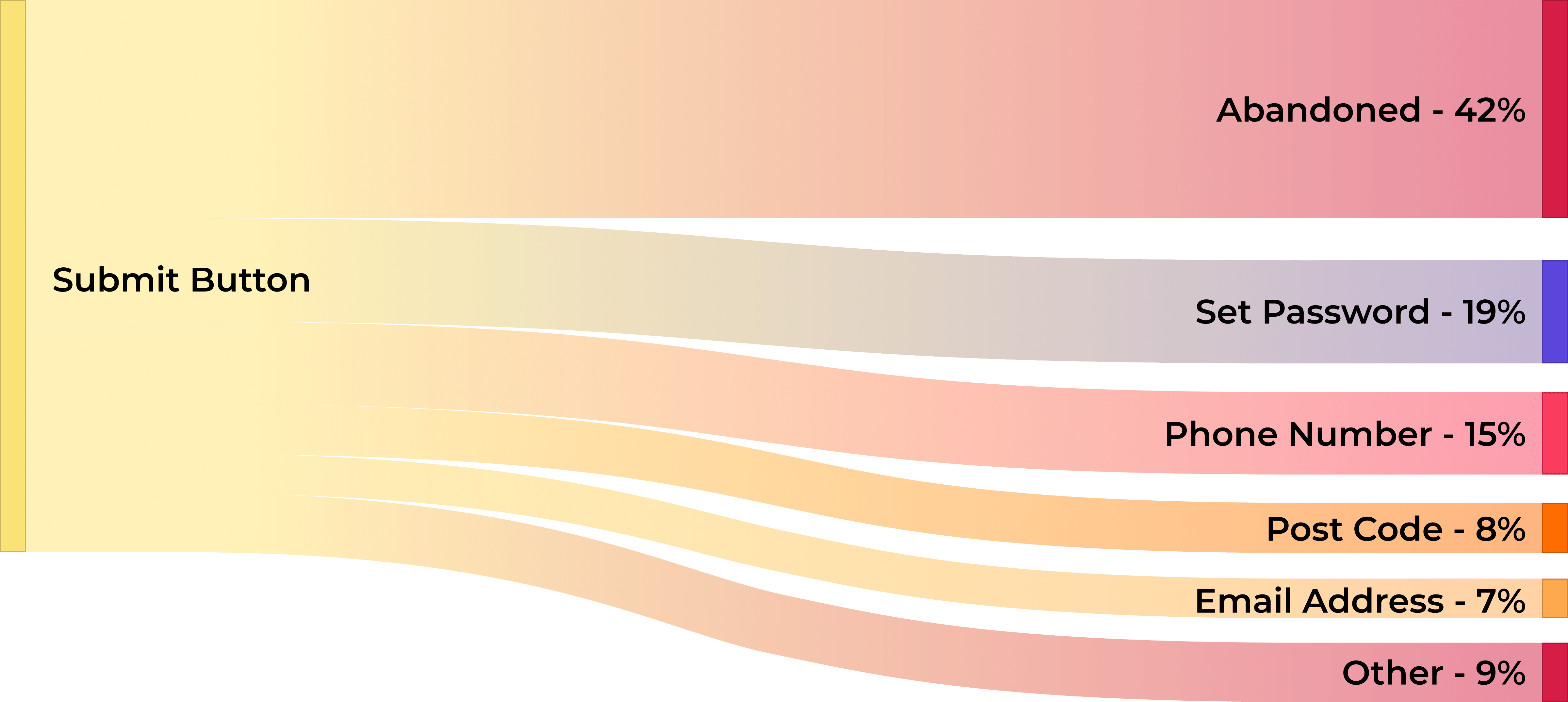
We can see that around 42% of users immediately abandoned after attempting to submit. More interestingly, we can also see where users jumped back to, attempting to resolve any errors. In this case, the ‘Password’ and ‘Phone Number’ fields are the top two fields users returned to. The users clicked submit, returned to ‘Password’ and ‘Phone Number’ to try and fix their answer. They were unable to do this so they abandoned the form.
A simple ‘post-submit’ visualisation like above is a quick way to identify the fields that your high-intent users are struggling with the most.
iii. Segment on a field level
Segmenting and comparing your visitor groups is critical if you want to diagnose the issues on your forms accurately. Start by analysing at an aggregate level to see if there are any obvious behavioural differences. For example, do visitors from paid traffic sources abandon at higher rates than those from organic sources? Then move on to analyse segments at a field level to understand if
particular fields are more of a problem for certain groups.
When segmenting, you should always look at the key metrics we identified earlier; abandonment, field returns, and time spent. The exact segmentation you use will depend on the makeup of your visitors. Still, some of the most common splits include traffic source, device type, operating system, new vs returning, product and A/B test variants.
To illustrate this, let’s use the example of a discount code field on an eCommerce checkout mentioned in section (i).
The below segmentation shows field return figures at the checkout for mobile versus desktop users. It shows that desktop users return to the discount code field more times than mobile users (3.8 vs 2.6 on average).
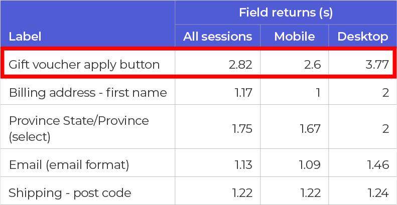
Normally, this would indicate higher frustration amongst the desktop users as they are being forced to come back multiple times to input something acceptable to the form. However, it's important to validate this. The next table shows the respective abandonment rates for the two user groups.

Interestingly, despite their higher return rate, desktop users have a lower abandonment rate on the discount code field (16%) than mobile users (22%).
This deeper insight allows us to develop richer hypotheses based on user behaviour. In this case, does the desktop format make it easier for users to open a new tab and search for discount codes that work? Is it more difficult for mobile users, so they leave unsatisfied? You could test a pre-populated discount code within the form field for mobile users only to understand the impact on conversions, revenue and AOV.
Step 3: Create Hypotheses
To improve your form methodically and scientifically, you'll need to create hypotheses based on data.
In the optimization domain, a hypothesis is a supposition of how form performance might be improved. Basic examples include “If we change the submit button colour to green then conversion rates will improve” or “If we remove the phone number field, then the form
abandonment rate will reduce”.
This white paper doesn’t contain a full discussion on how to write and validate hypotheses (there are plenty of external resources that already cover this). Instead, it aims to help you use analytics data to base your hypothesis on.
Once you have analysed your data and identified the problem areas, you’ll need to visit your forms and interact with the elements in question. The objective is to come up with plausible theories as to why these fields are causing issues for users. Other tools, such as user testing, heat mapping, form building and session replay, can be useful for developing the hypothesis.
You can read around the topic in more depth in Zuko’s article on form abandonment, but some of the issues you should consider are:
Is the field guidance comprehensive? Does the microcopy clearly state what the user needs to enter, or could there be confusion? Perhaps you should add more instructions?
Are the error messages clear and helpful? If you are not being specific about what the user needs to do to solve the issue, they may just leave the form and not come back.
Do your error messages trigger at the right time? If you only trigger error messages on the submit button, you may be causing unnecessary stress. Studies have shown that using inline validation to trigger errors immediately after the input is entered will result in
a better user experience and conversion rate.
Is the user interface fit for purpose? Are there any obvious UX issues with the interface? These may include;
- difficult-to-click buttons or text fields
- huge dropdown menus that fall off the page
- modals that obscure elements of the form
- broken submit buttons
Make sure you run this user testing on mobile and desktop formats, as they will render very differently.
Are you fulfilling user expectations? Is the information you are asking for in line with what the visitor expects? If you are an eCommerce business, why do you ask for users’ phone numbers? Perhaps you might want to test some microcopy explaining why you need such information.
Are you asking for information that the user is unwilling to give at this stage? If the information you are asking for is sensitive, you may be driving prospects away. Do you really need that information now? Consider making the question optional or asking it later in the form or sales cycle, after the user has completed the form.
Is a question too complex or intimidating? If a user didn’t anticipate having to input information that requires a lot of thought, they may just leave. Top tip - if this is the case, the field immediately prior may have an artificially high abandonment rate as the user doesn’t even bother to start the complex question following it.
Are you driving users to external web pages? The discount code example given earlier is a classic example. Some questions may inadvertently incentivise a user to look elsewhere (for research or comparison purposes), and they might never return.
Step 4: Run Tests
Once you’ve developed your hypothesis, you need to run tests to see if the changes positively impact form performance. Again, we’re not going into full detail, but below are some of the things you’ll want to be mindful of when running tests.
Choosing the right test design: A/B or Linear Test?
A/B testing (or split testing) is where you run two different versions of your form simultaneously, exposing a set percentage of your visitors to different variants. There should be a “control” version (usually the current incarnation of the form) and a “test” version containing the changes you specify in your hypothesis. You will then be able to see whether the changes improve the control.
Linear testing is different. It involves making the same changes for all form visitors and seeing whether metrics improve from that point on.
Generally, it is better to run A/B tests rather than linear tests because A/B tests control for external factors that may pollute the results of a linear test (e.g. seasonality, marketing activity, economic trends, etc).
That said, if A/B tests are not an option (and assuming you have enough traffic to run statistically significant tests), using the linear test is still better than running no test at all.
Field-Level Data Tracking
As well as looking at overall conversion rate, it is important to look at field-level metrics as well. You may run a test that does not improve overall conversion and it would be easy to write it off as a “fail”. However, by looking at the metrics around the field(s) you made changes to, you may discover these scenarios:
a. The abandon rate on the field is static, but other metrics such as field returns or time spent have improved. Although there hasn’t been an appreciable impact on conversion, some aspects of the user experience have been upgraded, which is no bad thing.
b. The abandon rate on the field has improved, but it’s cancelled out by a worsening rate on a subsequent field. You’ve made one thing better but pushed the problem along. You now have another field to focus on; if you can solve that issue, you’ll hopefully increase conversion.
Testing more than one change
You really only want to test one change at a time so you can be as certain as possible that the change is what drove the improvement. If you need to move faster, however, you may want to use multivariate testing to assess the impact of multiple changes. At a pinch, you can also use field-level data tracking through tools like Zuko to evaluate the effect of individual changes on specific fields.
Determining a winner - statistical significance and power
Don’t just use the raw figure to determine if your changes have been successful. You need to ensure the sample size is large enough to be reasonably confident any uplifts are a result of the changes rather than random chance. You can find more on calculating sample size, including a handy calculator, at this site from Converted.
Step 5: Rinse & Repeat
You simply follow the process again, analysing the data, creating a hypothesis to mitigate the issue, designing a test and running it to see if it is effective.
Form optimization is not a one-and-done process. Once you’ve resolved the biggest form problems, it’s time to move to the next most important issue which is generally determined (or prioritized) by the volume of abandonments.
In Summary
If you’re an impatient soul and have just skipped to the end to see whodunnit, fear not. We’ve saved you the effort of having to read through everything with a summary of the essential points:
- Benchmark against yourself first - Judging your forms by others’ conversion rate will mislead you into what is a “good” result.
- Look at abandon rate and total abandonments - Some of your fields may be conditional so analysing the proportion of abandonment is important.
- Segment abandoners and completers - The difference in behaviour between these groups will help pinpoint your problem areas.
- Analyse failed submissions - Behaviour after the submit click is crucial. By examining what users do next, you can understand where they are struggling.
- Run field-level segmentation - Breaking down the data allows you to see if specific fields are causing issues for particular user groups.
- Use hypothesis-based testing - Use your data to develop a testable hypothesis aimed at delivering performance improvements.
By using the steps outlined in this white paper, we’re sure you will be able to increase the conversion rate of your forms and checkouts to drive an increase in new customers or prospects. However, if you want any further help with the process, feel free to reach out and contact us at support@zuko.io. We’d be more than happy to point you in the right direction.
Start Optimizing Your Forms with the Award-Winning CRO Analytics Platform
Zuko helps you understand why users abandon forms, identify friction points, and increase completion rates — faster and easier than Google Analytics.
(No Credit Card Required)