
Is a Single Page Form or Multi Step Form Better for Conversion?
An overview of the merits of single-step Vs multi-step form journeys plus advice on multi-step structures.
How should you structure your online form?
So, you’ve decided on the questions you need to ask in your form and the formats you want to include (text, radio, dropdown, etc). The next big thing you need to get right in your form optimization is the structure of the form - how will a user encounter those questions and is it the optimal UX? Specifically, will they just be on one page or will there be a number of steps? This article looks at the issues involved in making this decision and provides a framework to think about the process along with some best practice tips if you do decide to use a multi-stage form.
What is a multi-step form?
A multi-step webform is one where the questions are not presented all at once to the user. Rather, they are packaged up and presented to the user in stages. Generally, the user has to successfully complete one stage before being allowed to move to the next (often through the use of a “Continue” or “Next” button). Multi-step forms may be built with different stages appearing on separate web URLs or through the use of Single Page Applications. They are particularly prevalent in eCommerce checkout patterns which chunk different types of data together (details, payment, etc).
What is a Single Page Application (SPA)?
A single page application is a website that dynamically changes as the user interacts with it. In the context of webforms, that usually means that additional form sections are revealed on the same page once the user completes the preceding one (rather than being redirected to an entire new page).
Page refreshes do not typically occur in SPAs. Instead, all code is retrieved by the browser itself on the first load and the page does not need to reload at any stage. If you are interested in the technicalities you can learn more in this overview by Bloomreach.
Making the decision
Where do you start when looking at whether you should present your form in a single or multi-step format?
Of course, if you want a definitive answer the only thing to do is to conduct an A/B test - run a single stage and multi-stage form simultaneously against randomly allocated visitors and see which one performs best.
That said, if you don’t have the time or resources to do that, there is external research that may help nudge you in the right direction.
The comparative studies that have looked at this question have been pretty consistent. Their results are consistent in showing that, where a form is sufficiently complex or long, breaking it into multiple steps will deliver a higher conversion rate. While the exact quantum of performance improvement varies, they all point in the same direction:
Hubspot report 86% higher conversion rates for multi-step forms
Conversion fanatics also saw a multi-step format perform better than a single step
Why does multi-step consistently perform better? Intuitively, you probably already know the answer. Take a look at this form below. Would you even bother to start it? Consider how much worse the user experience would be in a mobile environment as well.
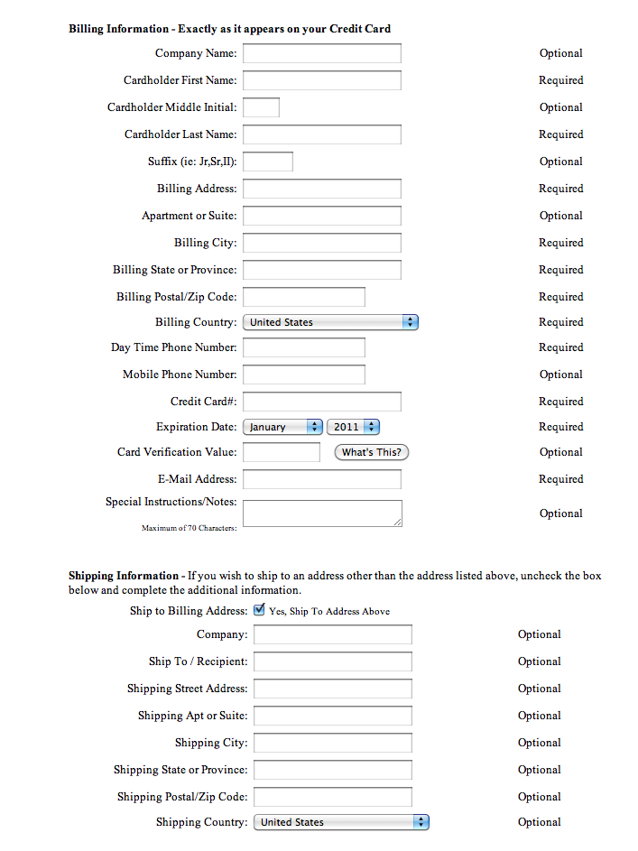
Now, imagine the form planners had broken it up and the first form section you can see only has three fields - Company name, Cardholder First Name and Cardholder Last Name. Would you be more likely to start it now? And then, when you came to the next section with another 3 questions would you complete those? Breaking the form into chunks reduces cognitive overload and is more likely to inspire action. Once you have started the form the psychological principles of consistency and completeness kick in. Users are more likely to want to finish something they have already started.
Of course, multi-steps don’t make sense in all situations. If you have a simple contact form, spreading it across multiple pages may be irritating or confusing for the user so you’ll likely want to keep it in one place. That said, for anything remotely complex or long you should be breaking it out into steps.
Working on that assumption, the next thing to ensure is that breaking the form up does not result in a poor user experience. We’ve listed some of the key things you’ll want to bear in mind when creating your multi-step form (over and above the general CRO advice you should use for all forms).
Best Practice for Building Multi-Step Forms
Cluster similar questions
Have you ever been asked for your credit card details as soon as you walk into a high street retail store? No? Well don’t do that on your forms.
Multi-step forms work best when similar question types are clustered together. This keeps the user’s mind focused on one area of data and reduces cognitive overload. It is a balance though - don’t “over-split”. It may annoy users if they think they are done with a section but you keep asking for more.

A simple step breakdown example for a form might be
- Basic personal details (name / email)
- Form “meat” - product selection / confirmation, etc
- Delivery details (for eCommerce)
- Payment
Easy before hard
As noted above, when users have invested time into starting a form it makes them much more likely to complete it.
So, don’t begin your form with a 1,000 work essay question. Something easy to start with. There’s a reason that 99.999999999%* of forms begin by asking your name.
*Number plucked out of the sky to underline the point!
Use progress bars
Ever started a multi-step form and you don’t know how long it is going to take you and what they are going to ask for?
Don’t be that form. Use a progress bar to let the user know how much time they have to invest and how far along in the process they are. For more specific advice check out our dedicated article on progress bars.

Don’t have TOO many steps
If your progress bar can’t fit nicely on a standard mobile screen, you’ve probably got too many steps. No-one wants to see they have another 27 stages before they get the benefit of completing a form. If this is your form, consider clustering more questions together to reduce the number of steps.
Allow the user to move back and forth between steps
As well as managing a user’s expectations around time commitment, you can use a progress bar with labelled stages (as opposed to pure percentages) to further improve the experience. Let the user hop between stages so they can easily pop back to amend inputs without having to risk the use of the back button.
Make sure the data saves between steps
On the subject of the back button….
You need to make darn sure that, once a user completes a stage, their inputs are saved forevermore unless they deliberately change them. Even if you have a perfectly designed UI which makes it super easy for a user to move between stages, you know that many of them will simply hit the browser’s back button. On too many forms this back button explodes all that has gone before it leaving the user with a blank version of a stage they have already completed; guaranteed to raise the cortisol and provoke abandonment. At Zuko, we have seen conversion improvements of up to 10% by fixing this simple but annoying bug.
Ensure your continue buttons are named uniquely
This one is less for the benefit of the user and more to save your analysts pulling their hair out.
One thing you notice with multi-step forms is the prevalence of “Next” or “Continue” buttons at each stage. Your developers probably just copy and paste them in without thinking before ticking the box and moving on to the next task.
This leaves a problem. The developers rarely give each next button a unique HTML name or ID. This can mean that your form analytics software can’t distinguish between them and may end up combining the data from each of them together in one messy bundle.
Pushing your developers to give each one a unique name (“Next1”, “Next2”, etc) will save you this headache and ensure you know exactly at which stage of the form users are dropping out.
Use the power of conditional logic
One of the beauties of multi-step forms is you can dynamically streamline the user flow based on their inputs, only asking the most relevant questions, and removing unnecessary friction. We often see this technique used in financial forms where customers can be funnelled towards appropriate products based on their answers to qualifying questions.
Be careful with your progress bar if you have a conditional path, however. If you skip a user through a stage that they can see on the progress bar, make sure you tell them you have done this (and why) otherwise your session replays may show FOMO-infused users desperately clicking on your progress bar trying to reach a step that will never come. Forms who use conditional pathways heavily may want to consider using an SPA rather than different page URLs and have a percentage based progress indicator rather than defined steps.
In Summary
The choice of single Vs multi-step form is generally pretty clear.
Use a single step form if:
- You have a simple proposition (Contact, subscription, lead gen, etc)
- You don’t have many fields (2-5)
- You only need one type of information from the user
- You want the user to have complete transparency from the start on what you will be asking them
Use a multi-step form when:
- The form is reasonably “long” (6+ fields)
- The user expects to part with a reasonable amount of information and is motivated enough to complete multiple stages
- You can easily group your questions into similar topic clusters
For more advice on form optimization, check out Zuko’s Big Guide.
Common Questions about Single Step Vs Multi-Step Forms
Do multi-step forms convert better than single-page forms?
In many cases, multi-step forms convert better, especially for longer or more complex forms. Studies show they can increase conversions significantly by reducing perceived effort and breaking tasks into manageable steps. However, this isn't an iron-clad rule. The impact often depends on the context and implementation of the form.
When should I use a single-page form instead of multi-step?
Single-page forms work best for simple tasks with few fields (typically 3–5), such as contact forms or newsletter sign-ups. They are faster, more transparent, and reduce unnecessary clicks when the required information is minimal.
How many steps should a multi-step form have?
There’s no universal “perfect” number of steps, but most high-performing multi-step forms use between 3 and 5 steps. The optimal number depends on the complexity of the data you need to collect. Too few steps can mean stages feel overwhelming, while too many can cause drop-off. The key is to group related fields logically and test different step structures to find what works best for your users.
We wrote the book on form optimization!
"The best book on form design ever written - 80 pages of PURE GOLD"


More from our blog:


Want to get started with Zuko?
Start a free trial that includes all features, or request a demo