Titles in online forms - how inclusive should you be?
Asking for a potential customer's Title can be surprisingly fraught with difficulty. How should you approach it to maximise your chance of conversion?
This article is part of a series on optimizing individual form fields. Links to the other articles in the series are below:
Optimizing the phone number field
Thank you for joining SpeedyCompost.com, Baroness Claudia Von-Hammerschmick
As part of many online journeys, users have to self identify how they want to be identified in future messages from you. Sounds simple enough. How hard can it be to ask people their name and title?
Well, it turns out, very. Or at least, different websites have taken wildly different approaches to this issue. This will probably be the most familiar way you’ve been asked for your Title:

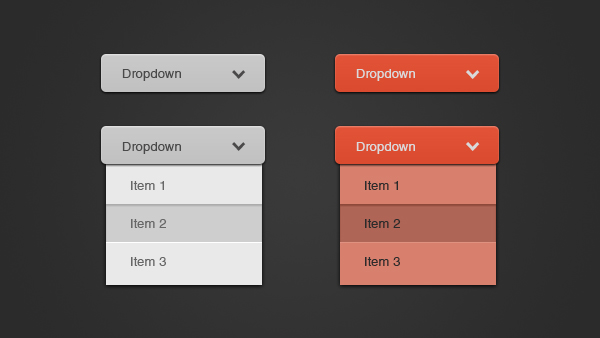
A dropdown, with some options. The above includes Dr outside the usual Mr/Mrs/Miss/Ms. This is perhaps the most common additional Title field.
Get more form design advice in Zuko's Big Guide to Form Optimization and Analytics.
Why ask for Title anyway?
Titles are linked to both self-identified status, but also gender. Many people, whether they identify with a particular classification of gender or not, will be reticent about answering additional personal questions. In some cases this is due to an aversion to demographic profiling, but at its simplest, the way we ask for Titles is a way for companies to know how to address their customers. It is also strangely antiquated.
The shortest list of available titles can be seen here:

This is effectively asking:
- Do you identify as a man? If so, your marital status is unimportant.
- Do you identify as a woman? If so, are you unmarried, married, or prefer not to say?
This asymmetry between the options for males and females is odd if you pause to think about it for more than a few seconds. When creating any form you should always justify each question. Do you really need to ask the question or not?
If you are not happy with simply addressing people by their Full Name (without titles), then it seems strange to both ask people how they wish to be identified, but also limit their ability to do so by having a small finite list of titles.
Some websites have tried to remedy this in increasingly bizarre ways.

The above has four options, then an ‘other’ option, which opens up a new drop down, which provides two additional titles, and another ‘other’ option. So you can be Other Jane Bloggs, or a Reverend or Dr, but nothing else.
So should we increase the number of options in this drop down?
This website seems to think so:

So no gender neutral ‘Mx’ option, but if you’re lucky enough to be a Viscountess, at least you’ll be addressed correctly in the letters sent to your fourth home in Tuscany. But if you are promoted to Count or Countess, you will not have the option to be addressed by this title. You must be furious.
May we recommend then, shopping at Fortnum and Mason. If you order one of their food hampers, then you can rest easy that you should be addressed correctly on the packaging:

“Wing Commander Danny Firestorm, please find your 4 pack of Scotch Eggs Enclosed. Best, Fortnum and Mason”. This absurd list still doesn’t include ALL titles either - Marquess, Archdukes, Emperors, Brigadiers, Tsars and Earl would all be disappointed to find their titles missing from this list, and will almost certainly look elsewhere for their posh biscuits.
Tongue in cheek yes, but I think there is a lesson to be learnt. No matter how comprehensive you make your list of Titles, you’re going to miss some out, and the larger the list, the longer and more effort it takes for 95% of your customers to self identify.
The real reason Titles are there
Titles are far less important to brands than their ability to pop you, the customer, into a demographic pot. Titles are a way to do that without directly asking you to put yourself in a gender pot. All answers other than those that have a direct link with one gender or another will likely be marked as ‘unknown’ or ‘other’.
That’s why drop downs or radios are used - so there’s no way in which you, the user, can get it wrong. If there’s not an option you like, you simply have to pick one of the available options, so the marketing team can put you in a category.
Businesses should be able to work out this information in other ways - perhaps based on what you’ve bought from them, or even asking a direct question that’s not part of your first transaction with their site.
If we were siding with users (which we usually do), we would advise, in the interests of making the journey as easy as possible, do one of the following:
- If titles and gender are not integral to your business - get rid of them entirely
- If titles are somewhat important, but you suspect your customers are unlikely to require more unusual options - go for Mr, Mrs, Ms, Miss, Mx and perhaps other
- If titles are vital and you know you have some customers with unusual titles - a free text box instead of a drop down, like this:

We hope you enjoyed this blog, Group Captain.
We wrote the book on form optimization!
"The best book on form design ever written - 80 pages of PURE GOLD"


More from our blog:
Want to get started with Zuko?
Start a free trial that includes all features, or request a demo


