Optimizing the Form Address Field
Advice to help get the UX of the address field on your form right
Top tips to optimize the UX of the address capture field
This is part of a series of articles on optimizing the UX of individual form fields. Others in the series are:
The address field is a huge part of so many forms. Billing, delivery and identity checks all require the user to complete their address. And yet address entry is often the slowest and most demanding part of an online form. Here are the top tips from our friends at Loqate on how to optimise the address field in a form to provide the best user experience:
1) Size matters
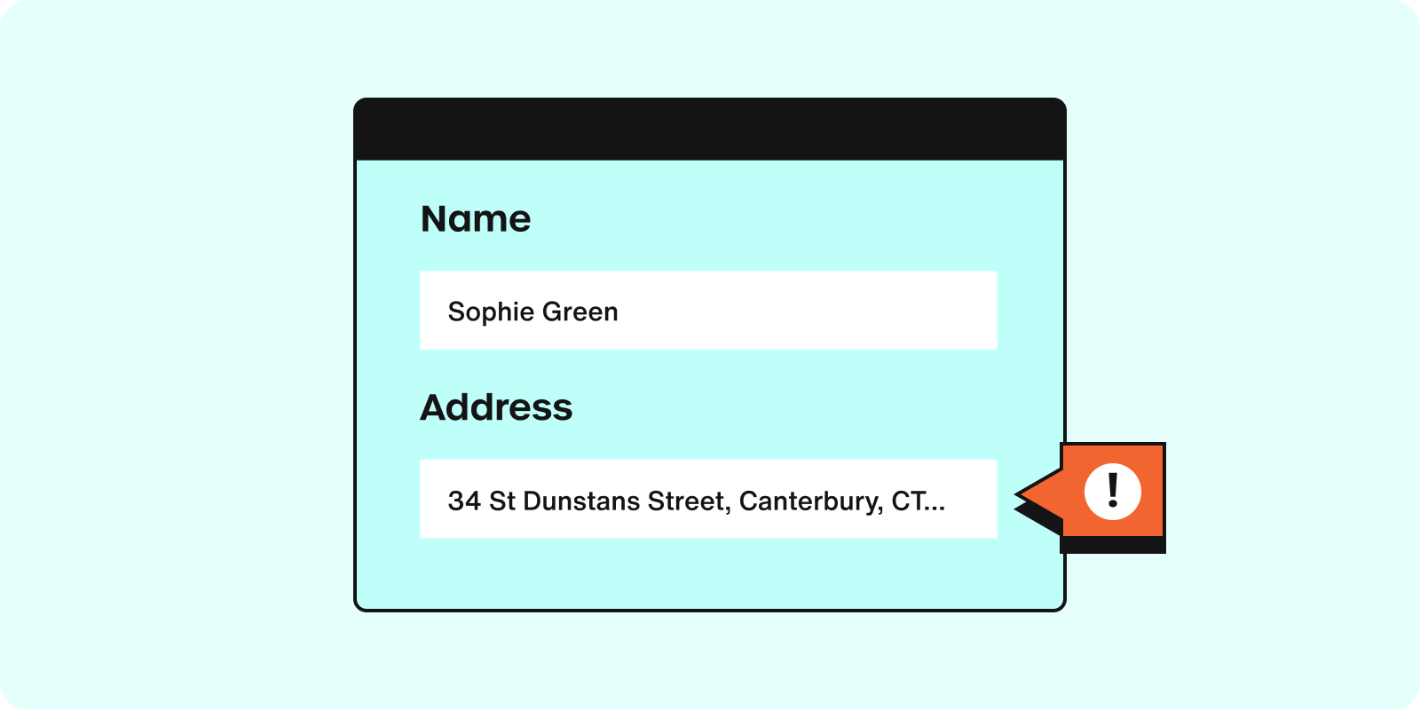
Are your fields long enough? Check your form field lengths; can they accommodate everyone’s details? The world’s longest postal code is 10 digits long. The world’s longest settlement name is 85 characters long and the longest address line in the UK is an enormous 147 characters long.

2) Consider label placement
The label tells users what information belongs in the form field. The best position for placing a form label is above the input field. Do not use the placeholder text for this. The placeholder saves some space as it sits inside the form field rather than above - but there is a drawback. As soon as users start typing, the placeholder disappears. To see the placeholder again, they are required to remove the input. Also, some users will navigate your site purely using the keyboard, so they won’t even see the placeholder text. Keeping a clearly defined label will help with the accessibility of your forms as well.

3) Single line versus multi-line fields
A single line address lookup layout simplifies address forms down to just one field. Typing any part of the address on a single line is quick and simple, and results in address forms occupying far less space.

4) Required fields
Be careful when making fields mandatory. Not all addresses contain the same elements or number of lines. Optional fields like ‘Company name’ should not prevent the user from submitting the form. Equally, some countries do not use County/State/Province names in their addresses.

5) Keyboard Optimisation
Ensure the correct keyboard type appears for each segment of the address. For instance, a numerical keyboard for flat or house numbers.

You can find a cheat sheet on setting the correct keyboard html type here
6) Limit Typing with Autocomplete
Anything that prevents unnecessary typing will improve user satisfaction, decrease error rates, and boost form completion. Filling out an address is often the most cumbersome part of any form. Users get irritated by the keystrokes required to enter their address, especially on mobile. Address autocomplete technology that suggests addresses as the user starts typing is a great way of streamlining the process and can reduce address entry time by up to 78%. It cuts back data entry errors at the point of capture by more than 20%, improving the end-user experience.

7) Use Geolocation
You can reduce data entry even further by considering Geolocation technology to enable users to pinpoint their location on a map. This is especially helpful for mobile users who can simply tap on their location to autofill the address field.

8) Allow for Alternate Addresses
Sometimes, users might need to provide a different shipping and billing address. Always provide an option for them to add an alternate address without filling everything from scratch.
9) Allow users to enter addresses manually
No matter what validation software you use on your site you should always give users the ability to override it if necessary.

10) Test and Iterate
Finally, always be open to feedback. Test your address form with real users, gather insights, install form tracking, and be prepared to make iterative changes based on their experiences.
A well-optimised address field not only elevates the overall form experience but also ensures data accuracy and consistency. By following these best UX practices, you can create a seamless experience that users appreciate and trust.

Henry Thomas, UX Team Lead, Loqate
Henry Thomas is a seasoned User Experience (UX) professional with a passion for crafting exceptional digital experiences. As the UX Lead and Technical Product manager for address validation leaders, Loqate, Henry plays a pivotal role in shaping the way users interact with location data solutions.
We wrote the book on form optimization!
"The best book on form design ever written - 80 pages of PURE GOLD"


More from our blog:
Want to get started with Zuko?
Start a free trial that includes all features, or request a demo


