
Research: Eye Tracking Employment Details Fields in Web Forms
A closer look at Santander, Halifax, Post Office and Little Loans webform analysis. Using sophisticated Eye Tracking technology, what can we learn from their mistakes?
In the next part of our eye-tracking series, we examine forms that ask for details around employment: where you work, how long you’ve worked there and employer information.
If you’d like to take a look at our previous eye-tracking studies, you can find them here: Eye-tracking study on contact details and Eye-tracking on date of birth fields
Why analyse employment details?
Certain financial services products such as loans or credit cards require information about an applicant’s employment details. The range of details asked for is large, and in our tests we found fields asking for:
- Employment status
- Employer name
- Employer address
- Your employment industry
- Job title / Occupation
- Time in current job
- How often are you paid
- Next pay date
- Following pay date
- Monthly take-home pay
- Yearly income
- Total monthly household income
- Other sources of income
- Work telephone number
The scope and range of questions are wide, but all are asking for information that would allow a creditor to verify financial details about a potential applicant. Companies need to know if an applicant has the means to pay back what they are borrowing.
Here are the forms that we analysed in our eye-tracking study
Halifax
Loan Application Form
Little Loans
Loan Application Form
Post Office
Loan Application Form
Santander
Loan Application Form
Results
(For a reminder of what each of the following metrics indicates, take a look at The Beginners Guide to Eye Tracking on the Nudge Insights site) .


Comments
What’s interesting about the employment section of these forms is the variation in the type and amount of information requested.
In my research, I saw a range of 5 fields (Halifax) to 11 fields (Santander). In between the Post Office had 11 fields and Little Loans had 8. The Halifax form is quicker to complete as less information is requested from the user.
Santander – why it performed badly
Here are some Santander visualisations that illustrate just how complex it is to complete:


Completing the employment segment on the Santander form required the highest fixation count and the highest total fixation duration, indicating the highest amount of effort required of the users.
The visualisations demonstrate the complexity of the customers’ journey. The users’ gaze regularly moves up and down the form, and occasionally out to the right side of the form, hunting for additional information. We can also see large numbers of fixation points gathered closely together, which indicates that each field required a higher level of cognitive effort to complete.
The Santander journey was longer, more mentally taxing, and required more effort than the other forms. If we compare this to the visualisations on the best performing form below (Halifax), the Santander form is more complex. Employment information should be something that people know intuitively, as such you should expect to see visualisations with much fewer fixation points gathered around each field, indicating that it was easy for the user to complete, creating a smooth journey.
Looking in more detail are the form itself, we can find reasons why the journey is so difficult to complete. Here’s a reminder of the section in question:

The first problematic area is the Job Title input box:

This field is not only asking for a job title, but also to match your job title to a setlist of options clearly taken from a database. You have to start typing a job title, then options will be returned which you then have to select. However, this input looks like it could simply be a free text input box where a user can enter anything they like.
The ‘?’ does give a hint that there will be a matching process, but the text seems better suited to a drop-down:

Compare this to ‘smart’ address lookup input boxes, where you can start typing any part of your address and the matching will begin immediately. The placeholder text inside the box acts as a prompt:

Santander’s form does not have this. What’s more, if you search for a Job Title that is not found, you won’t know this until you try to submit the form, since there’s not inline validation to tell you straight away that your chosen job title has not been found. After a submission attempt, you’ll see this:

A red asterisk indicates an error, but with no help text or guidance as to what you as a user did wrong. Error messages should be delivered in a timely manner, be clear, unambiguous and helpful. This field and its error messaging is none of those things.
It becomes difficult for users when you give them the freedom to type what they consider to be their job title but then match this to a set, finite list of values. For example, ‘Teacher’ is a job title that is available to choose in this list:

However, not every teacher would consider this their job title. We could, for example, the following as ‘valid’ answers to this question:
- Primary school teacher
- Secondary school teacher
- Educator
- Education professional
- Primary teacher
And so on.
None of the above match with “teacher”. There are a couple of ways to deal with this:
- Have smarter matching rules that search for the entered text in any part of the job title. For example ‘Primary school teacher’ still contains ‘teacher’ so display ‘teacher’ as a selectable option.
- Have a many-to-one style database. For every core job title, there may be many ways a user can enter this. Allow them to do so, but match the chosen job title to the underlying value. For example, a user could select ‘primary teacher’ as their options but when conducting a risk profile, the data sent is in fact ‘teacher’
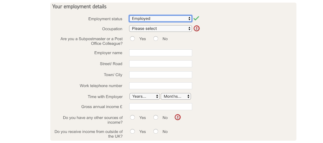
The next input box on Santander's form also has some minor issues:

Dropdowns are usually a sub-optimal way to ask a user for information. We’ve written before on this, and it applies here too. Ignoring the fact that the categories are confusing (aren’t the government and military sub-sectors of the public sector category?) – it would still be easier for users, particularly on a mobile device, to have these presented as radio buttons rather than in a dropdown.
The next section asks for details on the employer:
Santander ask more information about your employer than any other form in this study. This includes the phone number of your place of work and there’s no clear explanation of what they will do with this information. It will not be something that most people will know instinctively, causing delays as they find it.

The address lookup functionality in this section could also be improved. The above address lookup fields seem more suited to a home address than a commercial one, and it is not possible to search for the address just with the postcode – you need to enter something in the first field. This is not a requirement for other sites however, who allow you to search just on the postcode field.
The error messaging shown above is unhelpful. The subtle red asterisk does not draw sufficient attention to the mistake or give guidance on how to should be corrected.
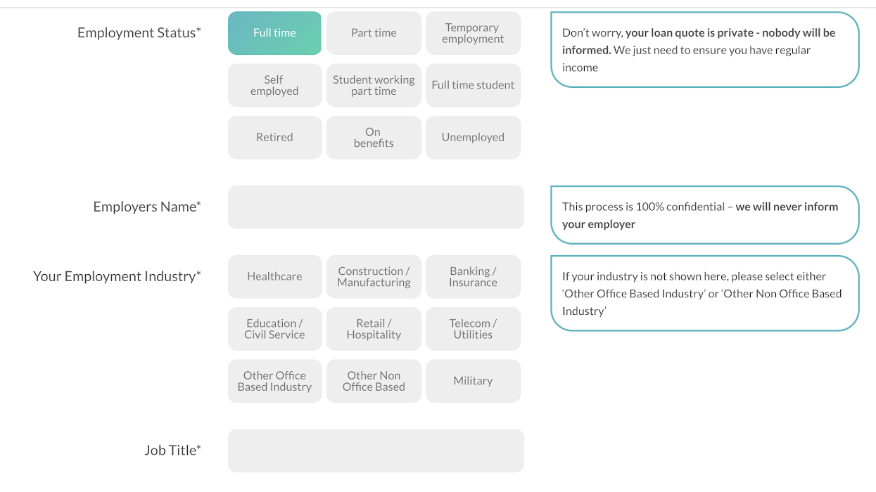
Little Loans – underperforms despite looking nice
In our previous research Little Loans did not perform as well as we might have expected, and it’s the same on this review.
- Always visible placeholder text in fields can be distracting
- The two pay date fields feel unnecessary when the previous field identifies the day you are paid.
- Take-home pay can be confusing as potential customers will know their gross pay.


As you can see from the visualisation above, study participants were regularly distracted by the additional information presented on the right hand side. Most of the information being asked for should be well known to the user, so the additional information is not necessarily helpful, and adds an interruption to their flow through the form.
Halifax – why this is the best
Halifax performed the best out of all forms (lowest fixation count and lowest total fixation duration) so let’s take a look into why that might be.


There are fewer input elements than other companies in this study, reducing the amount of cognitive load that is needed to complete the application.
Aside from that, some of the fields are better designed than the other forms.
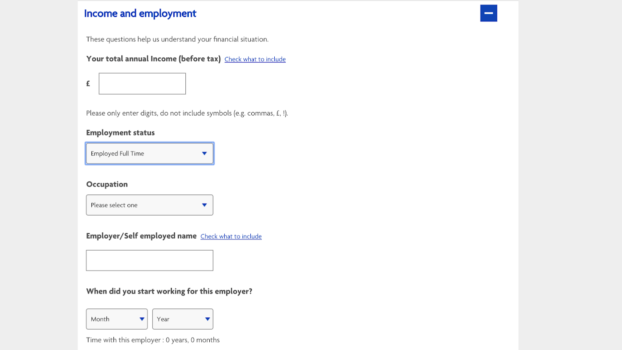
Rather than asking how long an applicant has worked for an employer (which requires doing some mental maths), the Halifax form asks for a start date and then auto-calculates the amount of time one has been there:

Halifax also has a different approach to asking for Job Title (listed under Occupation instead), and rather than a free text box with a look up functionality, has a drop down list with fewer options:

Although a drop down is not ideal when you build a form, presenting a smaller finite list of options which are more general may actually be simpler for a user to complete than other approaches. The categories shown are broad enough that a user would be happy picking one of them without agonising if it is a precise description of their daily work.
The error messaging on the Halifax form is also stronger than Santander’s:


These errors are clearly indicated, with additional guidance on how to correct the errors made. “Enter a value” isn’t particularly user friendly language, but it’s more helpful than a simple red asterisk appearing next the the label for the field.

Conclusions
- Reduce the number of fields that you ask the user to complete. The less load you put on the potential customer the more likely they are to get through your process and become a paying customer.
- Always visible help text can be a distraction as much as a help. It may feel like you’re guiding the user on every field, but often a user feels like they have to
- Placeholder text within inputs can be helpful to users, but if every field contains it then it becomes confusing. There’s also the challenge of placeholder text disappearing when you enter a field.
- Giving a user a list of options rather than asking them to enter free-text, and then Smaller limited options can sometimes be simpler than large, open ending options
If this has whet your appetite and you’d like to learn more about eye-tracking, Nudge has also written a Beginners Guide to Eye-Tracking, an easy introduction to the techniques and terminology that eye-tracking analysts use.
We wrote the book on form optimization!
"The best book on form design ever written - 80 pages of PURE GOLD"


More from our blog:


Want to get started with Zuko?
Start a free trial that includes all features, or request a demo