
Bad Web Form Design - 7 Examples
Improve your form performance by learning from the worst in this selection of bad online forms.
Every now and again we come across website form design that’s so bad we can’t resist taking a screenshot and sharing it with you.
This isn’t about pointing and sniggering. Because, by sharing examples of bad web forms, our industry can learn, grow and avoid making the same UX mistakes.
For additional form design tips, check out the advice in section 3 of our Big Guide to Form Optimization and Analytics.
Here are seven of our most painful examples:
Drop Down Menus That Don’t Drop Down
One of our team was asked to complete a feedback questionnaire. There was no incentive other than helping the organisation improve their service. So, you would think the form would be as painless to complete as possible.
However, a fatal form design flaw occurred with the inclusion of drop down menus that didn’t drop down. Clicking in the usual place – the green arrow in the image below – did absolutely nothing.
Trial and error revealed that the user’s options were only disclosed when the cursor was placed in the field where the selected response would appear.
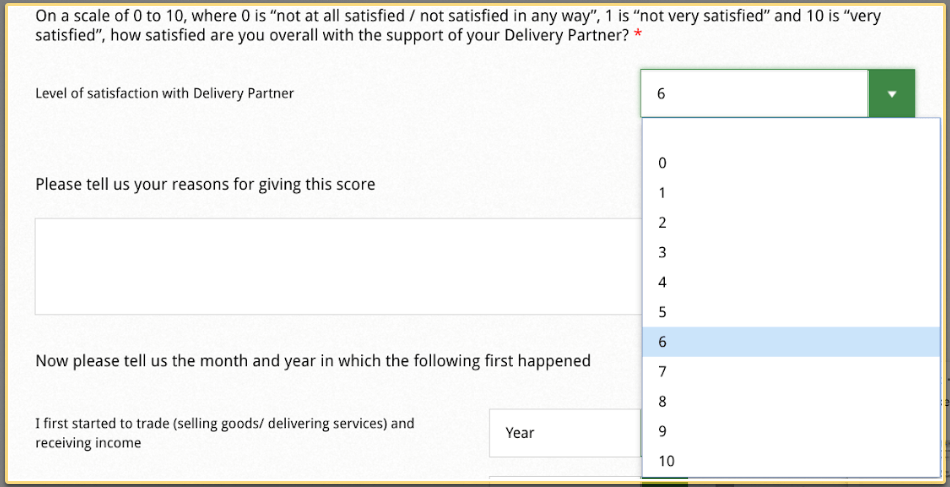
This design choice makes it more difficult for users to complete the form, wasting their time and increasing cognitive load as they puzzle out how to reveal the menu options. Bad web forms like this don’t make for good UX.
The lesson? Stick to expected website form design functionality unless your testing reveals otherwise.
Unhelpful Error Messaging
When form users make mistakes, it’s always good to let them know. But get your error messaging wrong, as in this example, and it can do more harm than good.
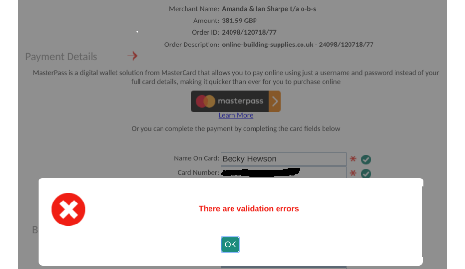
Although the text tells the user there’s an issue, there are two UX design problems:
The error message doesn’t tell the user what the problems are or where they are in the form leaving the user to check every field
The error message popped up at the end of the form requiring the user to mentally readjust after they have moved on from the field. Which means more mental effort and frustration.
As an example of how important this is; based on Form Analytics data, the team at classic gaming site Solitaired made an improvement to their credit card checkout page where they specifically identified which field had an error and how to address it. They wanted to make it crystal clear on how to move forward, instead of having the user guess where an error might be. This improvement alone created an 8% conversion rate improvement to their premium solitaire game offering.
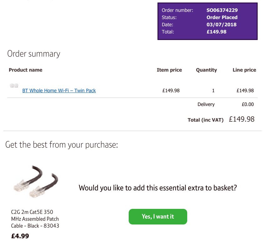
Up-sell at the Right Time
Checkout processes often provide customers with the option to buy related products. Get the timing of product placements right and you’ll get more customers to buy. Recommend an “essential extra” after the customer has paid and you’re more likely to confuse customers than close sales.
Perplexing Next Steps Don’t Help Users
When you’re asking someone to pay a road traffic fine, the last thing you want to do is annoy them further with a puzzling online form.
In the case of this fine payment form, the poorly labelled call to action buttons make it more difficult than it needs to be.
Unless their form testing told them otherwise, the ‘Add to transaction’ button should be labelled ‘next’ or ‘submit’ so users can easily complete their payment. Which would get the unpleasant process over with as quickly as possible.
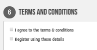
Double Negatives Don’t Make a Positive When it Comes to Bad Web Forms
Where to start with this checkout form? When your online checkout form is your shop till, you need it to work. Which is why the multiple problems throughout the purchase process are so incredible:
1. The checkout form is huge – it didn’t actually take long to fill this form out, but too much white space, tiny text boxes and a minute font size makes it look more formidable than it is.

2. The basket is invisible – it was only at the point of payment that it became obvious that there were two items in the basket. Which meant going back several steps to remove an item and then re-submitting completed pages.
3. Unclear navigation – the ‘next’ button is an unusual black colour and located in the right hand menu bar. Because it’s not easy to locate, users waste time trying to figure out how to progress.
4. Added extras that can’t be removed – a damage waiver was added to the order but there wasn’t an option to remove. An unpleasant surprise at the end of the checkout.
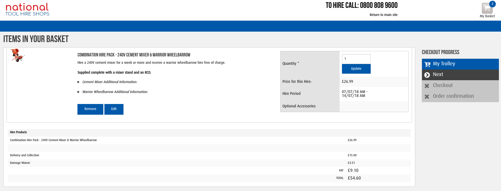
5. Hard-to-target T&Cs tick box – tiny boxes are hard to select and there was no link to the T&Cs to see what you’re signing up for.
Filling out forms is a necessary evil. So it really doesn’t help when you build a form that makes it harder than it needs to be. Re-entering details. Figuring out what’s wrong with the data you’ve entered. Trying to navigate through poorly signposted forms. These form design issues all waste your time, send your blood pressure rocketing and leave a bad taste in your mouth.
And that’s exactly why Zuko was started. To rid the world of bad forms and help designers avoid the form faux-pas that make your brand stand out for all the wrong reasons.
We wrote the book on form optimization!
"The best book on form design ever written - 80 pages of PURE GOLD"


More from our blog:


Want to get started with Zuko?
Start a free trial that includes all features, or request a demo