
Common problems on Forex registration forms and how to fix them
Foreign exchange trading forms are complex. We share advice on how to make their UX better.
Advice on improving the UX of foreign exchange forms
Foreign exchange (FX) trading platforms tend to have long, complex registration forms to satisfy compliance obligations. This means that there is plenty of opportunity for potential customers to be scared off by a sub-optimal user experience
FX form design presents certain problems: they generally require lots of information from users, including potentially sensitive information, and the questions asked often cover various aspects of a user’s personal and financial situation. These are often challenging for users to complete, so it is hugely important to optimize these types of forms to make the process easy and efficient for the user to limit the number of potential obstacles to conversion.
Because of the complex nature of FX forms, many forex companies use Zuko to improve their conversion rate. That means that we see that many of them have the same UX issues that come up regularly. This article outlines some of the common problems that we see on FX registration forms and provides some suggestions on how to overcome them.
1) Fields creating unnecessary friction on the Create An Account step
The ‘Create an Account’ section of the registration form is by no means unique to FX forms but it is often where we see the biggest evidence of user frustration and abandonment. Make this part of the form as easy as possible to encourage progression to later stages of the sign up flow where the more challenging financial questions are, as the further users get through the process, the more likely they are to persevere with your form. With this in mind, here are the common problems that we see and how to minimise them:
i) Username field: is it really necessary?
Users are often asked to create a username as a unique identifier in addition to an email address. Zuko data often shows a high percentage of user sessions having to return to this field multiple times, often because the user’s preferred username is no longer available. The user is then left to try to find an available username and ultimately may create one that bears very little resemblance to the one that they initially wanted to use, purely to satisfy the form’s requirements.
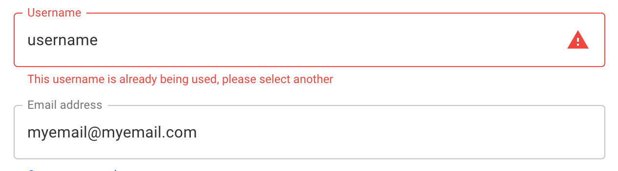
When analysing form data around the username, we often see a bouncing effect between the 'Continue' button at the end of the form step and the username field as users attempt to progress and are guided back to this field by error messages. The more this pattern occurs, the more frustration builds in the user and the more likely they are to drop off your form before they have really begun.
If the form asks for an email address for the user, this should already have satisfied the requirement for a unique identifier so a username field is adding unnecessarily obstacles to your form. With this in mind, it is worth considering removing the username field and asking for an email address alone.
ii) Password fields: onerous password requirements & the famous “Confirm Password” field
One of the most common problems on account creation forms is the password field. We have written another blog that delves deeper into optimizing password fields but give some thought into finding the right balance between security requirements and not being overly restrictive in what the user can and cannot use as their password- the more conditions you impose, the more likely that a user is going to forget their password and this in itself will create further UX problems down the line.
When you ask a user to create a password, use inline validation to explain the password requirements and tick them off as the user satisfies them, and give them the option to see the password input as they interact with the field.

Finally, remove the ‘Confirm Password’ field: it serves very little purpose other than creating another barrier to conversion, as users will generally copy and paste what they have already entered.
2) Not managing user expectations before they get to the form
As users will be asked to provide information that they may not have immediately to hand, prepare them in advance so they know what to expect when they journey through the form. Common questions on FX forms include personal identification fields, such as a passport or social security number. If users do not come to the form with this information to hand they will have to interrupt their session to go and get those details and we run the risk that they might not come back to complete the form.

Likewise, FX forms often contain questions such as a user’s Net Worth and Source of Funds which are often a regulatory requirement for certain territories. These are questions that may need some consideration and lead to hesitation or even abandonment on the form if the user did not expect to have to provide this information in advance.
Therefore, prepare the user with a list of documents and required information before they begin the form so they begin the process armed with the data you require of them. With questions such as “What is your net worth?”, explain what this means and how to calculate it. When the user comes to the form, it will then be a question of simply filling it out and will remove the hesitation and mental gymnastics from their experience.
3) Asking users to provide sensitive personal information without any further explanation
Often the information required to create an FX account can be deemed sensitive, especially around a user’s personal finances, and often these fields are a source of abandonment as users do not understand why they are being asked to provide it. In many cases, these questions are asked in order to satisfy regulatory requirements, so tell the user why you need the information and define how you will use it.
Users will be more inclined to provide this information if they know that it is confidential, it is used for a single purpose and will not be shared with third parties. There are various ways in which you can inform users of this, but providing microcopy or a clear info box which explains why you need to ask the question will reassure your users. Make sure that this information is provided by the field itself and is clearly visible- don’t hide it away or users will be far less likely to see it.
4) Asking for “nice-to-have” information versus what is strictly necessary
The aim of the form is to allow users to create an account with you, so make sure it is focused solely on that goal. An FX registration form should not be a catch-all to satisfy information gathering for other areas of the business, for example marketing. FX forms are demanding enough in terms of the necessary information needed from the user, so if there are questions which are “nice-to-haves”, then consider removing these fields. Remember, each field is a potential obstacle to conversion, so streamline the form as much as possible.
Likewise, if there are questions that can be answered once the user has a registered account, then this information should be asked later on within the application. A good example of this on FX registration forms is “How much would you like to deposit?” : here, the user is being asked to commit to a sum before they have an account, which is likely to deter some users on the form. Ask this question within the user’s account once they have set it up and they have familiarised themselves with the platform first.
5) Bad UI practices
As we have said, forex forms are inherently long and quite demanding for users, so make the UI as user-friendly as possible to encourage them to complete it. Working on streamlining the form will only go so far if the UI is suboptimal.
There are many examples of best practice, but here are some examples that are particularly relevant for FX forms:
i) Progress bars: use them and use them well
As the form usually contains several sections (Personal Information, Financial Information, etc), include a clear progress bar at the top of the form which indicates to the user where they are in the process and what the next sections are. This is good user expectation management and when done well, can be a source of motivation to users to complete the form. However your progress bar should always be correct: if you are using a percentage-complete metric, do not be inclined to tell a user that they are further on than they are in the hope that this will be motivating as this is likely to have the opposite effect and frustrate your users.

ii) Include ‘Back’ buttons on the form
FX registration forms are nearly always multi-step forms but many that we see do not include ‘Back’ buttons, which can be frustrating for users who may need to return to previously completed steps. It is worth bearing in mind that, due to the length and complexity of forex registration forms, users may prefer to complete them in several sessions: Zuko data for FX forms shows that around 25% of user sessions are returning sessions. In these cases, users may want to be able to go back and refamiliarise themselves with the form and the information they have already provided, so allow them to do so.
Based on this data it also goes without saying that you should make sure that form information already entered is saveable. If a user returns to a half completed form and all their inputs have been deleted they won’t stick around.
iii) Focus on optimizing the form on both mobile and desktop devices
It's highly likely that users will access your form on either mobile or desktop screens so consider form functionality on both device types. This should also factor in your decision making when considering field formatting. A good example of this is the use of dropdown fields when there is a limited number of options, for example Employment Status questions on FX registration forms. Dropdown fields can be tricky on touchscreens, but if you build these as radio buttons, these will be much more mobile user friendly. Zuko allows you to compare metrics such as field abandonment rates on desktop versus mobile devices, and the data suggests that the abandonment rates of such fields are much lower on mobile devices when radio buttons have been used instead of dropdowns.

iv) Use aides where possible, but if you do, make sure they work!
Take some of the work out of form filling by using automated tools where you can (for example, address finders). These can be really helpful in reducing the time the user has to commit to your form and allow for a better user experience. However, if you do decide to incorporate automation in fields, make sure that it works for all users. In the example of an address finder, this should provide comprehensive location intelligence for all the markets you serve, otherwise there is a risk that the process of completing an address might be much more frustrating for the user than a manual input.

6) Neglecting Analytics
Finally, do not forget to track how users are actually behaving on your forms.
The FX registration form is extremely important in growing your client base, so a key focus in optimization should be on the form itself. Use in-depth analytics products like Zuko to find where users are struggling and help you develop hypotheses to mitigate these friction points. Neglecting the form can lead to lots of potential lost revenue, so regular analysis of where the form works well, and more importantly where it doesn’t, is essential to improving conversion rates.
For more tips on improving FX forms you can read our white paper on optimizing financial service forms.
Common Questions about Optimizing Forex Registration Forms
Why are Forex registration forms so difficult to complete?
Forex registration forms are complex because they require large amounts of personal and financial information to meet regulatory requirements. These forms often include sensitive questions about income, trading experience, and identity, which can create hesitation and friction. Zuko Analytics shows that this complexity leads to higher abandonment rates if the experience is not carefully optimized.
What are the most common problems in Forex registration forms?
Common problems include unnecessary fields, confusing questions, and friction in early steps like account creation. For example, asking users to create a username in addition to an email address can add unnecessary effort. Zuko Analytics data shows that early-stage friction is particularly damaging, as users are less committed and more likely to abandon before progressing further into the form.
How can you improve Forex registration form conversion rates?
To improve conversion rates, simplify the early stages of the form, remove unnecessary fields, and make questions as clear and easy to complete as possible. Reducing friction at the start encourages users to progress to later steps, where they are more likely to complete the process. Zuko Analytics helps identify exactly where users struggle - such as high drop-off or repeated corrections - so teams can prioritise the changes that will have the biggest impact.
We wrote the book on form optimization!
"The best book on form design ever written - 80 pages of PURE GOLD"


More from our blog:


Want to get started with Zuko?
Start a free trial that includes all features, or request a demo