
How to Design High Converting Registration Forms
Tips and advice on how to create a good registration form that converts well
Advice on improving your online registration forms
Life’s full of challenges already: completing your registration form should not be one of them.
In this article, we highlight the key components and optimization best practices to design forms that take the pain out of the registration process for your customers. And they’ll prevent drop-off, boost completion rates and enhance your bottom line too.
Don’t Force People to Create a Username; Use Email Instead
Asking people to create a username is irritating for many reasons: users will have to find an unused, memorable name yet, annoyingly, many people find their preferred option is already taken.
This results in users adding random numbers to the end making their username difficult to remember.
It also means adding more functionality to your registration form to include a ‘forgotten username’ link and process. Which means more work and upkeep for you.
Usernames exist to provide a unique identifier for each customer. So why put your users through all this unnecessary stress when you can simply use their email address? Dropbox is a good example of a business doing it right – four simple steps and no forgettable username delivers a great user experience.

The only exception to this is when the identifier is publicly visible. For example, if you’re creating a username that will identify you in a forum, it wouldn’t be appropriate for email to be used.
Automate Your Email Checks
On the subject of email, while it’s critical to ensure you get the right email address you don’t want to ruin the UX by doing so. Save your customers the irritation of entering their data twice by adding in a plugin to your form design that checks the domain name associated with the email.
For example, if someone enters mike@gnail.com and not gmail.com, the user’s mistake can be flagged as they complete the field. For an even better user experience, get your plugin to present an alternative. Asking your user, “did you mean gmail.com?”, is far more helpful than simply pointing out their mistake.
Validate Data at Point of Entry
Keep your customers motivated and on track when completing your registration form by using inline validation. Stick with standard form design practice by using red for errors and green for correct entries.
This single addition to your form’s functionality can produce the following results:
- Increased engagement
- Increased conversion rates
- Decreased form completion time
- Improved form flow
- Improved error recovery experience
- Reduced customer frustration
- Reduced cognitive load
- Reduced odds of missing a required field
For deeper advice on how to get this right check our dedicated article on inline validation.
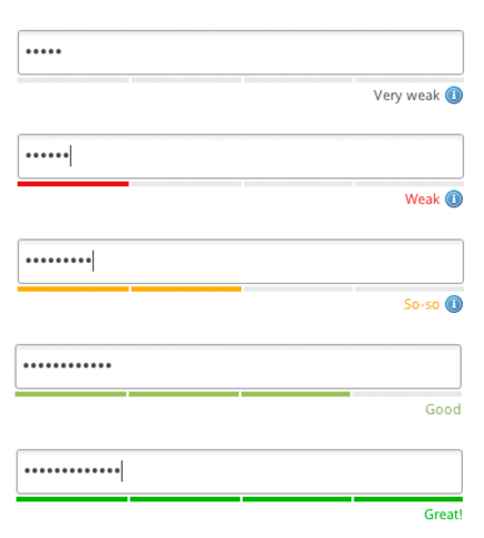
Perfect Password-Setting Practices
Registration forms nearly always require a password. Good form design can make this a painless experience for your users by helping them set passwords quickly and accurately.
Best practice to help users create a password is to:
- Allow them to see what they’re typing – get a single character wrong and the next time they try to login will be a frustrating failure.
- Only ask for the password once – by unmasking the password field people are less likely to make a mistake removing the need for a second password input field. Our own experience proves that removing the double data-entry requirement improves conversion rates.
- Share the rule book – make your password requirements clear upfront so users can enter an acceptable password right first time.
- Limit password parameters – you might be able to relax your password requirements depending on the sensitivity of the information in a user’s account. Read more on this in our specialist password blog.
- Show password strength – letting users know how strong their password is can prompt them to improve it themselves. Giving decision making control to users reduces the frustration of being told that their password isn’t strong enough and makes them more likely to fall in line with good practice.
Be Consistent With Your Branding
Your form is often the last stage in your sales process. So all the branding that has got your customer to the point of filling out your form shouldn’t suddenly stop.
Consumers take brand image as a sign of the quality of the product or service they’re interested in. With registration forms the deal isn’t in the bag. So pulling a prospect up short with a form that looks and feels different to the rest of your site could result in drop-off.
Extend your branding and reputation management to your form with consistent:
- Brand colours and fonts
- Tone of voice
- Links to customer services in case users have a query
Ensure your form sits within your website and doesn’t direct users to another location – this makes it feel like an extension of your site, not part of the same process.
In the example below, Vendio continue their blue branding on their registration form page. It sits alongside other messages that highlight the benefits of signing up, including the fact that it’s free. And consumer concerns are preempted by making it clear that no credit card details are necessary.

Be Sure Why You Are Including Each Field
Demanding forms with endless fields make customers wonder why you need so much information. Are you simply being nosey? What might you be using their data for beyond your registration form? Baymard Institute research shows that unexplained requests for certain information (particularly phone numbers) can be a direct cause of form abandonment.
Sowing the seeds of uncertainty with questions that don’t seem relevant can certainly reduce your conversion rate. But you also need to get the information you require with as few clicks as possible.
Take a look at the form below which is a good example of how not to do it: there are 25 fields in total of which three are not “required” to progress. Of the remainder, it could be argued that some of these fields are also surplus to requirements. It could do with a good audit - what do you need now, what can you capture later after getting their details and what can you do away with asking entirely?

Compare this lengthy form which wants to know everything about you to the one below and that requests the bare minimum to get the job done. Which do you think will deliver the best user experience and conversion rate?

At the very least, if you have to ask all those questions, break it down into a multi step form which should perform better than a single step one with a wall of fields.
Ask For Data With the Right Field Format
Having fewer form fields can (but not always) deliver higher conversion rates. But so does shortening the time needed to complete the form with a more friendly UI.
You can help users achieve a quick turnaround with minimal fuss by using the right kind of fields in the right places:
- Avoid drop-down menus when there are only two or three options to be displayed; instead use radio buttons which are quicker to read and only require a single click to select an answer.
- Text fields should be used to capture information that can only be provided by typing.
- Text box size should be appropriate for the expected length of answers.
Using the right data entry fields can make a form with more fields quicker to complete than one with fewer fields and the wrong kind of data capture.
Address Lookups the Easy Way
If an address is a need-to-know for your organisation, you’ll want to capture accurate data whilst making it easy on your customer. Most registration forms that need an address provide some sort of lookup tool to tick both these boxes.
The most advanced option is to use an auto-fill API. A user doesn’t even need to add their entire postcode, just the first few letters of any part of the address; the tool does the rest for them (such as in the below example).
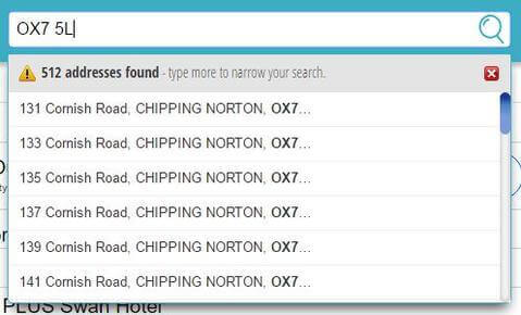
Clicking on a predefined address means that there’s a reduced risk of incorrect data entry and form fillers are far happier because they’ve completed another section quickly with a solid user experience. This example cites a 19% completion uplift from implementing such a solution.
Explain What You Need and Why With Microcopy
Laying out the different elements of your registration form in the correct order is critical to ensuring the right flow. But the words you use to guide, explain and warn are just as important.
For fast form filling, less is more when it comes to explanatory copy, hence the name, microcopy. Good form design includes small pieces of text that help alleviate the concerns of your users quickly and effectively.
Microcopy can be used in many ways but here are the key takeaways when it comes to registration forms:
- Error messages – letting people know they’ve done something wrong can feel like an admonishment; get your language and tone right and you can be a helping hand instead.
- Button copy – encourage people to hit submit by using language that’s outcome oriented rather than passive (think “Yes, Register Now” rather than a simple “Submit”)
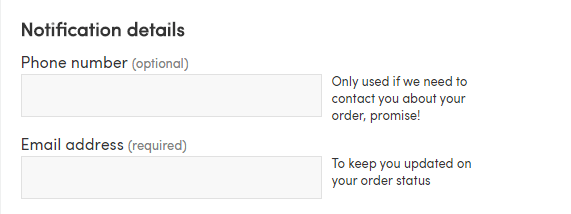
- Highlight sensitive data – for example, let people know why you need their date of birth or (as in the image below) phone number. If it’s so you can provide special deals on their birthday or to help with delivery let people know; they’ll be far more likely to provide the data and move on to the next field.
Mobile Keyboards Make Data Input Easy
In today’s mobile world, forms are regularly completed when people are on the go. Which means making your registration form mobile friendly is essential.
Did you know it takes twice as long to enter a password on a mobile device in comparison to a laptop or PC? You can deliver a better user experience, reduce form completion times and ease your customer’s pain simply by letting mobile devices know which keyboard to display when.
Want someone to add their phone number? Build your form so the numeric keypad pops up. Asking for an email address? Provide a keyboard that includes all the different elements you’re asking for including:
- the @ sign
- both numbers and letters
- other common symbols people use like !*&
Technically, to make this seamless, you need to set the field HTML to the appropriate input type. The relevant types you should be using are:
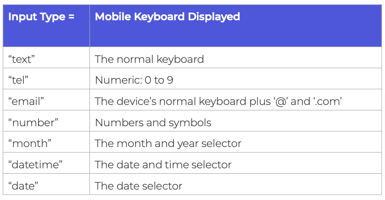

Users will thank you for this with higher conversion rates.
Make Terms and Conditions Confirmation a Cinch
Registration forms (especially forms in the financial sector) often require users to accept T&Cs. There are plenty of ways to display them but the simplest is to provide a link to the full document with a radio button for people to select.
With GDPR adherence a must in many territories, if you’re planning on using registration form details to communicate with your user, you need to tread carefully.
Sainsbury’s two-stage process covers both acceptance of T&Cs as well as marketing terms. By using colour coded switch buttons it’s really easy for users to see their selection.

A couple of don’ts: never pre-select on your user’s behalf and don’t make tick boxes or radio buttons too small to be easily completed, especially on mobile.
Avoid Entering Data Altogether
Social sign-up is increasingly being used as a way to gather the data organisations need without making users go through the pain of providing it. One click on their preferred social network button and they’re done.

Registration forms are prime candidates for this tactic as they generally only require basic biographical information that’s already contained within social platforms.
Popular social media platforms like Facebook and Twitter are most commonly used as they are the platforms with most users. As in the image above, always give people the option to complete your registration form as well, as they may have data sharing privacy concerns around social networks.
These are just some of the many ways to perfect your registration form design to boost conversion rates and deliver an outstanding user experience. Make it as quick and easy as possible for users to provide their details and you’ll increase the numbers moving down your sales funnel. For more advice and tips on design, check out Zuko’s comprehensive guide to form optimisation.
Common Questions about Designing High Converting Registration Forms
What makes a high-converting registration form?
A high-converting registration form is simple, easy to complete, and minimises friction. It only asks for essential information, uses clear labels and instructions, and provides a smooth user experience across devices. Reducing unnecessary fields and making the value of registering clear are key to improving completion rates.
How can you improve registration form conversion rates?
You can improve registration form conversion rates by shortening the form, simplifying fields, and removing unnecessary steps. Clear error messages, intuitive design, and mobile-friendly layouts also help users complete forms more easily. Testing different designs and analysing user behaviour (by using a specialist tool like Zuko Analytics) can reveal where users drop off and what to optimize.
We wrote the book on form optimization!
"The best book on form design ever written - 80 pages of PURE GOLD"


More from our blog:


Want to get started with Zuko?
Start a free trial that includes all features, or request a demo