
How to Break Your Online Form and Why It’s Good for Business
Uncover UX issues by behaving badly on your form
Uncover UX struggles by smashing your form to pieces
As a digital marketer or UX designer, it's easy to fall into the trap of assuming users will behave logically when interacting with your online forms. We believe they'll follow the path we've laid out, filling in the required fields, clicking the right buttons, and not making errors. But that assumption couldn't be further from the truth.
In reality, if there’s an opportunity for someone to mistakenly click the wrong button, enter invalid data, or press “back” when they shouldn’t, they will. And they’ll do it a lot. This is why it’s crucial to break your online forms on purpose. Testing for unexpected situations ensures that you’re not leaving any stone unturned in making your form user-friendly and foolproof.
This process might feel counterintuitive. After all, why would anyone submit a form with missing or incorrect information? Why would they ignore clear instructions? Well someone will, and the sooner you accept that fact, the sooner you can identify and fix your forms pain points.
Why Breaking Your Form is a Good Thing
Breaking your form is not only beneficial—it’s necessary. If a form can be broken easily, users are likely experiencing the same issues. By identifying these issues, you can fix them and improve both user experience and conversion rates. Your goal should be to identify every possible flaw or source of confusion in your form and address it.
Here's why it’s essential:
- Real-world testing: Users don’t always behave how you expect. They may skip fields, enter incorrect data, or interact with the form in ways you didn’t anticipate.
- Preventing frustration: A frustrating form will lead to higher abandonment rates. The more user-friendly and intuitive your form is, the more likely people are to complete it.
- Improving conversion rates: A seamless form experience translates to higher conversions. Every obstacle you remove in the form-filling process boosts the likelihood of a completed submission.
With that in mind, here’s nine ways you can test the usability of your forms by deliberately breaking them:
Tips for Breaking Your Online Form
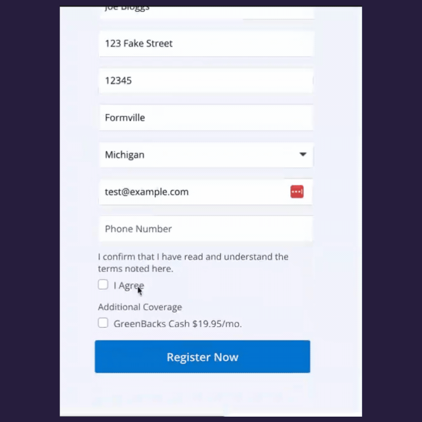
1. Submit the Form Blank
The simplest test you can do is to submit the form without entering any information. This is surprisingly common among users - whether by accident or impatience. So, what happens when a user does this?
- Does the form return a clear message explaining what they’ve done wrong?
- Are users told exactly how to fix the issue?
- Does the error message appear immediately, or is it buried in a sea of text?
An ideal error pattern provides clear, actionable feedback. If the form simply reloads without indicating what’s missing, that’s a problem. Ensure the error messages guide users through the correction process.
2. Miss Out Certain Fields
Now, try submitting the form after intentionally leaving specific fields blank. Does the form display a list of missing fields? Are the error messages helpful and easy to understand?
Ensure each error message is:
- Specific: "Please enter your email address" is better than "Field required."
- Actionable: Suggest how the user can fix the mistake, such as "Use the format: name@example.com" for email fields.
- Visible: Errors should be highlighted next to or within the problematic field, not in a separate section.
In certain, worst case, scenarios we’ve seen forms where submitting a form with a blank field has “nuked” the whole form, deleting all the data inputted and resetting. That’s pretty much guaranteed to lose you a customer quickly.
3. Test Multi-step Forms
If your form is a multi-step journey, it’s crucial to test navigation between the different steps. Try moving forwards and backwards through the form multiple times to see how it handles the data.
- Is the data wiped out when you go back to a previous step?
- Does the user have to re-enter information they've already filled in?
Retaining entered data when navigating between steps is essential for user satisfaction. If users lose their input each time they go back a step, they’ll likely abandon the form in frustration.
4. Leave the Form Idle
Sometimes users get distracted and leave the form unattended for a while. Let the form sit idle for 20 minutes and check what happens when you return.
- Are users timed out without warning?
- Does the form offer an option to save progress?
A sudden timeout can be incredibly frustrating, especially if the user has entered a significant amount of information. If your form has a session timeout, provide a clear warning before it happens, and if possible, offer a way to save progress.

5. Error Messages Should Be Clear and Helpful
Error messages are a critical component of the form-filling experience. Vague or generic messages like "Something went wrong" are frustrating and unhelpful.
- Do the messages explain what went wrong?
- Do they provide a clear path for the user to correct their mistakes?
Error messages should always be actionable. If the user enters an invalid email, for example, guide them with a message like “Please enter a valid email address, e.g., name@example.com.”

6. Input Validation Tests
Test how your form handles incorrect data in specific fields. If a field expects a number, try entering letters or symbols.
- Does the form accept incorrect input and cause issues on the backend?
- Or does it reject the input with a clear, easy-to-understand message?
Similarly, for text fields, try entering numbers. Ensure the form only accepts valid input types and provides helpful feedback when it rejects invalid entries.
7. Spaces, Brackets, and Special Characters
Some fields, such as phone numbers, often trip users up. Try entering phone numbers with spaces, dashes, or brackets. What happens when users enter too few or too many characters? How does the form handle these variations?
- Does it strip the spaces or reject the input?
- What would the user expect to happen?
User expectations play a significant role here. If people are accustomed to entering phone numbers with spaces or brackets, your form should accommodate that or provide a clear message explaining the correct format.
8. Password Field Testing
Test your password fields by entering passwords that don’t meet best practices. Try entering too few characters, only letters, or even ignoring required special characters.
- Does the form prompt users to meet the password criteria?
- Is the error message clear and specific about the missing requirements?
Poorly implemented password fields are a major source of frustration for users. Clear criteria should be displayed upfront, and any mistakes should be highlighted with actionable feedback.

9. Hammer Those Buttons
Finally, evaluate the functionality of all buttons on your form, particularly the navigation buttons.
- Do the buttons perform their intended actions every time?
- Is it obvious what will happen after clicking?
- Can users navigate back and forth without losing their data?
- What happens if you click them twice in quick succession?
Pay special attention to inactive buttons. Do they clearly appear inactive, or do they give users the false impression that they’re clickable?
Always Consider the User’s Perspective
As you go through each of these steps, always try to think like your users. Imagine your mother is filling out the form. What would confuse her? What might cause her to give up entirely?
- Would she know how to fix an error?
- Would she struggle with unclear instructions or vague messages?
- Would she abandon the form altogether because of frustration?
If a user encounters any difficulty, no matter how small, there’s a risk they’ll abandon the form before completing it. A smooth, intuitive experience leads to happier users and more conversions.
Breaking your form may sound counterproductive, but it’s one of the best ways to identify weaknesses in your form's design and functionality. By testing every possible error scenario, you can ensure your forms are as user-friendly as possible.
So put on your digital hardhat, grab that virtual sledgehammer, and start smashing through the flaws in your form!
Form more form optimization tips check out our big guide on that topic here.
We wrote the book on form optimization!
"The best book on form design ever written - 80 pages of PURE GOLD"


More from our blog:


Want to get started with Zuko?
Start a free trial that includes all features, or request a demo