
Why Online Forms Are So Hard for Blind Users
What real conversations with blind users reveal about form friction for everyone - and how to fix it
What the UX of blind users reveals about form friction for everyone
We all struggle with bad forms. Zuko has made a business out of helping improve forms and checkouts that are delivering such a poor user experience that they are actively causing customer drop-off.
Now imagine what the experience would be like if you couldn’t physically see the form either
Recently, we’ve been speaking with blind users about their real experiences filling in online forms - from banking and insurance to ecommerce and local government websites. What emerged wasn’t a story about niche accessibility edge cases. It was a nightmare tale about avoidable design decisions that make forms harder for everyone, but almost unusable for blind users.
This article has three parts:
1. The key struggles blind people face with online forms
2. How these issues can be avoided
3. General design and build principles that improve form usability for blind users (and, as it turns out, sighted users too)
Key struggles blind people have with online forms
1. Form fields that aren’t properly labelled
“You kind of have to guess. Tab out of the field, tab back into it, and hope the screen reader tells you you’ve highlighted the right one.”
One of the most common problems described was simple, but devastating in impact: form fields without clear, programmatic labels.
For a screen reader user, an unlabelled field isn’t just slightly confusing, it's unknowable. You may hear “edit box” or “button” with no indication of what information is expected.
A typical example:
- A dropdown asking for title (Mr / Mrs / Ms)
- The dropdown cannot be opened or navigated properly
- The user is forced to guess, tab out, tab back in, and hope the screen reader announces the correct option
This turns what should be a one-second interaction into trial-and-error frustration.
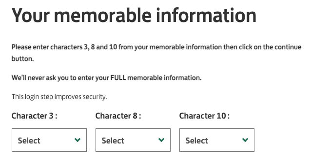
2. Multi-part security fields that rely on memory
“You’re told to enter the third, fourth and fifth characters but as you go into each field, you don’t know which field represents which character. You’re constantly trying to remember what it was while navigating fields that aren’t telling you what they’re for. If you’ve got a 10 or 12 character password, it becomes a nightmare.”
A particularly striking anecdote involved online banking security.
Some banks ask users to enter “the 3rd, 4th and 5th characters” of a password or PIN but present this as three empty, identical fields, with no indication of which character goes where.
For a blind user, this means:
- Remembering which character is required
- Remembering which field represents which position
- Navigating between fields that all sound identical
In this case, the issue was eventually fixed by clearly labelling each field (“Enter 3rd character”, “Enter 4th character”, etc.), instantly removing the cognitive load and making the experience better for everyone .
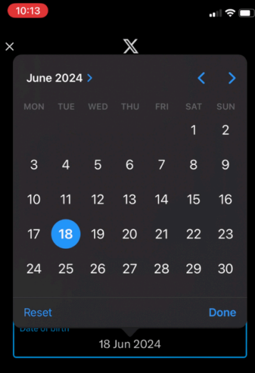
3. Calendar-only date inputs
“Trying to find the button to move to the next month is a nightmare. They want you to click the calendar and scroll through all the dates when I could type the date quicker than anyone.”
Calendar pickers are one of the biggest recurring pain points.
Many forms:
- Use a read-only date field
- Force users to open a calendar widget
- Require navigating day-by-day or month-by-month
For blind users, this can mean:
- Difficulty finding the “next month” control
- No clear announcement of which date is selected
- Excessive keyboard navigation
Crucially, this isn’t just an accessibility issue. Even sighted users can type dates faster than they can click through calendars (Zuko research has shown this) especially for dates of birth decades in the past.
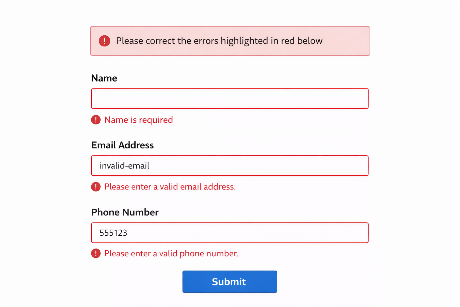
4. Errors that are not sign-posted immediately
“It’ll say ‘correct the errors highlighted in red’ which is about as much use as a chocolate fireguard to me.”
Error handling is another major failure point.
Messages like: “Please correct the errors highlighted in red” are almost useless to someone using a screen reader and often frustrating for sighted users too if they can’t easily locate them.
If errors aren’t announced clearly and specifically associated with a field or require visual scanning to locate then blind users are forced into repeated submission attempts, or simply abandon the form altogether.
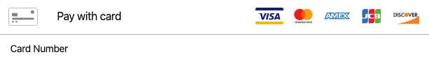
5. Icons, images, and logos without text equivalents
“All it says is ‘Image, image, image’. I’ve got no clue what cards they take.”
Payment forms frequently rely on logos alone. Think Visa, Mastercard, American Express. To a screen reader, these can appear as “Image. Image. Image.”
Without visible text or properly implemented alternative text, users have no way of knowing which payment methods are supported.
This problem isn’t limited to blind users. People with cognitive impairments, low digital literacy, or unfamiliarity with logos face the same confusion.
6. Overloaded journeys and unnecessary interruptions
“I can’t find the button to go to the next screen because I’m wading through all this morass of crap.”
Another theme that emerged was over-complication. Users often arrive at a form knowing exactly what they want to do - buy a product, renew insurance, complete a task. But they’re forced to plod through upsells, alternative recommendations, cross-sells and repeated confirmations (think Amazon or some airlines).
This is annoying for all users but at least sighted users can quickly scan past anything that is irrelevant. Blind users have to keep tabbing through and assessing whether each element is relevant before they reach their goal. This additional content forced upon them takes time to navigate, obscures primary actions, and makes it harder to find the next step.
This increases abandonment. Not because the user can’t complete the task, but because the effort required stops being worth it. Ryanair was called out in particular for being so much hassle, the user would prefer to pay a bit more to fly with their competitors than have to suffer their bloated purchase flow.
How to avoid these issues
The good news is that none of these problems require exotic solutions. Most fixes involve simple things like clear labelling, explicit instructions and cutting out unnecessary interactions.
Key principles:
1. Label everything explicitly
Every input, dropdown, radio button and checkbox should have a visible label and a programmatic label associated via HTML (`<label for="">`).
This is a WCAG Level A requirement (WCAG 2.1 – Success Criterion 1.3.1 & 4.1.2).
2. Make error messages specific and actionable
Instead of generic error banners announce errors immediately on refocus, state exactly what is wrong and associate the message with the relevant field.
For example:
- “Postcode is required”
- “Date of birth must be in DD/MM/YYYY format”
3. Always allow manual input
If you use calendars, dropdowns or sliders make sure you provide a keyboard-accessible, text-based alternative (i.e. a simple text input).
This is recommended in GOV.UK Design System guidance, which consistently favours simple text inputs over complex widgets.
4. Reduce cognitive load
Ask only for information you genuinely need. If a postcode determines the same outcome for every house on a street, don’t force users to scroll through house numbers.
Every unnecessary field increases abandonment especially for users navigating sequentially via keyboard and screen reader.
General design and build points to aid blind users of forms
Many of the best accessibility improvements are simply good form design:
1. Use clear progress indicators
Multi-step forms should announce which step the user is on and how many steps remain. This helps blind users orient themselves and reduces anxiety about form length.
2. Design for keyboard-first interaction
Blind users navigate sequentially, rely heavily on tab order and expect logical focus movement. So, ensure your form has a logical DOM order, no keyboard traps and clear focus states.
3. Prefer text over icons
Icons can support text but shouldn’t replace it. If something is important, say it in words, not just visuals.
4. Test with real assistive technology
If you want to get accessibility right, nothing replaces proper testing with screen readers (NVDA, JAWS, VoiceOver). Make sure you test keyboard only navigation and include real sight-impaired users, not just automated tools.
Automated accessibility tests catch some issues but they won’t tell you what it *feels like* to complete your form.
Why this matters
According to the World Health Organization, over 2.2 billion people globally have some form of vision impairment and many more experience temporary, situational, or age-related impairments. That’s a lot of people who may struggle with inaccessible forms.
But the bigger lesson is that the same things that frustrate blind users are often the same things that frustrate everyone else. Poor labelling, unclear errors, unnecessary steps, and overcomplicated controls don’t just create accessibility issues, they create abandonment.
Fixing the issues that are causing blind users maximum frustration will benefit *all* of your users.
Common Questions about Blind Users and Forms
Why are online forms so difficult for blind users?
Online forms are difficult for blind users because many are not properly structured for screen readers. Zuko’s research shows that issues like missing field labels, unclear navigation, and poorly coded inputs mean users often hear vague descriptions like “edit box” with no context. This turns simple tasks into trial-and-error experiences and creates significant friction.
What are the most common accessibility problems in online forms?
The most common problems include unlabelled fields, confusing multi-part inputs, and forms that rely on visual cues rather than clear text. For example, security fields that ask for specific characters of a password without identifying each field create a heavy cognitive load. Zuko’s findings show these issues make forms not just harder but sometimes unusable for blind users.
How can you make online forms more accessible for blind users?
To improve accessibility, forms should use clear, programmatic labels, logical structure, and descriptive instructions for every field. Each input should communicate exactly what is required, especially for complex tasks. Zuko Analytics shows that fixing these issues reduces friction for all users, not just those using screen readers, leading to better completion rates and lower abandonment.
We wrote the book on form optimization!
"The best book on form design ever written - 80 pages of PURE GOLD"


More from our blog:


Want to get started with Zuko?
Start a free trial that includes all features, or request a demo