
Form Optimization Teardown: Personal Loans
We analyse a real life loan form to see what lessons can be learned for your forms
Personal Loan Forms: Have we moved on from the 1990s?
There's a whole heap of advice on how to optimize the UX and conversion of your form out there.
Like high school science, though, just looking at the theory can be a little dull. It's only when you throw the (metaphorical) magnesium into the water to create the explosion that you really start to understand its value in real life.
So, we thought we'd try out our optimization skills on a live form to show how you form analysis techniques can practically improve your forms.
For the first tear-down in this semi-regular series, we decided to take the form of a global brand. Let us take you on the user experience of applying for a personal loan quote from HSBC, a worldwide bank with
- Reported revenue of 12.25b USD for 2022.
- 50 million customers globally
- Operates in 75 countries
Whilst not wishing to pick on HSBC, the overall form experience did remind us of the past. Do you remember the time when you had to listen to a modem screeching at you as it tortured itself trying to connect to the internet? Perhaps even the era of Netscape Communicator, where installing it required you to borrow no less than 18 floppy discs from a mate who had managed to download it on the pinnacle of bandwidth envy with a 56k modem whilst you sobbed gently waiting for your 28k modem to even boot up? We do. And, whilst the 90’s did have some high points (such as genuinely thinking that pagers were going to become a thing, and playing Snake on our Nokia phones) it’s probably not a time we’d want to return to - especially when it comes to filling out forms online.
Are you ready to time - travel?
Brace yourself, it’s gonna be a bumpy ride as we pick out the good, the bad and the ugly of HSBC's form!
Blurb Page
We start with the blurb page which is always a good idea to set user expectations before they embark on the form journey. And here we are straight into 1991. The application form is contained within an iframe on the page and we have to wonder what optimizely is doing… Nonetheless, an iframe implementation isn’t always the better option especially when you consider the possible security threats of their usage (clickjacking for example). But as this isn’t a security post we’ll move on in the hope that HSBC have done their very bestest to mitigate any security problems of this type of implementation.

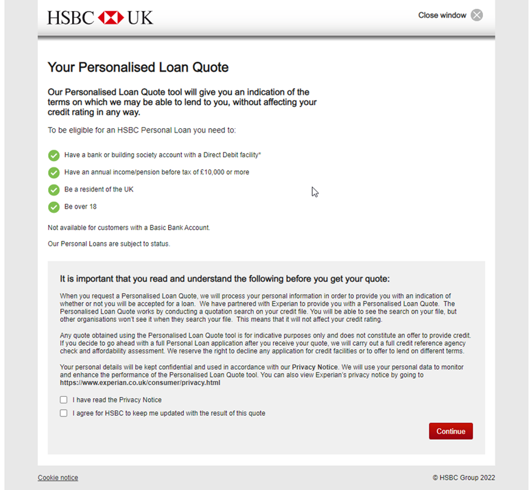
On the actual content:
The Good and the Bad
Good
- They have listed the eligibility criteria for applying for the loan
- The Call To Action (CTA)is easily visible in the hierarchy (though not at lower resolutions)
Bad
- There is no easy way to find out what a “Basic bank account” is
- The font size for the body copy is irregular and quite small 12px which makes hard reading, especially for those with impaired vision
- Important information such as credit searches carried out is hidden in reams of copy - users may well want to know if the act of applying for this loan will have an effect on their credit rating
- After application steps are also hidden in the copy (full credit search, affordability assessment)
- The input label “I have read the privacy notice” next to the checkbox does not contain a hyperlink to the privacy notice in question. This is particularly gnarly as there are 2 privacy notices to consider here, HSBCs and Experian’s.
- There isn’t an indicator here whether the checkboxes for the privacy policy and updates are mandatory. Yes, we know all the cool kids don’t bother with such frivolities these days, but actually being explicitly clear here reduces the chance of errors happening, especially as at this point in the form no precedent or rules have been set or stated.
- There is no information about whether you can part-progress though this application, save your progress and come back to it later. At this point there is no indication of how many questions will be asked or how long this process is going to take - it’s all just a guessing game.
- Related to the above point, there is no progress bar to indicate where in the process you are and how many steps there are to go.
- There is no information for the maximum and minimum loan amounts that this type of loan applies to, nor the available terms. A reminder here would be helpful.
- Horizontal layout - It kinda makes sense for the loan amount and term section, but not for “A few details”. Look at how much “eye travel” is required to get from the input labels to the radio buttons and dropdown - too much
- There is no information around what determines a UK resident and a Non UK resident
- There is no justification as to why a reason must be given for what the loan will be used for.
Error Handling

We can’t fault the SIZE of the error message, but what is a bit rubbish is the fact that it appears at the very top of the page which isn’t where the actual problem is. In this example, the checkbox for the privacy notice has not been checked and it is THIS checkbox and associated copy that should be directly highlighted to the user in combination with the top error message.
Loan Details

The Good and the Bad
Good
- A progress bar has finally appeared, hurray!
- Mandatory field information key has been provided
- Error messages do clear when the input values are corrected
Bad
- The distinction between the active step (loan details) and subsequent steps lacks affordance to show it is the currently active section. Grey is just so… grey!
- The placement of “These fields must be completed” is poor. Users' eyes will be directed to the left of the content meaning this is going to be missed.
- Terminology is very 'banky'. Loan amount and term… for example. Is this even needed given that they are then asking “How much would you like to borrow” and “Over how many months”? It is much better to use language that customers will understand without feeling intimidated.
- There is no direct way to manipulate the amount and months to see what effect it would have on the repayment plan. It’s a shame because there is one here but this functionality is not available right when the user is actually applying for the loan. Chances are they won’t remember the information in the loan repayment calculator by this point even if they did get to this part of the form. Pre-filling any loan calculator information the user has already entered at this point would be helpful and allowing them the ability to manipulate it as they see fit would vastly improve the UX here.
- The input tooltip copy is way too small at 10px
- If the available term is dictated by the value of the loan, this rule should be applied when the user enters the loan amount so that they can only select a term that is valid, instead of doing this when the user enters an unsuitable term:
Side Note: This error message lacks clarity and needs to be much more user friendly

Whilst error message text is shown in red, the corresponding input and labels the error message relates to are not highlighted.

Your Details

The Good and the Bad
Good
- Clear indication of previously completed step
- It has an address lookup - sort of?
Bad
- No way to go back a step (no back CTA, progress bar isn’t clickable)
- The privacy notice text is actually a hyperlink, but as it is not underlined the affordance is poor.
- Left aligned input labels - look how far they are from the input they relate to. This makes it difficult to scan over the form and understand what is required where
- Title select drop down, wow! We’d love to know how many Lords, Lady’s, Dames and Captains might be perusing this form. We’re not trying to form a judgement here but it would be interesting to know the metrics behind including these options on the default drop down. Perhaps a better way would be to have common titles (Mr, Mrs etc) listed and an option for “other” that allows the user to choose some of the less common ones if they’re particularly precious about it.

Date of birth entry is OK. At least you don’t have to scroll to enter your YYYY. However, eye-tracking research shows that text boxes are more efficient than drop downs for the DOB field so they should be used instead of the current execution.
Number of dependants. Goodness, that’s a massive input box, we wonder what sort of numbers they’re expecting here? Not to worry though, as actually when you start typing, the most you can enter is a 2 digit number, phew! We were wondering if they had potential guinness world record holders applying… It does beg the question, however, why the input needs to be so long, given the constraints applied to it. Input length should be appropriate to the data expected AND if a constraint is in place, it should be noted near the input.

Current address… The postcode look up doesn’t support partial postcode entry, just states that it’s invalid, even if you get as far as MOST of it being entered. It should be able to provide a list of suggestions with this much information, it’s just that the look up isn’t as clever as it should be. Note also there is no quick link to enter your address manually if you’d rather, or you know your postcode is a pig or it just comes up as invalid.

To do that, you have to enter some sort of postcode to get the option to select “address not listed” at which point you can select “address not listed”. Not that the instructions state that, they suggest you just enter your address manually using some magic part of the form that is currently invisible.

Well done form warrior for getting this far, now you can select not listed to enter your address manually. Far more work than it ever needed to be.
Once you have selected an address, the form then pre-populates the address information which is helpful. But can you spot what else has sneaked in here?

On first view you might not notice a set of further questions being asked - the only indicator is some red error messaging about valid dates which tells the user they’ve done something wrong already (or something has gone wrong with the address selection) when they’ve only just been presented a whole load of new information to process. In these situations, visually chunking information for processing can help so stuff doesn’t get missed - something as simple as a horizontal divider between the address inputs and the subsequent questions below could make a massive improvement here to indicate that there is more to do. Not showing an error message straight away would also help.
However, if you get your email address wrong, it’s ok! Because there is a (un)helpful error message to tell you just that:

There are many UX patterns you can use here to provide guidance (and even auto-suggestions) to fixing email addresses so they’re valid. Sadly, not today though.
Then just as you thought you were done with addresses, and hit continue expecting a new screen, BAM! You’re hit with more information requests on the same screen. Urgh, it’s exhausting. Yes, information about income probably is expected when applying for a loan, but this could easily have been put as a new “section” to break down the cognitive load for the user - with the expectation set in the progress bar that it’s something that will be need to be done, rather than springing it on the user like a scary clown at a birthday party for 3 year olds.

Financials… where to start?! At the beginning I guess.

Employment status is always a tricky one to categorise. What is a key/part time - are they the same thing? What if you’re not a housewife / husband but a “partner” that is a homemaker? Receiving pension… but you’ve not retired from work? What if you’re part time employed? Users shouldn’t have to be deciphering categories here - make them clear!
If you’re employed though, you do get the fun of categorising your employers business. These always feel like a multiple choice test when you’ve not revised and you’re just selecting something for the sake of selecting it. A bit like a pot luck dinner, you could say. What’s worse if that you happen to think your employer is “Financial A or B” then you need to find the help link. There is a help link, sure, but again this lacks any affordance whatsoever so good luck spotting it and even better look figuring out what’s what when the link opens.


Figured out your employer's business yet? Lucky you, now you can decide what occupation YOU have - what if you don’t fit into ANY of these particular boxes:

It doesn't matter what your employer's business is, the same list of occupations are shown for all of them. So if your employer is Finance A for example, you’ll see the same options as an employer who runs a quarrying operation.

Ah, a lovely long input again! It’d be lovely to fill it to its entirety wouldn’t it? Never fear though, you can only enter a 6 digit number here but don’t worry about specifying a currency because it’s a mystery! And of course no indication is given that a forced limit on data entry is in place.
Don’t worry though, if you mess up this field you get another (un)helpful error message:

At least it tells you the currency - and a reminder you should only enter whole pounds. Not half pounds or quarter pounds, just the full ones. This is not a form for accuracy or decimals it appears. What would have been nice is consistency in terminology - total annual income (before tax) is your gross annual income - they are the same thing. So sticking to the same terminology would have been the better option rather than cracking out the financial term thesaurus.

Undefined? What does that mean exactly? You get paid once in a blue moon (freelancers, we hear ya!)? Isn’t 4 weekly the same as monthly pretty much?
The Result

It’s worth noting here that for the purposes of this audit we were never going to fill in factual data (no one needs an unnecessary credit check!) but remember, not all users are going to get that fairytale experience of a successful application. It’s always helpful to see what happens when things go wrong, and how you can recover the situation for the user (and let us tell you, 9 times out of 10 this is a woefully neglected user journey on most sites)
The Good and the Bad
Good
- It’s very obvious if you’re not going to get a loan quote. A bit like getting slapped in the face with a fish.
- You can go back and check the information you entered to try again
- You can take your chances and just apply anyway
Bad
- There is no FAQ here as to why the user can’t progress the quote with suggestions as to what might need to be fixed. It is not impossible to understand where users are failing on the form (such as problematic fields, data match discrepancies etc), so if you know the common reasons someone can’t be identified, provide guidance on what could be wrong and how to go about fixing it.
- There is no explanation of what happens next if the user does decide to apply - will any other information be required? What are the next steps…?
Final Score
You may wonder why we’ve done an exposé on what you’re probably thinking is an exception to the rule when it comes to form design, experience and interaction. Who could possibly conceive such a terrible online form in 2022? Well, here’s the thing. It probably wasn’t built this year, but it’s been left to fossilise in the depths of the underbelly of this particular website and long since forgotten, despite it being the primary method of applying for a personal loan on a major financial institute’s website.
The fact is though, these sorts of forms (or forms that follow similar patterns, layout, logic etc) are more common than you’d think. We’d know, we get to analyse thousands of forms every year and we’ve seen some corkers. So many businesses let their forms fester to the point they become a liability
So what’s the takeaway?
- Don’t neglect your forms - especially if they are your lead and conversion drivers!
- Monitor your forms - figure out where users are failing. Then fix the form and help your users fix problems with data entry when they encounter such a situation
- No excuses - there are reams of great content out there to help you figure out the best ways to present forms and interaction patterns to follow.
- Content and copy is just as important as the structural elements of a form. Remember, you’re dealing with fellow humans - treat them as you’d want to be treated yourself.
- We still want a DeLorean. And a hoverboard.

We wrote the book on form optimization!
"The best book on form design ever written - 80 pages of PURE GOLD"


More from our blog:


Want to get started with Zuko?
Start a free trial that includes all features, or request a demo